
We’re four principles into this life of typography and we are already feeling that we learned a lot of interesting new things. Today we’re going to move our attention towards two new elements: apertures and counters. Let’s define them and understand they’re particularities!
Let’s define these new elements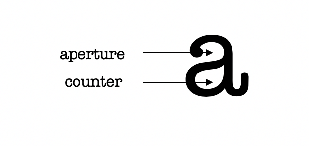
Some people might say that there is no difference between apertures and counters. They think those two elements are interchangeable and refer to pretty much the same thing. We believe that they define similar, yet different aspects of a glyph. By differentiating them, we will make our lives easier when it comes to describing a particular glyph. This way, we won’t encounter any misunderstandings, we’ll attribute the right name to the right concept and our life’s going to be much more easier.
Firstly, let’s define them. On one hand, the aperture is an open space between the interior white space and the exterior of a glyph. It’s very visible in letters such as lowercase ‘a’, lowercase ‘e’ or both uppercase and lowercase ‘c’.
On the other hand, the counter represents the closed white space inside a glyph. You can think about the same lowercase ‘a’ or lowercase ‘e’ in order to understand this other notion. Or, for a simpler image, just imagine an ‘o’ or a ‘p’, letters who are characterized by a simple counter.
Basically, the one and only aspect that points the difference between them is whether the white space is enclosed or not.
The importance of understanding the differenceWhen combining various fonts, it’s important to keep in mind the shapes of apertures and counters. The shapes of these elements will determine if a font is or isn’t compatible with other fonts. By taking this into account, you can avoid mixing up two fonts and realizing one looks bigger than the other one.
If you’re looking for the right mix of fonts, check WhatFontIs. We have over 500,000 fonts available, so you don’t need to worry about apertures and counters. You’ll definitely find one right combination that’s just right for you.
Technical lead at WhatFontIs since 2010 with a (healthy?) obsession for fonts.

