Modern Graphic design leans towards magnetizing audiences through an upgraded minimalist, yet functional style while veering away from the extreme flat design trends that have been dominating this trade as of late. The 2018 graphic design trends seek to streamline old graphic design patterns into fresh, avant-garde graphic design styles.
In need of inspiration when it comes to the best graphic design trends this year? Here are 11 elements to focus on to implement current design trends that will render your clients speechless in 2018:
Responsive Logos
The responsive logo is the next step, unthinkable until recently, in today’s epoch of responsive design that made digital branding possible and efficient in the context of mobile browsing.
With devices of all screen sizes and shapes browsing the internet, companies have increased their efforts of implementing flexible designs that make their websites visible on any screen space.
The usability issues of a traditional website have been overcome through the development of the responsive design.
Today, much like responsive design, responsive logos can adapt to any screen size and shape and still look mind-blowing and efficiently reinforce corporate identity.
Gradients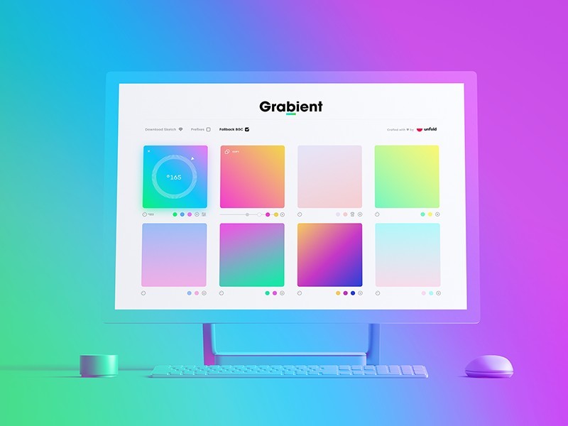
There was a time when gradients ruled the world of graphic design from website buttons to PowerPoint presentations, but that reign had ended when flat design took over in 2007.
With the transformation of flat design into a contemporary semi-flat design or flat 2.0, gradients are experiencing a comeback of their own in the form of color transitions.
Color transition is the flatter, smoother, and more vibrant application of the old gradient. It as it is defined in modern graphic design suits better the current aesthetical needs of the semi-flat design.
Color transitions can be implemented in many aspects of cool graphic designs, from overlays and backgrounds to illustrations and branding.
Depth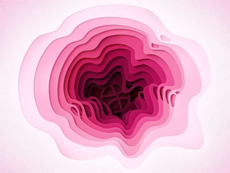
When minimalist and 2D designs have become the new trends adopted by top graphic designers, website design has lost its depth. Designers used to achieve depth with shadows, but shadows were disregarded along with realistic and skeuomorphic objects.
In 2018, depth is once again recognized for what it is: a valuable tool that enhanced visual hierarchy, allowed visitors to determine input fields and ascertain CTAs. The modern graphic design is re-embracing shadows as Google Material Design reinstated shadows as a boost to their user interface.
Contemporary graphic design artists felt encouraged to reintroduce a new type of shadows that they had been experimenting on for some years. These new shadows, so-called long shadows, are soft, substantial, and colored even adding dimension and subtle depth to flat designs.
Long-shadows come to demonstrate the depth is compatible with the new development of the semi-flat design. Depth can enhance usability and achieve simplicity, which is two of the values that define the flat design. Within this context, designers have started to shadows are increasingly used in websites, as well as illustrations, print designs, icons, or app interfaces.
Duotones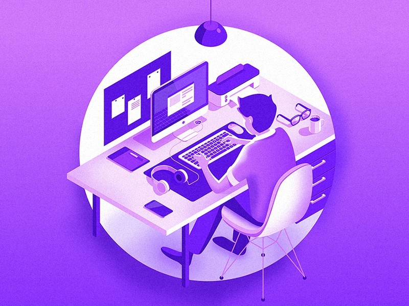
Duotone represents a halftone replica of an image utilizing the placement of one color halftone over different color halftone. This technique is employed to reveal highlights and middle tones of an image. As the name properly suggests, duotones are two-color images.
Inspired by one of the essential printing processes, designers have begun to generate duotones using imaging software.
Their creativity has allowed them to create variations within the same sphere, which resulted in dashing tinted images, or fake duotones, monotones, tritones, or quadtones.
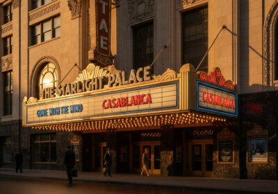
The 80’s & 90’s Color Schemes and Patterns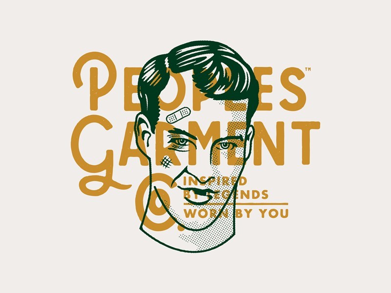
Just as eras of fashion can be identified by glancing at a piece of vintage clothing, the graphic design creates and follows trends over time. Trends tend to reinvent themselves in any trade.
The modern graphic design is now looking into incorporating the color scheme and textures of the 1980s and 1990s in an effort to steer away from extreme flat designs. Latest graphic design news reinstates the patterns and palettes inspired by the 80s and 90s.
It may be that the electrical hues, pretty pastels, and abstract and geographic patterns of the year have become popular trends in modern graphic designs simply because those who have been growing up in that era have become today’s target audience, thought leaders, or brand leaders.
Microinteractions and Animations
When it comes to a movement as a feature of the modern graphic design, micro interactions and larger animations have grown to be almost an industry standard.
Already coined among the most prominent user experience trends and practices, micro interactions represent miniature animations designed to assist users to complete specific tasks when your website.
In this context, micro interactions, as the name properly suggests, are also extremely efficient communication tools establishing a particular bond with the users. On the other hand, GIFs are larger animations have a dual role and embody a trend of their own.
A graphic design icon, the larger animation, including SVG, appeals to users captivating their attention and interest and having them interact with your website in a more efficient, almost natural manner.
GIFs and SVGs, as larger animations, make communication with your users possible, conveying ideas and processes. Today, GIFs are an integral part of any modern graphic design that aspires towards excellence.
One of the most popular trends in 2018, the slick, ingenious, and attractive GIFs have the power to make your logos, ads, illustrations, newsletters, and icons more interesting and engaging than ever before.
The Digital Art Glitch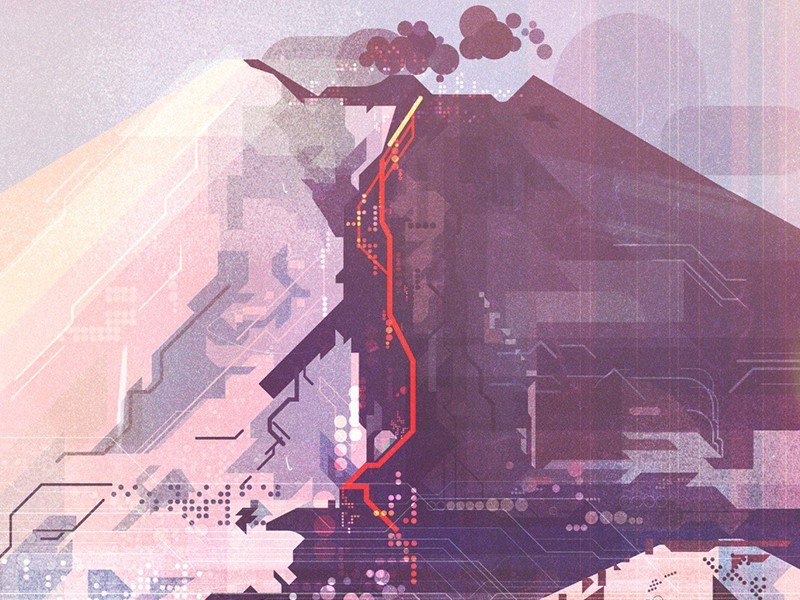
The glitch effect or the art of corrupted images, has grown into one of the most well-liked visual arts and graphic design trends. What is the glitch effect and what does it do for web design?
The industry has developed image glitch tools that allow you to deliberately corrupt digital data for aesthetic purposes. The art of glitching has been inspired by a technical error occurring in software, video games, images, videos, audio, and other digital artifacts.
The modern graphic design has transformed an annoying effect into much more than a much-desired effect. Glitching images is now considered an outstanding form of visual art that has secured a top position among the most popular design trends in 2018.
The Art of Destroying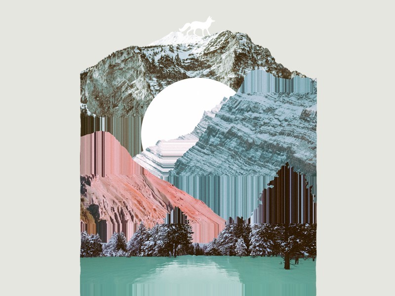
It seems that 2018 is the year where people simply love broken looks. In addition to the glitching effect, graphic design trends 2017 had to offer included the ruined effect, where designers play with tools that destroy the aesthetical harmony of any composition.
There are many graphic design articles that try to explain the appetite for ruining the appeal of various forms of digital art by splashing, ripping off, scratching, or breaking effects.
Authentic Images
Another trend that is encouraged by modern graphic designers in 2018 is the use of authentic photos rather than stock photos when it comes to social media sharing.
To reinforce your brand, you need to show your social media followers that you care enough about your work to put in a lot of effort into adding authenticity and therefore uniqueness not only to your marketing and design strategies but also to your social media shares.
Why do people use social media? To see the same irrelevant stock photos that everyone else can pick up in two seconds from the internet? Is that what you want your brand to be identified within 2018? The answer is a definite no.
People need to see that you are willing to go a long way and make great efforts to prove the value of your work, whether it is a service or a product, and an authentic photo can do wonders.
Risky Colors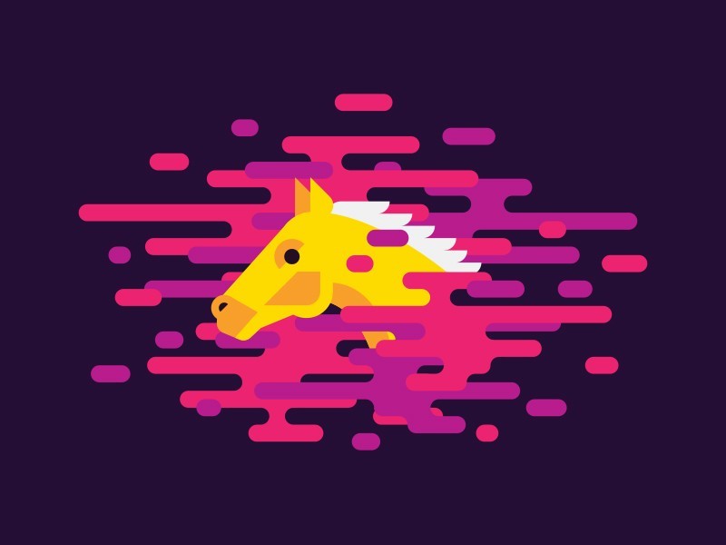
As far as modern graphic design is concerned, 2018 seems to be the year of taking chances with unconventional design effects. The glitch and ruined effects are gaining rave reviews of popularity, but using risky colors is also a widespread trend.
Lots of companies, some truly famous, have tampered with their long-standing color palette that used to be identified with their brand. Such an approach may be a bit drastic, but you can simply stick to an infusion of risky colors that will brighten your graphic design projects in 2018.
Color Channels Effects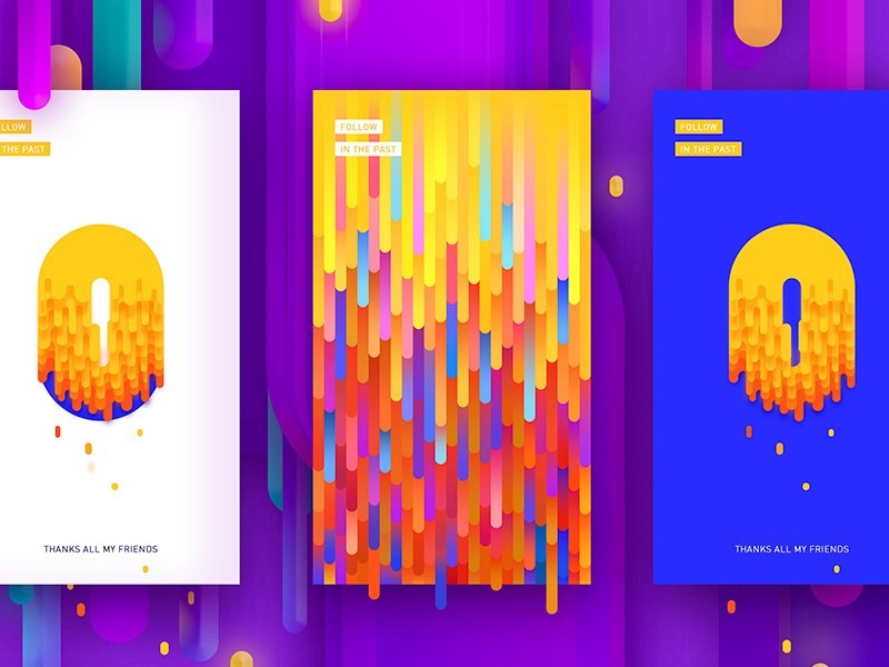
Another technique that gets rave reviews is the color channel effect, where designers play with color channels to generate impressive illusion-like effects that can include hallucinations, holographs, or distorted realities.
These effects resemble the work of an illusionist, a magician, and appeal to users in a most compelling manner, which places the color channels effects among the trendiest graphic design techniques of 2018.
Ending thoughts on graphic design trendsToday is a fascinating time for modern graphic designers who have a chance to be part of the movement that revives graphic art in an effort to resist the dominance of extreme flat designs.
As the focus is shifting towards emphasizing unique brands that target distinct audiences, the world of graphic design becomes an even more interesting scene for branding purposes and getting more business.
It is a time when designers are breaking patterns by intermingling the old with the new to create a harmonious, original style, unlike anything seen before.
As far as graphic design is concerned, 2018 is the year when you must allow your creativity to tell you how to target your audience and convert those users into clients.
If you enjoyed reading this article about graphic design trends, you should read these as well:
- Good Magazine Ads to Take as Example
- Color theory: what you need to know as a designer
- Make your own font: A guide on how to create a font
Technical lead at WhatFontIs since 2010 with a (healthy?) obsession for fonts.