After long hours of thinking about fonts, we have come to a significant conclusion: fonts are ubiquitous. They really are everywhere. We see them on books and movie posters, on clothing and school papers. We even see them on food. Remember the Alphabet soup, right? All in all, some fonts are easier to recognise than others. And no, we’re not going to chit-chat about the one and only Times New Roman. Instead, we’re going to move our attention on other fonts and their origins, fonts that really have an impact on how the world is written today. With no further ado, let’s dig into the story of some of the most recognisable fonts.
Helvetica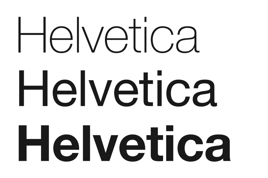
The Helvetica font is one of the most notorious fonts in the world. It is the creation of Eduard Hoffman, director of Haas Type Foundry in Switzerland and it first appeared in 1957. Its original name was Neue Haas Grotesk – a bit hard to remember, right? Shortly after its appearance, it became Helvetica, after the Latin denomination of Switzerland.
Originally, Helvetica was used for printing papers. But with no doubt this sans-serif font is doing very well in the digital era. Nowadays, lots of brands use Helvetica. To state some of its most famous usages:
- on the NASA spaceships, the name of the United States of America lays written in Helvetica;
- you can see Helvetica all over New York city because all subways signs are using that font.
This font is so cool it even has its movie. Released in 2007, Helvetica is a documentary film that gathers lots of opinions on typography in general and Helvetica in particular from many influential typographers and graphic designers. Check out the trailer here.
Georgia
Another very recognisable font is Georgia. Designed by Matthew Carter and Thomas Rickner, this serif font first appeared in 1996. At first, it was one of Microsoft’s core fonts for the world wide web, but after a while it became available on Macintosh too. Rumour has it that this font got his name after Georgia O’Keefe, the favourite artist of the Microsoft’s program manager.
Georgia was designed to go hand in hand with Verdana. Despite their different proportions – Georgia looks a bit smaller than Verdana when they are side by side at the same point size – they represent the perfect contrast pair. They are clear, readable and legible on screen, unlike other fonts that go well on print, such as Arial or Times New Roman.
Today, we all know about Georgia. It’s popular and goes well on text heavy sites. It’s pretty much the right choice for a more upmarket, classic design. But things were not always like this. Back in the day, Georgia was not that popular and it was perceived way too similar to Times New Roman.
Garamond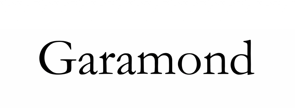
Old, but yet very recognisable. Garamond was created between 1530-1545 by a French type founder, publisher and type designer named Claude Garamond. This serif font is one of the typographical highlights of the 16th century. To create it, Claude Garamond found his inspiration in the handwriting of Angelo Vergecio, the librarian of the French King Francis I. It was brought back to life in the 1920s, by Stanley Morison and the Monotype Corporation.
There’s something very appealing about this font: the characters are fluid and consistent, while some of them have very unique traits. Just look at the small bowl of the lowercase ‘a’ or at the small eye of the lowercase ‘e’. These characteristics make Garamond one of the most easy to read fonts in the world.
Today, the one and only set of original Garamond type is in Plantin-Moretus Museum, Antwerp.
Didot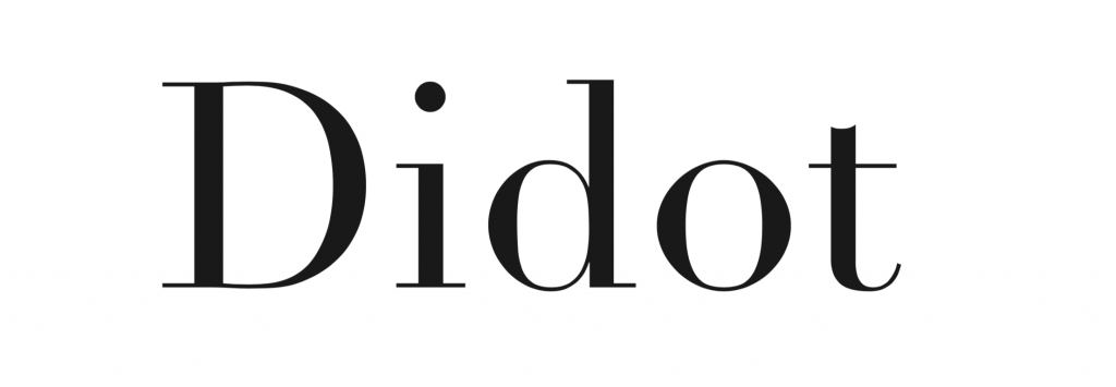
Created in 1784, the Didot font is as fresh today as when it first appeared. Member of the most recognisable fonts gang, Didot is the first font that unmistakably defined the modern style known as Didone.
Inspired a little bit by Baskerville due to its increased contrast and vertical stress, Didot has strong, clear forms and flat serifs. His neat and clean look make it more appropriate for fashion and cultural uses. Remember the new Zara logo? If not, check out the article on that here if you want to see this font in action.
Rockwell
Last but not least, let’s move our attention towards the Rockwell font. It’s a reinterpretation of an older font called Litho Antique and it was released in 1934. Made almost entirely out of straight lines, perfect circles and sharp angles, Rockwell is a simple serif font. Although the shapes are pretty complex, they don’t feel overwhelming at all. Also, because of its shape, it doesn’t read well when used in the body of a text. We recommend it mainly for the titles, it will surely be more effective.
When you think about Rockwell, you cannot help to not think about the architecture and design of Modernist movement. Simple, bold and captivating.
These are just some of the most recognisable fonts in the world. But, as we like to think, these are some of the most relevant fonts that everybody should have in mind when starting a creative project. Choosing a right font is as important as choosing an appropriate logo or catchphrase. If ever in need for a pinch of inspiration, check WhatFontIs.com. We have lots of fonts available and one of them might be exactly what you are looking for.
Technical lead at WhatFontIs since 2010 with a (healthy?) obsession for fonts.

