
Imagination made us wonder: are humans and letters similar? If you really think about it, you might find lots of similarities. Some are tall and some are short. Some are round and some are slim. And, surprisingly, both humans and letters have ups and downs. People have good days and bad days, while letters have ascenders and descenders. Don’t know what those two elements are? Take a sit and let us tell you their story!
Ascenders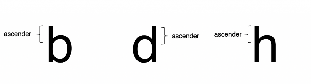
An ascender is the upper part of a lowercase letter that is taller than the font’s x-height. That upper portion rises above an invisible line known as the ascender line. Check out letters such as ‘b’, ‘d’ or ‘h’ to really visualise this concept.
Keep in mind that the ascender line is not the same thing as the cap-hight. Usually, the former is set slightly higher in order to create the illusion that the top of a letter visually aligns with the cap-height.
Descenders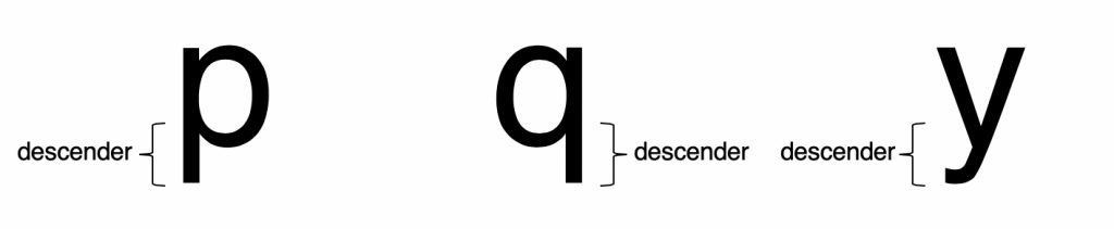
A descender is the lower part of the letter that extends below the baseline of a particular font. For a better understanding, always keep in mind letters such as ‘p’, ‘q’ or ‘y’.
Both parts of lowercase letters, ascenders and descenders do not require any particular rules of usage, height or design. Descenders are not necessarily proportionately linked to the ascenders height. Also, modern fonts tend to minimise the size of descenders and really emphasise the heigh of ascenders.
Did you read our articles about the previous five principles of typography? Go on WhatFontIs.com, blog section, if you want to find out lots of interesting things about stress, body height, glyph width and many other elements that you are not familiar with. After this short reading break, check out our fonts collection and pick your favorites for future creative projects.
Technical lead at WhatFontIs since 2010 with a (healthy?) obsession for fonts.

