
As you probably noticed already, there are a lot of typographical terms that are alike. The difference between them might be imperceptible in most of the situations. We learned this in one of our previous articles when we talked about apertures and counters. Today, we’re going to move our attention towards two new other notions that are very much similar and learn how to differentiate them. Girls and boys, let’s find out more about legs and tails!
Leg or tail? Different, yet so similar
Typographically speaking, there’s a fine line between a leg and a tail. And, to be honest, from our point of view, the best way to learn the differences between them is throughout examples.
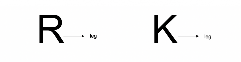
Firstly, let’s talk about legs. The leg is that short, descending stroke that certain letters have. Commonly thought to serve as support, this stroke has one attached end and the other one free. For a better understanding, check out the uppercase R or the uppercase K. Those two descending strokes on which the letters stand are basically the leg.
Secondly, let’s move our attention to tails. The tail can be defined as that small stroke at the end of an uppercase Q that differentiates it from an uppercase O. In other words, this stroke often plays a decorative role, being a small detail that really makes the difference.

When it comes to mixing & matching fonts, legs and tails play a pretty important role. Besides those two aspects, keep in mind to always take into account the ascenders of certain letters. If those are too tall, they might overlap with other letter’s tails.
Looking for the perfect combination of fonts? Check out WhatFontIs, Amongst over 500,000 fonts, you can definitely find lots of awesome fonts combination.
Technical lead at WhatFontIs since 2010 with a (healthy?) obsession for fonts.

