Typography is pretty much a key component when you’re talking web design and choosing the easiest font to read for your next project has a much bigger impact than you’d think.
There are different types of fonts that are better suited for some specific purposes, for example sans serif for high-impact headlines. Below, we’ll focus on some of the best fonts for reading, or, fonts that will guarantee readability.
Is your font the best font for reading?
If your design contains text, chances are, there’s something important that you’re trying to communicate.
Having easy to read fonts is an important quality in such a design if you want to make sure that your message will be conveyed. But, besides your own visual assessment, how do you tell if a font is readable? Well, there are a couple of ways to distinguish readable fonts from those you shouldn’t be using.
Size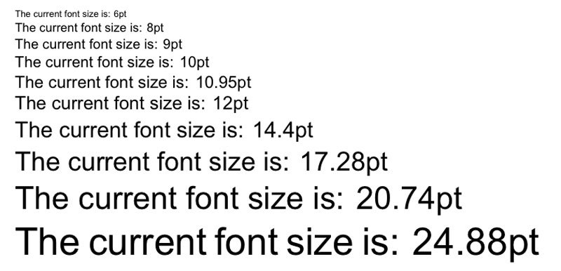
The point size should fit your design context, as, obviously, an event poster requires a different size than a business card. Something that may be viewed on mobile devices should be checked with a word processing program.
Type a few lines with the font you’ll be using and reduce the size. Is it still readable? You’re good to go. If you Google a font’s name, you’ll also easily find information on whether it’s optimized for web usage.
Spacing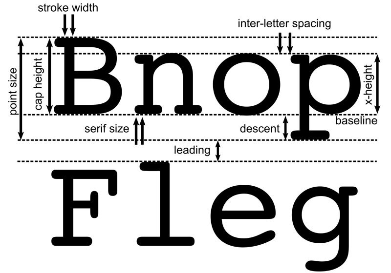
Well-adjusted spacing is another key factor. Generous spacing will usually improve readability, but if you’re tight on space, try experimenting with different combinations of spacing and font size. Many design programs let you adjust the tracking and letter spacing, as well as the leading and kerning.
X-height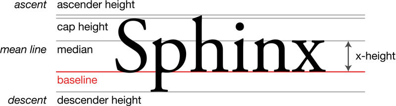
This is the lowercase letters’ height, and a generous x-height will usually improve readability while maintaining it at smaller sizes. However, the x-height shouldn’t approach the capital letters and make them hard to distinguish from each other.
The I/l/1 test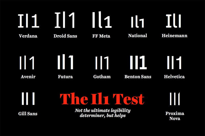
If you’ll be including both numbers and letters, type out a lowercase L, a capital I, and the number one. If you have two or more looking identical, readers will have problems with that, and you’ll be very far from having the easiest font to read.
Hierarchy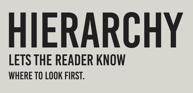
Every typographic layout requires hierarchy. Hierarchy is what defines how you’ll read through content, and it will show the user where to start, and where to read through. It shows the user the difference between the header and the body text.
Even though you can theoretically use colors to contrast, hierarchy usually refers to the difference in size. And, even the most readable font will make impossible to scan if the hierarchy isn’t mastered.
Contrast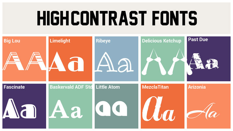
Another key factor that makes the difference between the easiest to read font, and the most difficult one. A good contrast makes text easy on the eyes, and easier to scan. However, poor contrast will result in an almost-painful, and much slower experience. As said above, the easiest fonts to read are easily destroyed with poor contrast.
Line height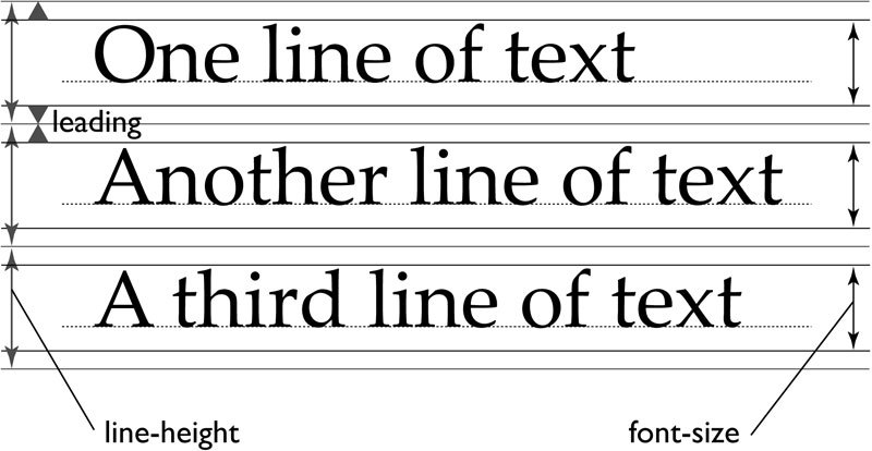
Another common term that defines the space between two or more individual lines of text. It’s another factor to consider and is especially important in web design.
This is what makes the text much more scannable, and a too short line height will cause the reader to squint. Too large, and the text will seem like separate bodies.
Line length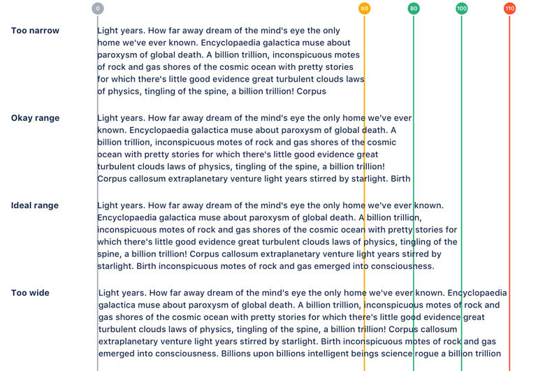
Often overlooked, line length is the number of words per line. A good line length means that the reader’s eyes can naturally and easily flow from the end of the line to the beginning of the next one.
Letter spacing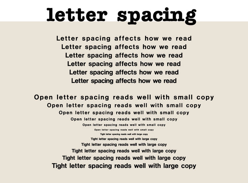
Just like line height and length, letter spacing has a big impact. It is the space between each letter in a word, and when looking for the most readable font for print, you will often find negative letter spacing for a fun feel. However, it should never be used in body text.
So, how do you achieve readable typography?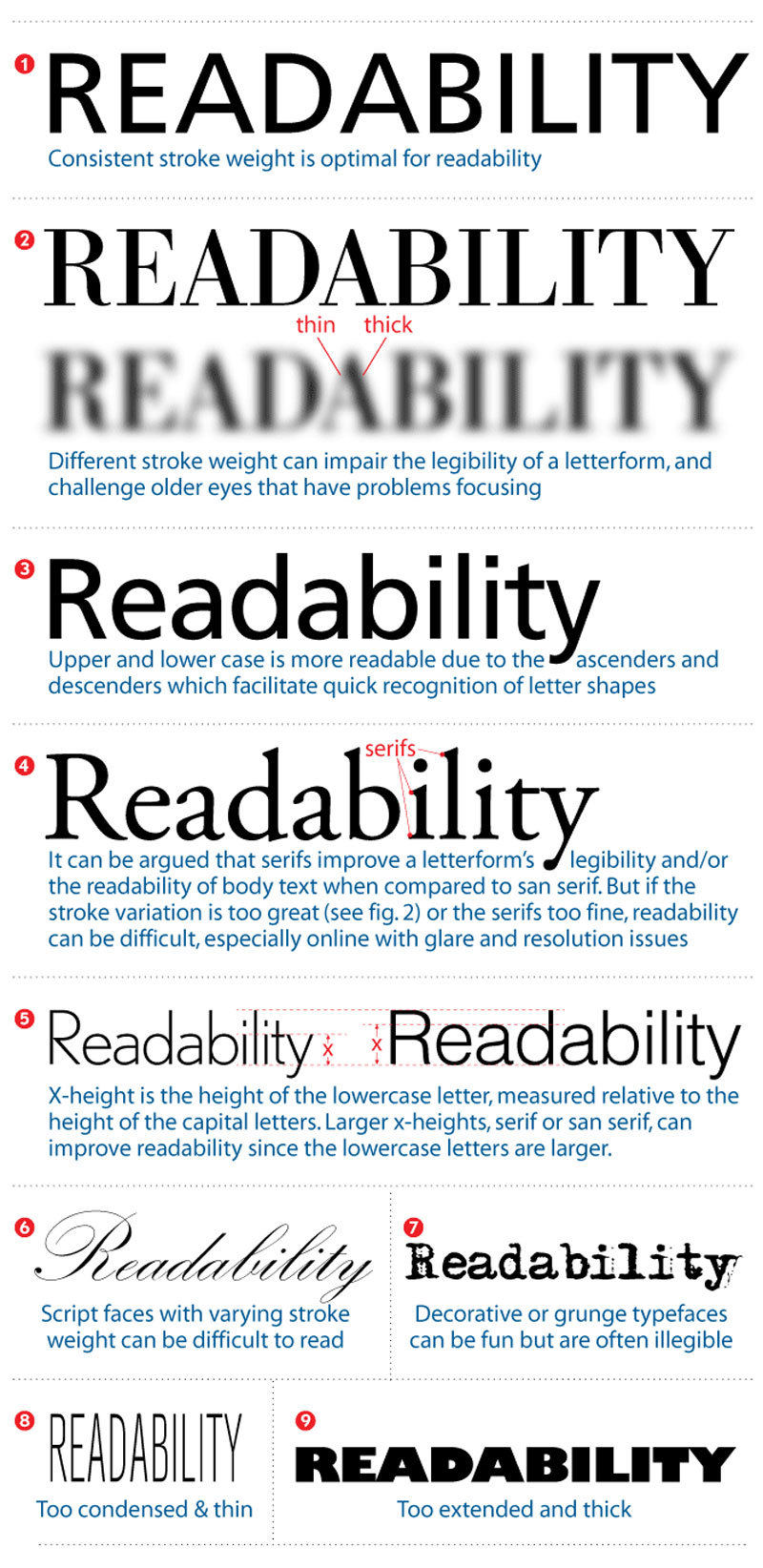
All it takes when you want to make sure you have the most readable font for web possible is to follow a couple of key practices.
A website that is easy to read truly goes a long way with your users, and their experience will be severely impacted by readability. When you’re designing for the web, your main goal is to make the UX as pleasant as possible. Below are a few more tips on how to get to some fairly high readability levels.
Headers that are user-friendly and maintain hierarchy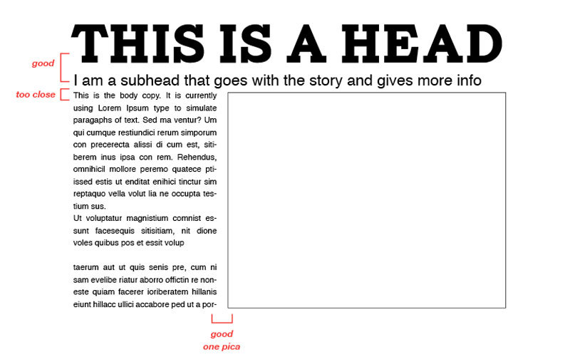
They’re a key element and are a major factor in the text that is easily scannable, something we’ll discuss below. Header size is just as important as the body text’s size and having a too big header with a lot of content will undoubtedly throw the user off balance, leading to them losing their spot.
And, at the end of the day, it ends up being a distraction and ruins the content’s flow. If the header is too small, on the other hand, the hierarchy of the article is ruined. And, it won’t draw the user’s attention.
Text that is easily scannable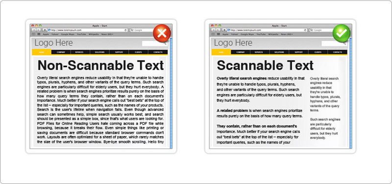
Already mentioned quite a few times, you’ve also undoubtedly heard “scannable” text elsewhere as well. It is something that goes hand in hand with text that is readable, and it consists of hierarchy, good header use, and focus points that will be used to guide the user through the page’s content.
So, how to make the copy scannable? There are quite a few factors, and the most important ones are header position and size, text line height, body text size, text contrast, as well as the focus points throughout the article. A focus point is what will attract, or should attract, the user’s attention, such as a button, or graphical element, or even a header.
Consistency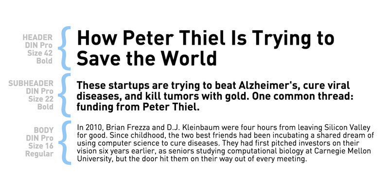
Often regarded as one of the most important techniques for usability, consistency is also a key factor for readability, as having a consistent hierarchy will make for a much more user-friendly layout.
For this to be true, all headers that are of the same importance should be the same color, size, and font.
For example, the h1 headers should all look identical, to give the users a familiar focus point when they’re scanning, and to help with content organization.
Text densityThis usually refers to the number of words that you will place in a single are on the website. The density will actually have a pretty major impact on the readability and is commonly affected by things such as letter spacing, text size or line height.
Managing to nail down the balance between all of them for the content to be right in the middle of compact, and too widely spaced, and you have perfect density.
Putting an emphasis on important elementsPutting a highlight on links or showing quotes and bolding text that is important will put an emphasis on elements that should attract the viewer’s eye.
These focus points are essential, and by emphasizing these objects, you’ll provide focus points for your user. This will make sure the reader doesn’t have to face monotonous text.
Wrapping things upSure, a good font won’t turn a design project into a masterpiece by itself, but it does help you attract the viewer’s eye.
When you choose a font while having readability in mind, you’re helping your viewers, especially in a situation when you know that they’ll be forced to read a lot, because such a font is much easier on the eyes.
Technical lead at WhatFontIs since 2010 with a (healthy?) obsession for fonts.