
Carefully-tailored typography that harmoniously blends with all the elements of your design may be overlooked or may not even be appreciated sufficiently. On the other hand, typography mistakes will stand out glaringly and will weigh down your overall design.
Often associated with pretty fonts, typography is an essential element of any graphic design. Its intrinsic value becomes apparent when typographical errors poke out unpleasantly, which can and will ruin the overall coherence of your project along with your reputation for excellence.
It’s not easy to spot typographical errors in a well-thought design into which you’ve put a lot of time, effort, and energy. Here are some typographical error examples that you need to fix before distracting your audience away from the message you want to want to get across:
- Tight Tracking
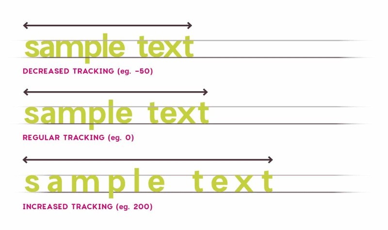
Tracking refers to the spacing of an entire word or block of text that affects its general density and texture. When space is an issue, tightening the tracking may seem a quick fix. In fact, you make legibility a veritable challenge, and your text layout design will appear full to overflowing.
- Crowded Lines
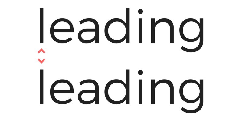
Leading refers to the vertical spacing of you type lines and one of the most useful rules of designing is to keep your leading balanced, i.e., not too loose, and not too crowded. Crowding lines is among the most common typographical errors with a negative impact on text readability.
- Disproportional Scaling
Among the widely encountered typography mistakes that beginners tend to make is disproportional scaling of a text box. Not scaling proportionally results in uninvitingly distorted letters with funny shapes and makes words coming out as either too condensed or too stretched.
Most graphics programs are equipped with a shortcut designed to perform scaling proportionally and allow you to fix the problem and skip the headaches. You can also adapt your tracking and/or your font size to fill the desired space more adequately.
- Difficult Legibility
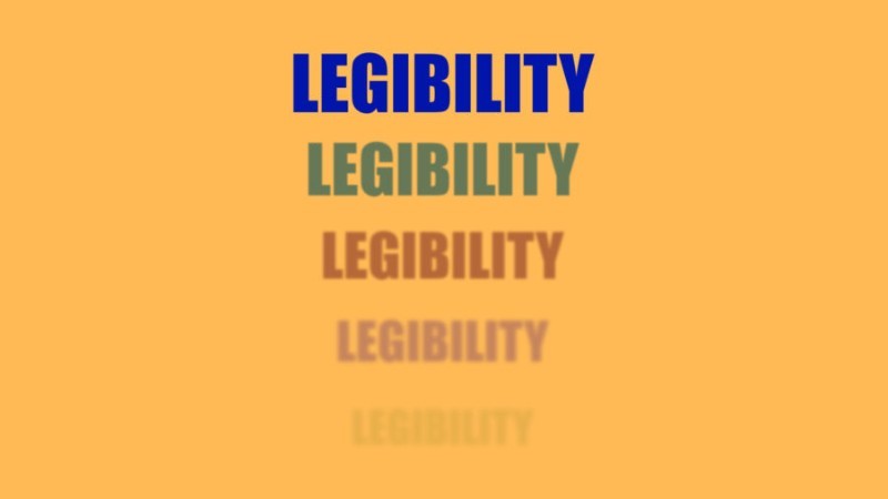
One of the most widespread typographical errors is sacrificing readability for the sake of aesthetics. Don’t make pretty typography choices that look good, but make reading difficult, such as sleek but illegible typographic fonts, clashing colors, transparency effects, and more.
Readability becomes an issue especially for lengthy texts where you can use some typography tips to make the text easy to navigate and read! You can play with typography elements, such as tracking, leading, font size, or kerning to achieve legibility for extensive passages.
Both sans-serif and serif typographic fonts can be a good choice when it comes to improving readability. Serif fonts tend to guide the eye’s natural movements making reading more natural, but sans serifs are more common for web-based reading. And, avoid text errors! They disrupt the reader as well!
- Widows and Orphans
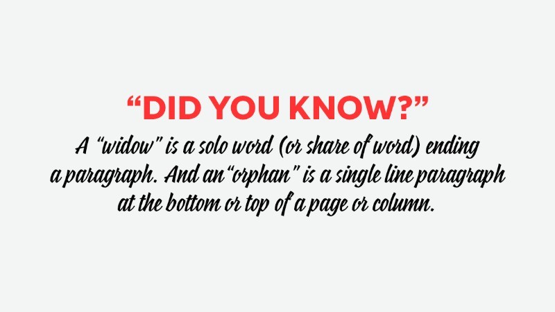
As the name properly suggests, both orphan and widow texts refer to short sentences or words that turn up at the top/bottom of the page/column, sticking out and looking separated from the rest of the copy. It is one of the clumsiest and easy-to-overlook typographical errors.
Both widows and orphans create unnecessary white space that looks off, disrupting the reader’s reading rhythm. Adjusting tracking, measure, or using manual line breaks are some of the typography tricks that help to fix these frequently occurring issues in typography practice.
- Double-Spacing
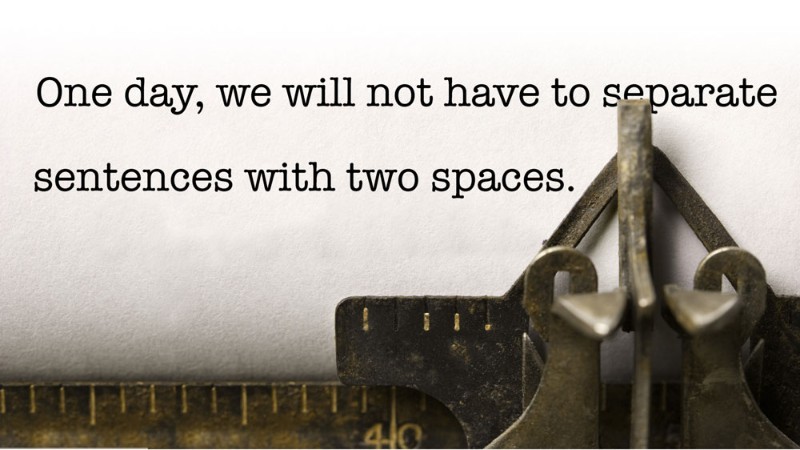
Among the many useful typography tips to avoid typography mistakes refer to the practice of placing two spaces after a full stop, i.e., after each sentence. The practice is an automatism that is redundant as well as outdated and will interrupt the readers’ focus.
Since many of them have double-spacing in their reflex, such typo errors can be fixed using Find-and-Replace type of functions featured in programs such as Word. InDesign has a similar function, Find/Change, that can help you find and replace double-spaces with single space.
- Too Many Fonts and Weights
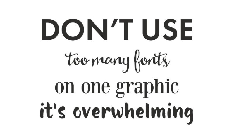
When learning typography for beginners, you learn that one of the fundamental rules of designing is: less is more, and many times more is too much. Newcomers of the typography practice feel that they need to use many weights and fonts in their projects as if that will make them better.
Your design will seem to be lacking coherence when using more than three fonts (there are exceptions, of course). Too many fonts and too many weights within a specific font will disturb the reader – interrupt his/her thoughts – and induce a heavy feel to your typography design.
The font-weight gives the weight, or boldness, of the font. Different fonts have different weights available, and some can go from extra light to extra black. Using too many fonts and too many weights remains among the typical typographical errors made by that the inexperienced.
- Lengthy Typography Measures
The whole point of your text content is to communicate a specific message to the reader. If it’s difficult to read, it fails its purpose. Not only do long lines make reading challenging, but they also hinder perception preventing the reader from understanding your message.
Easy typography rules say you need to try and set reasonable length limits for your lines. The traditional mass media limits content to 75 character-long lines. It seems to be the ideal measure for readers to maintain their focus on the content and its message.
- Poor Choice of Contrast
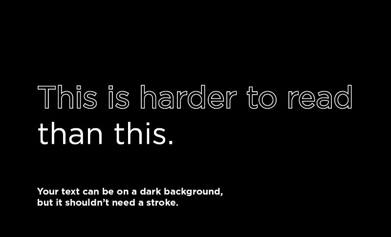
It is essential that you use the adequate color contrast between copy and background. Not enough difference between the two will render your text illegible and readers will fail to understand your message. The wrong choice of contrasting colors will have the same effect.
One rule of typography for beginners says you should avoid using similar colors for your background and copy and avoid rendering your copy against a tinted semi-transparent background positioned on top of an image.
- Failure to Understand Content
One of the most common typographical errors made by many designers is to ignore what the content is about. It is one thing to handle typography for a business plan and quite another to manage the typography of a kindergarten’s website.
To be able to carry out typography for a project in the most effective manner for that project, you need to get a feel of the written content and even consult the writer/writers to make sure you understand the message they need to be conveyed.
- No Visual Hierarchy
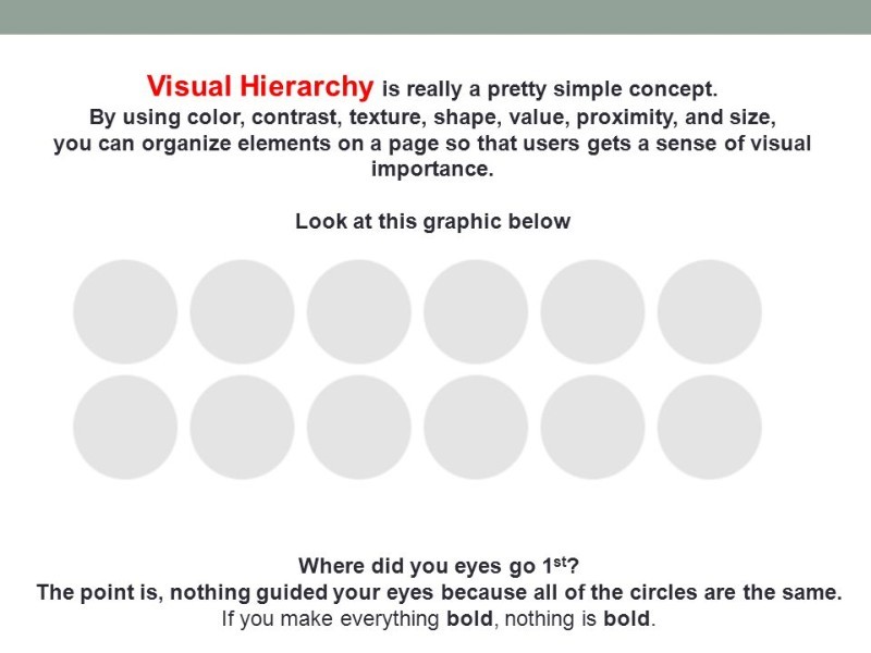
Visual hierarchy refers to how you use typography to make a distinction between the importance of the different elements on your page. You need to use typography tools to make your hierarchy visible and draw attention to the most important elements of your page.
- Abusing Capital Letters

There are designers that abuse capital letters because they feel that applying capital letters to certain typographic elements emphasizes the importance of the respective content. Full lines in caps can hinder understanding and make the reader feel uncomfortable, almost compelled.
Although some content is more important than other content, you need to refrain from using all caps for emphasis and find a different method to put the accent on the relevance of a specific piece of content. Moreover, caps negatively impact readability.
- Wrong Typeface Choice
Many industry newcomers make avoidable typographical errors, and one that sticks out is an excessive and chaotic use of a full spectrum of fonts to implement visual hierarchy. The best advice is to select complementing fonts rather than clashing fonts.
Mixing typefaces is a form of art that combines a set of well-honed skills with a touch of magic. Experiment and practice extensively and you will ultimately master the art of font mixing. Use the work of recognized typographers as inspiration and try to match their achievements.
Ending thoughts on typography mistakesAll of the above mistakes can be avoided or can be fixed as long as you understand that you need to check for common typographical errors no matter how experienced you are. Don’t get so comfortable in your ways that you feel as though you are beyond making mistakes.
People make mistakes, and even the best designers make mistakes. It’s not the end of the world if you check your design for common typographical errors. Finding them allows you to fix them while failing to check allows those errors to ruin your overall design.
Most designers agree that typography is a disguised form of art, downright invisible when done successfully. Typesetting with attention and care allows you to determine the reader to focus on the content, understand the message you wish to communicate, and act accordingly.
Typography creates an invisible platform that shifts focus from aesthetics to words and meaning and enhances an emotional bond with your audience.
If you enjoyed reading this article about typography mistakes, you should read these as well:
- How to install a font you downloaded from the internet
- Make your own font: A guide on how to create a font
- Font pairing: Combinations of fonts that go together
Technical lead at WhatFontIs since 2010 with a (healthy?) obsession for fonts.

