
As some of you might know, there are a few ways you can measure up the size of a character. The most common one implies two different aspects that you must take in consideration: body height and body width. Today, we’re going to spice things up a bit and move our attention to another way of determining the size of a character. Dear readers, meet glyph width!
So, what’s the difference between body height and glyph width?Once upon a time, in a land far, far away, fonts were set in hot metal in various ways. Because of this, each and every single glyph was placed on a designated metal block. We can consider this block to be the body of the glyph.
Nowadays, the typographic landscape is a bit different. But keeping in mind the image previously described will help us better understand the difference between body height and glyph width.
Let’s step into the virtual landscape of a Word Document, for instance. When choosing a point size, we are actually establishing the body height of the font we are going to use.
Now let’s go back and think about the letters on the metal blocks. Got that picture in mind? The glyph width represents the width of that particular metal block.
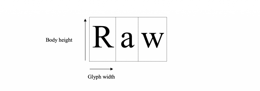
When it comes to proportional fonts, there’s one golden rule you’ll have to remember. The body height is constant, while the glyph width may vary quite a lot. How is that? Well, let’s focus on ‘i’ and ‘e’. When you write them down, you can automatically tell that ‘e’ is wider than ‘i’ and by default occupies more space. Meanwhile, the body height for both characters remains constant.
The glyph width is also visible between different styles of the same letter. Let’s take letter ‘g’, for instance. In one particular font, there are a few different ways of writing down ‘g’. This depends very much on what might follow after that ‘g’ and how these two letters will relate to each other. Due to this aspect, the width of ‘g’ varies while its height remains constant.
Why should we pay attention to the glyph width?Knowing things about the glyph width might come in handy in lots of situations. Off the top of our head, we are going to mention some of them.
- When placed side by side, between one font with a regular glyph width and a font with a wide glyph width, the second one is going to emphasise better the idea you want to transmit.
- If you don’t have a lot of space to place a particular text, you might take into account a fond with a narrow glyph width.
- Most important, always take glyph width into account when combining different fonts. Especially when it comes to two different fonts that are going to be used together at the same body height.
In case you missed out on our article about the first principle, check it out here: Principle #1: Let’s talk about stress and letters. You’re definitely going to love it!
Technical lead at WhatFontIs since 2010 with a (healthy?) obsession for fonts.

