What is color theory? The most important and subjective thing about design is color. A color will arouse different reactions from different people. This is due to culture, association, or personal preference.
Some people entire careers are built on the science and art of color theory. They build careers such as color consultants or brand consultants. A fabulously valuable expertise that designers can become proficient in and offer to their clients is knowing the effects of color.
A completely different feeling can be awakened by simply changing the exact hue or saturation of a color. A hue that can be happy and uplifting in one country can be depressing in another country. It all depends on that country’s culture.
Colors and meanings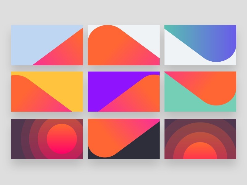
Color is defined by perception. Light is reflected in different composites of wavelengths by objects. Our brains become aware of the wavelength composites and convert them into the sensation we call color. Our eyes see the sky and information from our eyes is sent to our brain. Our brain tells us it is blue.
Do you look red or the logo of coke as you scan the shelves looking for your favorite soda? More than likely it is red that you look for.
It takes people less than 90 seconds to decide if they like something or not. Color is the major part of that decision. Color is a very important part of branding a product.
Color families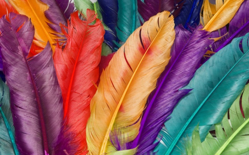
The color wheel can be a valuable resource when choosing colors for a project. Classic palettes can be pulled from the color wheel. Palettes that artists have been using for years to create their masterpieces. Masterpieces of balance, visually pleasing, high-contrast and striking color. In most design administration, color schemes will be split into one dominant color and accent colors. A dominant color is a color that appears in a design a lot or stands out more than other colors.
1) Monochromatic: a type of color scheme that is refined and conservative. They are various shades, tones, or tints of one color; for instance, a range of reds varying from light to dark.
2) Analogous: a type of color scheme that is versatile and easy to add to design projects. They are hues that are located side by side on the color wheel.
3) Complementary: a color scheme that is high-contrast and high-intensity. They are opposites on the color wheel, such as red/green or blue/orange.In their purest form, they can be difficult to add in a balanced, harmonious way to a design.
4) Split-Complementary: a color scheme that has a heavy visual contrast but is not more jarring than a complementary color combination. Any color on the color wheel and the two colors that flank its complement color.
5) Triadic: any three colors that divided evenly on the color wheel.
6) Tetradic/Double-Complementary: a color scheme that is very beautiful. They can be harder to add to a design than one complementary pair of colors.This is because the more colors you have the more difficult it is to balance.To use this type of scheme, you will have to choose one of the four to be the dominant color.Then adjust the saturation/value/etc. of the other colors so they work well in different parts of your design.You can use them in the text and background.
Warm Hues
There are three warm colors red, orange, and yellow. Any variation of these colors is considered warm also. These are the colors of fire, fall leaves, sunsets, and sunrises. These colors are energizing, passionate, and positive.
Red and yellow are primary colors and orange is a secondary color. In the middle or red and yellow is orange. Warm colors aren’t created by mixing a warm color with a cool color, they are truly warm colors. Passion, happiness, enthusiasm, and energy are reflected using warm colors.
Red (primary warm color)
A hot color is red. Red is affiliated with fire, violence, and warfare. A light red backgroundis also affiliated with love and passion. In the past, red has been associated with the Devil and Cupid. Red has been known to raise blood pressure, respiration rates, and metabolism.
Anger can also be affiliated with anger, importance, and danger. The red carpet at awards is used to show the importance of the celebrities. Stop lights, stop signs, and warning labels are red to show danger.
Red has different affiliations outside the western world.
Orange (secondary warm color)
An electrifying and dynamic color is orange. Orange is affiliated with the earth, autumn, and creativity. Since it is associated with the changing seasons, orange can stand for change and movement.
Since orange shares its name and color with a fruit, it can be affiliated with health and vitality. Orange attracts attention in designs without being as overwhelming as red. Orange is contemplated as friendly and inviting. Orange is not a bold, striking color.
Yellow (primary warm color)
The warm color that is energizing and bright is yellow. Happiness and sunshine are affiliated with yellow, yet so is deceit and cowardice. When you call someone yellow, you are calling them a coward.
In some countries, yellow is affiliated with hope. People who have loved ones at war display yellow ribbons. Not as strongly as red but yellow is also affiliated with danger.
Cool Colors
Let’s look at the cool colors definition. Cool colors are calm and soothing in nature. Green, blue, and purple are considered cool colors. Cool colors are more subtle than warm colors. Night, water, and nature are affiliated with cool colors. Green, blue, and purple are calm colors. Cool color backgrounds are calming, relaxing, and reserved.
The only cool primary color is blue. That means that to create green and purple-blue is mixed with a warm color. Blue and yellow create green. While blue and red create purple.
This causes green takes on some of the characteristics of yellow, and purple takes on some of the characteristics of the red. To give your designs a calming and professional feeling use cool colors.
Green (secondary cool color)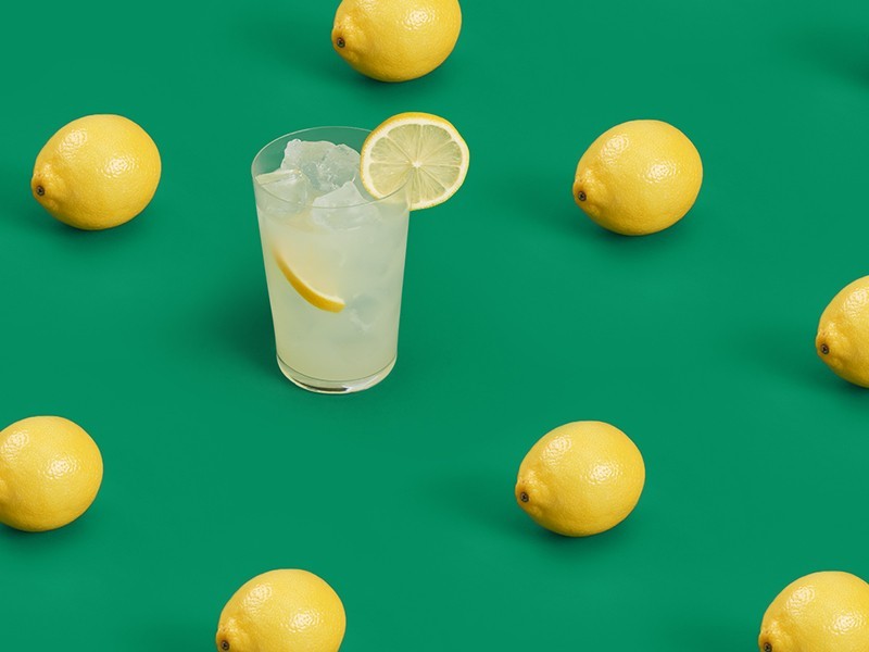
A down-to-earth color is green. It can express new beginnings, growth, renewal, and abundance. On the other hand, green can also express envy, jealousy, and inexperience.
Green owns many of the same calming characteristics that blue has, but it also includes some of the energy of yellow. For a balance, harmonizing, and stable effect in your design use green.
Blue (primary cool color)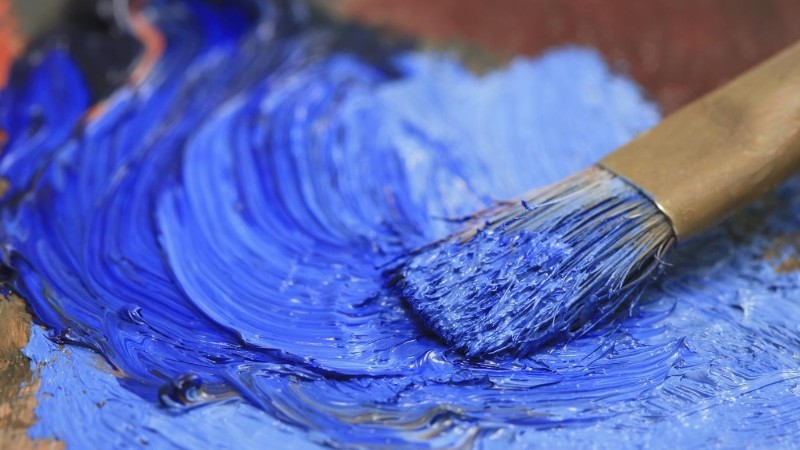
What does the color blue represent in the English language? Blue shows sadness in the English language. Blue is also used largely to show calmness and responsibility. To make your design refreshing and friendly use light shades of blue. In order to portray a strong and reliable feeling in your design use dark blues. Blue is also affiliated with peace.Blue also has spiritual and religious connections in many cultures and traditions. For example, the Virgin Mary is often shown wearing blue.
What blue represents depends on the shade and hue of blue that is being used. How your design is observed will depend on the exact shade of blue that you use. If you want your design to feel relaxed and calming use a light blue. For an energizing and refreshing feeling in your design use a bright blue background. For corporate sites and designs with strength and reliability use dark blues, like navy.
Purple (secondary cool color)
In ancient times, dyes were taken from snails to create purple. This caused purple to be an expensive color that only royals and the wealthy could afford.
Red and blue are combined to create purple. Purple take on characteristics of red and blue. Creativity and imagination can be reflected by using purple in a design.
A color used for mourning widows in Thailand is purple. Wealth and royalty are represented by dark purples. A lighter shade of purple is romantic.
Neutrals
Neutral colors are usually used as the backdrop in design. Neutral colors are combined with bright accent colors. Neutral colors can also be used by themselves in designs. This causes them to create sophisticated layouts. The warm and cool colors that surround neutral colors affect the meanings and impressions of the neutral colors.
What does the color brown mean? Brown is a neutral color. Brown is created by combining red, yellow, and blue. Brown color schemes often get a bad rap. They are said to be boring but they should be looked at as rich earthy tones.
Ending thoughts on color theoryColor theory and the psychology or neuroscience of color are studied by some people. The color theory definition is complex and intersects with art and science. This is what makes design interesting and effective in the marketplace. Although this article barely scratches the surface of what do colors represent, we hope that you are better informed to make effective color choices for your design projects. Happy designing!
If you enjoyed reading this article, you should read these as well:
- Font pairing: Combinations of fonts that go together
- Graphic design posters: Tips for creating amazing poster designs
- Free graffiti font examples that look amazing
Technical lead at WhatFontIs since 2010 with a (healthy?) obsession for fonts.