
What is kerning? What does kerning mean? Kerning is a typography process that allows designers to make the required adjustment of the spacing between letters or characters to avoid those off-looking clumsy gaps and ultimately improve readability.
Font kerning is about manually fiddling with the space between letters when the default kerning of a font is not ideal for a specific combination of letters causing text to look off somehow. Essentially, kerning is about adding visual consistency to letter spacing.
Kerning is about the visual perception of letter spacing rather than the actual amount of space between letters. Text kerning is a visual application and does not refer to the implementation of arithmetically identical spaces between the letters of a word.
Type can make mathematically equal letter spacing seem unevenly spaced and the other way around. It is an optical illusion generated by the uniqueness of letter pairing. Typesetting is like a puzzle, and without kerning, it can come across as untidy.
The Importance of The Kerning Game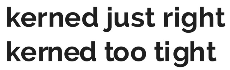
At first glance, kerning may seem to be an unnecessary process, but it has a dual purpose. Kerning will help you achieve pleasant and readable text by distributing the space between letters in a visually appealing and consistent manner.
Think off kerning as an optical enhancement tool that is particularly relevant when applied to large text, such as the highly visible text of headlines or logos.
Kerning and Troublemaking Letters and Combinations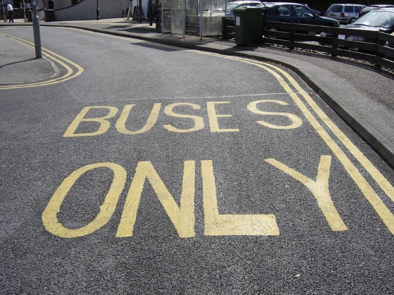
Understanding the role of kerning is very important if you want to learn how to change the spacing between letters in Word or other graphic programs. Text kerning is not grueling work, but it is a tricky process and requires attention to details and dedication.
Letters are uniquely shaped, and the particularities of their shape make some of them hard to kern: letters with extended pieces (F, L, T) or strong slants (A, K, V, W, Y). Text in all capital letters requires a bit more attention as well.
Imagine each letter surrounded by an invisible case. The trouble letters will not fill the case edge-to-edge, which will generate those awkward gaps between the letters of a word.
Some upper-case letter combinations to pay heed to include W + A or V + A (any order) as well as T or F + a lowercase vowel. Pay attention to troublemakers and how they interact with the letters on their sides.
Another aspect to keep an eye on is the combination of rounded and straight-edged lower-case letters. Rounded lower-case letters look great against other rounded letters but may look off when paired with straight-edged letters.
Point Size and Kerning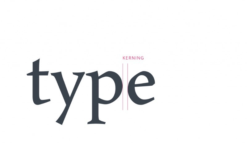
The readability of a typeface depends on the characteristics inherent in its design, which relate to the ability to distinguish one letter from the other. Size is one of the properties of a font that influences kerning as a process.
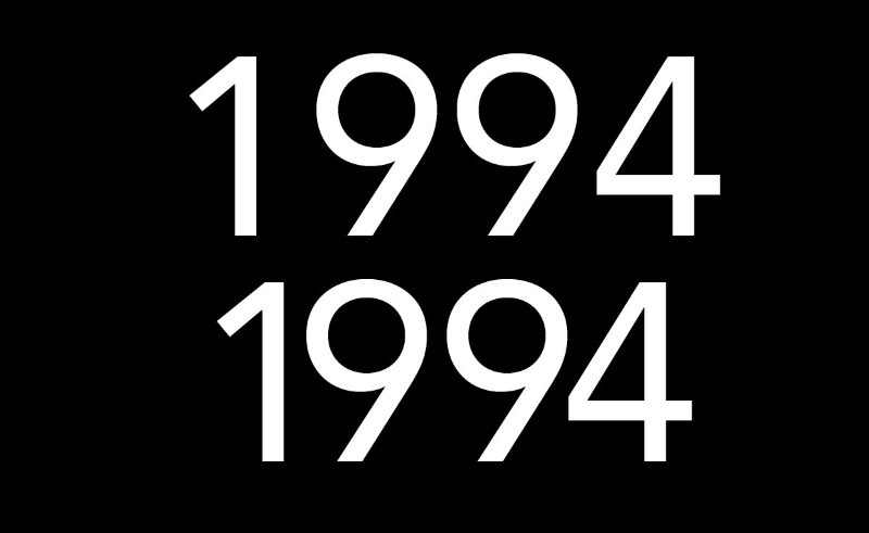
To be more specific, letters spacing may appear differently at various font sizes. Your beautifully kerned headline at 48 pt. will need new kerning if you downsize to 24pt. It is advised to complete kerning after you’ve settled on font size.
Sometimes, you need the same text in different point sizes for two different purposes, which essentially means that you need to proceed with the kerning separately. Lack of kerning is even more conspicuous when it comes to large, highly visible letters.
Tracking, Kerning, and Leading![]()
The correct order is leading, tracking, and kerning. Leading is vertical line spacing of type while tracking type is spacing of groups of letters. These two processes must be completed before kerning to keep the balance of your kerning adjustments. When it comes to tracking vs kerning, tracking comes first.
Do Your Own Kerning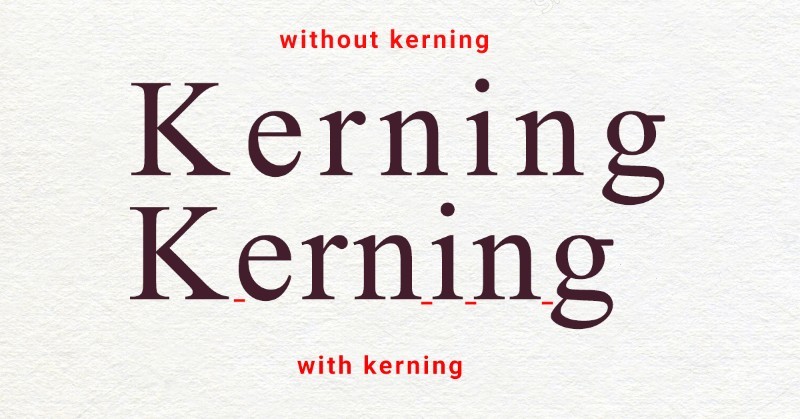
You could use a font software to do the kerning for you, but when it comes logotypes or headlines, manual kerning remains the most efficient approach. Remember that every font has its own spatial relationship for its letters.
Manual kerning allows you to have more control of the entire process and you can do that easily by using the Characters Panel in Photoshop, InDesign, or Illustrator, irrespective of which graphic program you use.
Manual kerning in Illustrator, as well as manual kerning in Photoshop, can be done by activating the type tool. The type tool is activated by double-clicking between two letters of the text you want to kern.
Proceed and change the number values in the kerning tool in the Character panel. As you decrease or increase the number values in the Character Panel, you start experiencing with letter spacing.
Things to Consider When Kerning
- Don’t focus on achieving mathematically equal spaces between letters but on achieving equally perceived spaces according to the human eye. Imagine sand filling the space between letters and try to keep the sand volumes equal.
- Refrain from zooming in too much on your lettering because you stand the risk of making spacing appear larger than the ultimate result.
- When it comes to kerning, less is more; over-kerning is a far worst option that kerning too little. Too tightly spaced type is hardly legible and unappealing.
- Always adapt your kerning technique to different sizes of the same typeface. Remember how letter spacing is perceived differently depending on font size.
Each font has its own personality and, most of all, letter spacing is perceived differently on a font to font basis. It should be easy to settle on a font first and then carry on with kerning. Practical, right? It makes sense and shouldn’t be too hard.
But we tend to settle on a font in the nick of time, which often means we start playing with letter spacing long before we make a font choice. The truth of the matter is that we finally choose a font, all our kerning wok will be canceled out.
To avoid wasting time with kerning different font types, merely accept the uniqueness of each font and how you need to focus on picking out a typeface before doing any kerning.
A Brilliant Technique: Kerning Upside DownThe human eye perceives words rather than individual letters in its pursuit of reading sentences or words; as a human, not as a designer, you may miss kerning. In order to prevent that human side from taking over your, kern upside down to avoid your natural tendency to pursue reading.
By flipping your typography upside down, you block your instinctive predisposition for identifying words rather than letters shapes and spacing. This simple technique allows you to focus on kerning without the distraction of words.
Ending thoughts on kerningKerning is not the most challenging part of your typography design, but it’s a wearying, mind-numbing type of work and is often overlooked.
Take kerning to the top of your priority list and make sure you cater to your letter spacing needs, which will improve your typographical proficiency drastically.
If you enjoyed reading this article about kerning, you should read these as well:
- Color theory: what you need to know as a designer
- Easiest font to read: What to use in your designs
- Free graffiti font examples that look amazing
Technical lead at WhatFontIs since 2010 with a (healthy?) obsession for fonts.

