
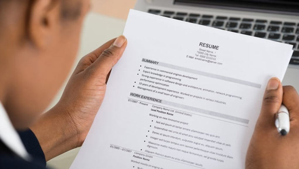
Looking for a new job can be stressful enough without constantly asking yourself why you are not getting called in for interviews. Make sure your resume is your best advertiser to potential employers. Nowadays, that doesn’t only mean updating your info, but also choosing the best font for your resume.
Elle Woods got into Harvard with a resume printed on pink, perfumed paper – to give a little something extra – as she said. Then again, the title character of the Legally Blonde movies also had pink, perfumed bags when she was out walking her dog. So, just for now, let’s try to stay away from pink, perfumed paper, and also from the Big Little Lies (pun intended) we may be tempted to sneak into our resumes.
The truth is, if you put enough attention and effort into writing and editing your resume, you won’t really need to lie that you spent the last six months saving an endangered butterfly species in the rainforest. No, the fact that you shared something about that on Facebook does not make you an environmental activist.

When writing your resume, make sure that the information you’re sending as your calling card to the world is not only true, accurate and precise, but that it is also presented in the best form to head hunters and potential employers. That means finding the best fonts for your resume.
Several studies have found that, on average, a recruiter will spend about six seconds reading a resume before deciding if a candidate is eligible for the position they’re looking to fill. So, let’s try to make the most out of those six seconds.

One of the first things you should keep in mind when choosing the best font for your resume is that one thing head hunters know better than almost anything is how to spot a slacker. That means there’s no replacement for time and effort. Put them in first, then we can talk about which font looks good on your resume.
Attention to details will demonstrate to recruiters just from a glance that you have an overall sense of style and aesthetics, but also the more pragmatic skills of knowing how to use a word processor. Imagine just what they think of candidates who write they have ‘proficient’ abilities in Microsoft Word, but who fail to select the same font size for resumes. Yeah, they don’t get called in for an interview.
The font you use in your resume should be fit for both paper and online reading. Even though you’re sending your resume in an e-mail, a lot of head hunters print them out for analyzing.
There isn’t a consensus when it comes to the best font to use in your CV. The most used is obviously Times New Roman, the main reason being the wide accessibility to this font in all major word editing software. This typeface is the most professional looking among the first options in both Microsoft Word and Google Docs.

Recruiters themselves have weighed in on the issue of what fonts they prefer for resumes and we’ll get to their recommendations in just a few moments.
One of their widely accepted recommendations is to use a sans serif font on your resume, mostly because so many employers and head hunters are now reading CV’s on multiple devices or on the go. That means a good font for a resume will be legible on both phone screen and desktop. If you do decide on a serif font – and we’ve also included a few serif fonts for resumes in our list below – make sure it is a rather subtle one.
Most smartphones now have responsive features for all documents, so they could automatically converse your font to a legible size customized to each screen it is opened on.
But that does not mean that you should not pay attention to the size of the font you use in a resume. Don’t use cheap tricks like pumping the size of the font just to make your resume longer. It will look awful and anyone who’s ever seen a CV before will understand immediately why you’re using a 16 size font. Instead, opt for the regular 12 size. Be careful, this might change depending on the font you decide on.
- Calibri is the top option in many recruiter’s eyer when it comes to writing your resume. Its smoothness on any screen makes it just as legible as Times New Roman, but it has the advantage of showing you didn’t just go with the default option.
- Garamond looks good on a resume due to its old style, somewhat sophisticated vibe. It also fits academic documents.
- Helvetica help your resume pop up, without being too loud. Recruiters will notice it from other CV’s because they will likely recognise it: Helvetica is used by the New York City Subway sistem and also by the German auto giant BMW.
- Cambria brings a fresh air among the dozens of fonts used in resumes. It was created specifically to look good when printed at small sizes, so that offers a neat, clean aspect to your CV.
- Didot is the font recommended for your CV if you’re specialized in arts, design, photography or graphics. The huge history the Didot font has in fashion and lifestyle magazines will make your resume look classy and sophisticated, without any effort.
- Gill Sans has the advantage of being somewhat rare all around, but especially in resumes. Its early XXth century English aesthetic will complement your work experience. It was also the original font used on the viral ‘Keep calm and carry on’ posters, so it will just make the recruiter or employer take a second look at you CV even without knowing why.
- Constantia is best used in resumes that want to give that human touch. Its roundness may seem less formal, but not enough to be ill advised for CV’s.
- Arial is a staple nowadays, but that doesn’t mean you should avoid it. It offers the clean, no nonsense look professionals need when trying to describe their life’s work and experience as briefly and clearly as possible.
- Georgia may also seem too obvious, but keep in mind its a great alternative for traditionalists who are looking for alternatives to Times New Roman. Even if it is a serif font, its thick lines make it easy to read on any screen or PDF document.
- Book Antiqua has gentle and subtle lines, great for giving that extra something. It is based on the Palatino font, so it has the humanist style it is known for. It looks great on resumes because of its vintage look.
Passionate about fonts or just looking for a quick solution for your lettering woes? WhatFontIs.com provides a catalogue of over 550.000 fonts that you can browse until you find the one that fits you just right.
Also, make sure you check the Blog Section – you might get that cool idea that will help you better define you visual identity.
Technical lead at WhatFontIs since 2010 with a (healthy?) obsession for fonts.

