
Do yourself a favour and don’t make back to school season harder than it has to be. Choose your books wisely – and choose the fonts you use for their layouts even more wisely.
Did you ever read a book and got a headache? No, it wasn’t just because you were reading Kafka of Freud. If the font chosen for the book is not the most fortunate one, you will most likely end up questioning not only philosophy and wondering about the meaning of life, but also with a migraine and an adversity towards books.
So what makes a font appropriate for it to be used in books? Why should it be any different than typefaces used for magazines? First of all, books stand out as opposed to any other written product – magazines, brochures, leaflets – due to the large distribution of text. So the typeface has to be easy on the eye – this means legibility and clarity before anything else. Secondly, the font has to maintain these two qualities at small sizes.
It also has to be steady and simple, with a sturdy baseline and straight characters – so no typefaces that include letters that seem to jump over others. That also means no extreme heights or elongated ascenders and descenders.

These traits often result in a classic, traditional serif fonts that the majority of book designers use. Others, fewer, choose a modern sans serif version.
All of them rely mostly on the familiarity of the typefaces – when a huge part of your potential audience is already familiar with a certain font, it is more likely they will not be distracted from the written message. As a rule of thumb when it comes to book typesetting: the best font is the one that goes unnoticed. In contrast, when you choose an extravagant, over the top font the reader will not be able to focus on the text because the form will catch all of his attention. So stay away from intricate letterforms and their extra details, no matter how pretty they are.
But that does not – we repeat, NOT – mean you should just jump on the first typewriter-ish font you see and declare its lack of detail, sharp edges and clear lines as the perfect match for a book because, well, it simply is not. The spacing often used in these fonts creates a uniformity that is often tiresome for the eye when deployed for large chunks of text.
Today, we will take a look at some of the most appropriate fonts for books, from both the traditional serif family and the modern sans serifs.
The first category, the old-school serif, ensures a classic, elegant look that is particularly appreciated when used for large portions of text.
First on our list is the Bembo font, a typeface with its roots steaming from the Venetian arts of the late 15th century. That is when Francesco Griffo, a local punchcutter, developed what is today called a humanist serif font. In the 20 century, the English typographer Stanley Morison took it to the next level by redesigning it and adding a complete set of weights. The result is a font that owns traits from both ages, combining classic elegance with modern lines. If you like it you can find similar Bembo free fonts here
Our second pick is Garamond and, believe it or not, comes from the same 15 century. The Garamond font family takes its name after Claude Garamond, a French engraver of punches. Actually, Garamond’s work was a continuation of Francesco Griffo, and their designs became what is today known as the old-style serif lettering. Garamond stands out due to its elegant, almost cursive letters, resembling the handwritten form it is based on.
![]()
The 17th century brought another of the big classics that is still widely used today – Janson. Although it was believed to stem from the Dutch Baroque age, the font family was actually proven to belong to an Transylvanian punchcutter called Miklos Totfalusi Kis, a priest and punchcutter. Its name remained Janson, from Anton Janson, a punchcutter from Leipzig who was first considered its creator. The font family has undergone several modern revivals in the 20th century, most notably from Stanley Morison. Here are some free alternatives to Janson
Another great option for the more traditional look is Sabon, designed in the 1960’s by Jan Tschichold, a German typographer. Sabon is thought as a new version of the widely known Garamond font family. Sabon is a old-style serif font, much like Bembo. Its neat, clear strokes make it suitable for just any layout, but it looks especially good in long texts. It fits literature particularly well due to its elegant, feminine touches.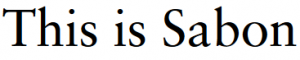
Let’s finish our classic serif category with Caslon, one of the most popular fonts out there – mostly due to Adobe carrying it. Caslon Std and Adobe Caslon Pro are considered the best in their family and work great in book layouts. Their delicate finishing touches create an aery, gentle look, while the mix of bold strokes with razor thin edges creates a strong impression on the reader.
On the other side, let’s take a look at the modern sans serifs used more recently in literature, although by just a few publishers. Most of them have found a way to preserve a classical look while adding a modern twist.
One of the prefered new kids on the block is called Trade Gothic and was designed in 1948 by Jackson Burke. Its bold version is widely used in media for headlines, but it has steadily made its way between book covers in recent years.
Another great option for the more modern look is Ashbury, a font inspired by the fonts used in the 18th century. It is a curved, elegant typeface that is very easy to read, blending old-style font traits with a contemporary vibe. Here are the best 100 free similar Ashbury fonts
And, because it is 2018, we have to take into account e-books. For digital longreads, most publishers use fonts such as Arial, Georgia, Palatino or Lucida Sans. One major factor to consider is that all of these fonts are the majority of e-readers carry them.
Technical lead at WhatFontIs since 2010 with a (healthy?) obsession for fonts.

