Some of the most recognizable lettering out there came from rock and roll. Today, let’s take a look at the fonts used by the biggest bands for their logos, album covers and the T-shirt you are wearing right now (or you wish you could wear at work)
Metallica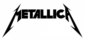
Anything you write instantly becomes hardcore when you’re using a Metallica font. The crown jewels are the first and final letters, with their thunder inspired cuts and sharp angles. The original Metallica logo is featured in all caps, with short, bold, clean letters. It was actually developed by James Hetfield, Metallica’s legendary guitarist. The look can be achieved with the Pastor of Muppets font, developed in 1997 by Ray Larabie.
Beatles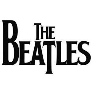
There is a pretty big chance that everyone on Earth has heard a Beatles song – a least one of their iconic choruses used in commercials. To be fair, their logo is not as recognisable, but it is still one of the most visible in the world. Known simple as the ‘drop-T’ logo, the famous Beatles lettering was created over the counter – literally – by a music shop owner. Before becoming huge, the band had bought a drum set from a musical instruments store and asked the owner, Ivor Arbiter, to inscribe it with the band’s name. Later, a font was developed imitating that lettering, called Bootle.
Rolling Stones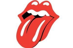
Everybody knows the Rolling Stones logo, right? Now close your eyes and swear that you can see the curled, plump lettering. Ok, now move away from that, it belongs to the magazine, not the band. The band has used, over time, several fonts, ranging from sharp, scribbly cursive to bold all capital lettering. So there is no font that the band is visibly identified by. On their first album cover, Decca, they used a free font, Futura Display. So, to be honest, everyone confuses the magazine’s logo with the band. The magazine logo is written in a custom font that has seen little changes since 1967, when it was launched. The font Royal Acidbath is heavily based on that original font.
Pink Floyd
The story is pretty similar with Pink Floyd. An artist designed the lettering for a cool album cover and some years later it became a font. Yes, we are talking about The Wall, the harsh, rebel letters scratching against the threatening white bricks. The original logo was created in 1975 by Gerald Scarfe, a British visual artist that was also responsible for the haunting animation and puppets featured in Pink Floyd The Wall live concerts. Going back to the lettering, the custom features are obvious – for example, the ‘L’ is written differently each time. Despite this, a font called that manages to keep the original look was developed in 1995, called Floydian.
Aerosmith
Before we start analysing the lettering used in the Aerosmith logo, for everyone’s sake, some context: it was developed in the 1970, about the same time that all of the music scene was dropping acid. So, yes, the font is trippy. It was originally created by Ray Tabano, who played guitar with the group for only a year. Nonetheless, his real contribution was the logo, that has not been altered significantly since. It was first featured on the album ‘Get your wings’, with stylized wings spurring from a capital A letter encircled in the background. The name of the band written underneath seems almous a cloud, a haze. Every curbed line of the letters reminds of fog, giving it an aery look. The font inspired by this lettering is called Aero Font One and was first released in 1999 by Daniel Eriksson.
AC / DC
Based on Gothic lettering, one of the most iconic logos in the Rock and Roll Hall of Fame belongs to one of the greatest band of all time: AC/DC. As was the case with many album covers and bands in the ‘70, it took a few shots before the current logo was found. The final version was first featured on the cover for ‘Let there be rock’ and some go as far as to say that the Gothic font was chosen due to its former use in the Gutenberg Bible. Also, a very important trait is that their details remind of an electrical discharge, very appropriate since the band’s name actually comes from ‘alternating current’ and ‘direct current’. The logo and lettering are both attributed to Bob Defrin, the art director for Atlanta Records at the time. A font that encapsulates all of these traits is called Squealer and was developed by Ray Larabie, the same graphician that gave us a font like the one used by Metallica.
Iron Maiden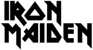
The same Raymond Larabie developed, in 1996, a font called Metal Lord and, you guessed it, it is based on the lettering used by Iron Maiden. The logo is featured on all of their official merchandise and the band is considered the top selling of band merchandise in the world. So the logo is, to say the least, widely recognizable. The font has sharp angles with small details. The main theme is the triangle, with its particular ‘O’ and delta-inspired ‘D’. The original logo and lettering for Iron Maiden are said to have been created by Steve Harris, the band’s bassist.
Kiss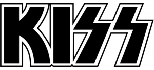
One of the most emblematic musical logos out there was actually born out of a typographical faux pas. The Kiss lettering relies massively on the lightning bolt shaped ‘S’. Designed by Ace Frehley, it first appeared on the band’s second album, ‘Hotter than hell’. Originally, the lightning bolt accents were much stronger, for a bolder, more stronger look. The only problem was that, during the Nazi regime in Germany, the Schutzstaffel, the infamous secret police, used a similar styling for their haunting abbreviation – SS. So the Kiss logo had to be heastely changed so that the ‘S’ became more curved rather than sharped.
Nirvana 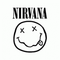
The crooked smile face is known around the world. Its crossed out eyes could mean anything and has launched heavy debates, just like Mona Lisa’s smile. But the shaky drawing would not be able to stand on his won without the heavy lettering to complete the logo. The Nirvana name written in yellow on a black background results in one of the most common T-shirts designs for a generation. The font used was actually not a custom one. The band featured the Onyx typeface, steaming from the Bodoni family, an extra bold condensed version. The same one was used for the cover of the ‘Bleach’ album. Nirvana is the only exception in this list where all the other bands found custom designs for their typefaces. Another strong, custom influence on some album covers fonts came with the rise of graffiti artists, but we will take a closer look on that in a coming post.
We had quite a struggle on what bands to include in this article 🙂 If you are curious what font used your other fav rock band just you can just upload the logo to What Font Is.com and find out. Rock on !
Technical lead at WhatFontIs since 2010 with a (healthy?) obsession for fonts.

