

True professionals give out business cards, not friend requests and follows. So, if your first instinct is to think business cards are all but obsolete, think again. They’re the fastest and classiest way to introduce yourself to potential business partners and that’s why you should be making sure it is the best version it can. Choosing the right fonts for your business card is tricky, but we are here to guide you.
In Japanese culture, it is considered an unspeakable insult to place a business card you have just received directly in your pocket or your briefcase. So why do we treat our own business cards so badly? Having them always on you does not mean fishing one out of the bottom of your bag, straighten it, wipe it and look, it’s brand new! So let’s start with an autumn resolution, ok? We’re going to treat our business cards better.

Now that we got that out of the way, we can get down to business. More exactly, business cards. Even more specifically, business card fonts. Because let’s face it, there’s only so much you can do with a 3.5 X 2 inch piece of hard paper. Font is everything – and we are not overselling this – when it comes to business cards.
You have limited space and a very restrictive number of words, 99 percent of them template – your name, your contact details, your place of employment. What you can juggle around with, the 1 percent we left out, is your position. But, before playing around with this, imagine if you really want to be the person who presents himself as ‘manager of opportunities’ when he is actually a receptionist.
But have no fear, there are ways for your creativity to ooze out of your business card without artificially enhancing your job title. We’ve asked our expert graphicians for their top tips & tricks when it comes to business card fonts and compiled a top with all their favourite fonts for business cards.
When you are giving out business cards, always assume the person you are handing them to is probably receiving more than yours that day. So you want yours to be noticed. That means for all the right reasons, not because it has red balloons drawn on it. So, before we get to choosing the right font for your business card, make sure you also choose the right shape.
As mentioned before, the usual business card dimensions are 3.5 per 2 inch, shaped as a rectangle. Square business cards had a moment a couple of years ago and I have personally received a round, laminated one. To each his own and, if you find that it does work for you, than who are we to say you can’t use an odd shape for your business card? But, as a general rule (and for the good sake of compiling this top for best fonts to use on business cards) we’re focusing on 3.5 X 2 inch rectangles.
So, overall, restrictive is the word when it comes to business card fonts. You have to choose a typeface that looks so amazing it impresses with just 10 words, but also clear and clean enough to fit in that small space.

Also, an important rule for business card fonts is the background colour. White, greys and beiges are the most common business card colours, but there is something to be said about strong, block colours. What we do highly recommend against thought is using more than three colours on your business card. Always keep in mind that the background colour determines how a certain font will look on your business card.
All the experts we asked agreed on one thing when it comes to business card fonts: the tone it sets. More than legibility, size and colour, the font you use on your business card should reflect an aspect of your job. Of course, sometimes you have to do that within the parameters set out by your employer, incorporating the company logo. That does not mean you cannot find a font for your business card that will smartly target your desired audience.
So let’s look at our expert’s favourite fonts for business card.
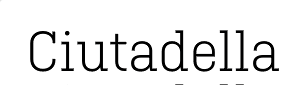
Ciutadella is a crowd pleaser among our graphics team due to its minimalist yet polished look. The simplicity of this font makes it a great option for business cards, yet it is modern enough to not look like a boring default typeface.
Avenir looks great in all caps, a style many choose for their business card fonts. It has all the old school essential features – clear, clean, airy – without feeling outdated.

Infinity is also great as a business card font because its tall, thin letters give an elegant yet modern look.

Sofia Pro is a softer, rounder typeface that looks awesome on business cards. It is simple and bold, sure to make an impact without causing a splash.

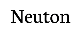
Neuton is our recommendation for all you academics that can’t fit all their PhD’s in one tiny business card. This font will make your card resemble school textbooks. Don’t laugh, that might just give you a visual edge among other job applicants.
Gotu is a more avantgarde font to choose for your business card. It has personality and may seem like an odd choice because it is a serif font, but used at the right size, with the right background it will definitely pop from the stack of business cards.

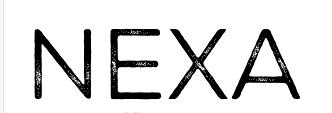
Nexa is also one of our editor’s favourite because it has the added option of matching your business card font with your website’s design. We are safe to assume potential business partners will look you up online, so it will be a nice surprise to find your business cards are actually part of your overall visual identity.
Grotesque is a great option if you are planning to synchronize your business card fonts with your other printed materials. It’s a classic option, but when did classic become a bad word anyway? Still, if it seems a bit too traditional for you, pair it with a modern, novelty font just for your name.

Ubuntu is a great blend of pretty much all the elements above. It looks great on both print and website, it is clear but unlike something you see everyday. That makes it a great font for any business card in our books.

Campton also came up more than once among our team. Its main qualities, say the designers we asked, is that its unique geometrical lines make it both unconventional and soothing at the same time. People are bound to remember it when they see it as a business card font.

Take a look at our guide and recommendations for the best fonts to use on your resume.
Passionate about fonts or just looking for a quick solution for your lettering woes? WhatFontIs.com provides a catalogue of over 550.000 fonts that you can browse until you find the one that fits you just right.
Also, make sure you check the Blog Section – you might get that cool idea that will help you better define you visual identity.
Technical lead at WhatFontIs since 2010 with a (healthy?) obsession for fonts.

