
John Wick 3 is out and fueling Keanu Reeves crushes all around the world. So far, is seems that the third chapter of the saga, ‘John Wick 3: Parabellum’, is going to break the record on gross sales for the series. But, this time around, Keanu Reeves got an upgrade in the official shots, and fans are wondering what exactly is it that makes the poster for John Wick 3 so eye-catching.
Keanu Reeves has made quite a comeback as the beloved hitman in the John Wick series, and the third part of the comic book based movie franchise is set to be the highest grossing one so far. Of course, that’s due to the outstanding performance by the actor dubbed ‘The Internet’s Boyfriend’ (spoiler alert ahead: John Wick in a suit, crossing the desert – you’re not getting a word more out of us). But, for the new release, the promotional materials also got a bit more attention.
As per usual when it comes to blockbusters with hundred of millions of dollars in gross revenues, the advertisers chose different versions of the John Wick 3 poster for the US and Europe.While both of them featured a font from the Compacta family, there are some key differences. We’ll take a closer look at both of them.
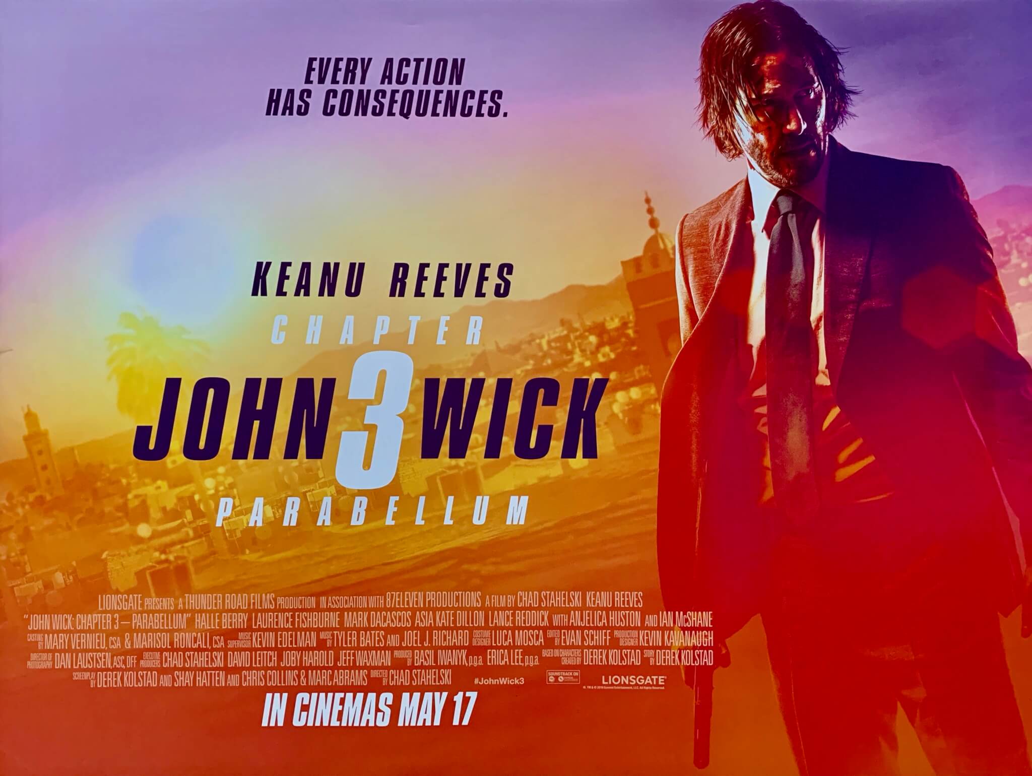
The US version is composed of a bedraggled hero, of which we see more of a figure, than a portrait. We can barely see John Wick’s eyes or face features and we mostly guess he’s holding a gun. Well, let’s say we’re familiar with the plotline, so that’s not such a big guess. The backdrop is that of an African, dessert town (for the most part, the movie was shot in Morocco).
The image is burnt, overexposed, and you can almost feel the scorching sun on your face just by looking at it. The colours are warm and the fonts are written in clean, simple black and white. The font chosen for this version of the John Wick 3 movie poster is the Bold Italic type of Compacta. The designers paired it with a custom, extra wide spacing between the letters, mostly to even out the blinding and fuzzy effect of the background.
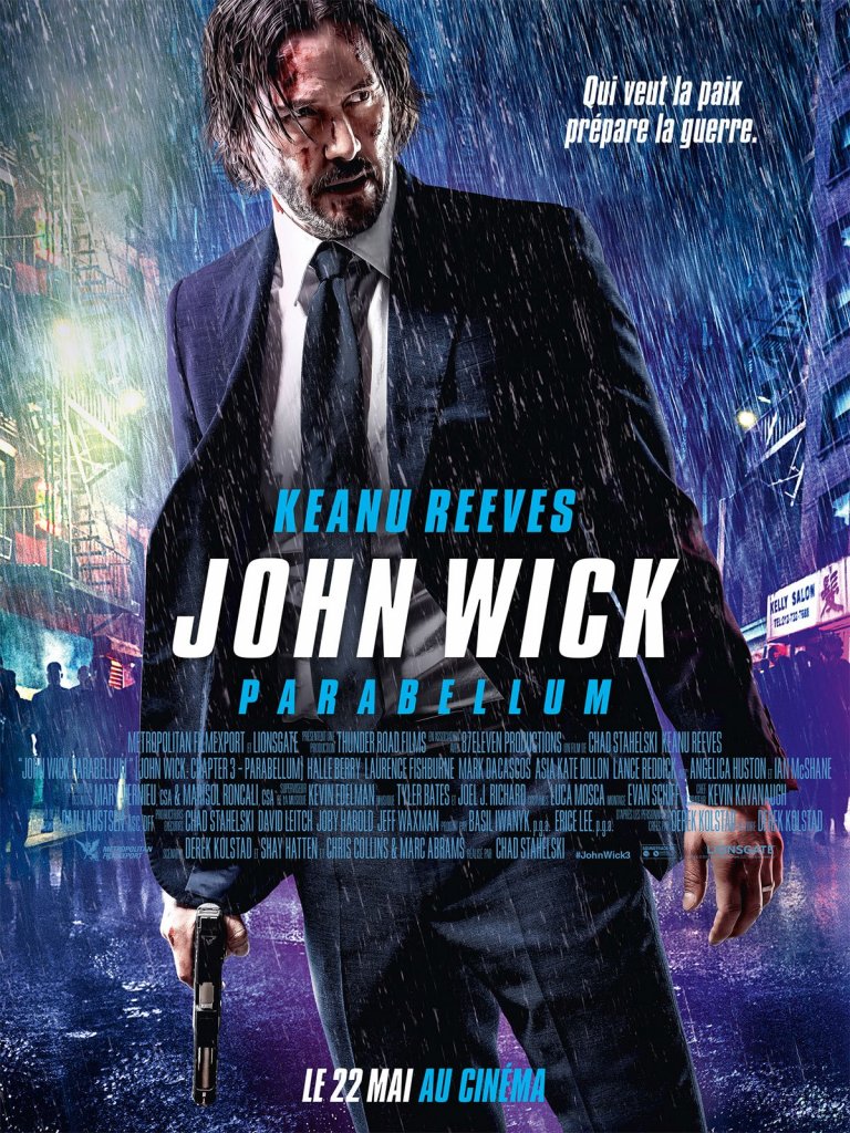
The poster for the European release of ‘John Wick 3: Parabellum’ is true to the comic book genre, a noir portrait of the dishevelled hero, bearing the marks of battle, in a purple rain decor. The neon lights, reminiscent of John Wick’s Japanese background, create just the right amount of dimness for the fonts used for the John Wick 3 poster to stand out. The colour chosen for the title, a perfect pearly white to pop out in the black and blue background.
The ‘John Wick 3: Parabellum’ poster fonts were selected with the same thought in mind: clean, clear lines, that manage to stand out amidst a otherwise pretty full setting of silhouettes, buildings, bright signs with lettering on them and a pouring rain. The tall, thick letters on the John Wick 3 movie poster is called Compacta and it does its job perfectly, much like the adored assassin.
The designers for the record breaking movie franchise chose the Compacta Italic version for the John Wick 3 poster, a change from the previous promotional attire. The Compacta font was created in 1963 by Fred Lambert, a British Graphic designer that went on to teach typography at the London College of Printing. Compacta was Lambert’s most successful font.
The condensed sans serif lettering stood out due to its uniquely square shaped characters. It became popular among magazines and other pop-culture materials, making its way on the Rolling Stones album covers for Aftermath and 12X5 and also on the cover for I Can See For Miles by the band The Who’s. The Compacta font also gained huge recognition in the United States due to it being featured on shows such as Six Million Dollar Man, Baywatch and on NBC’s Sports graphics.
You can get the Compacta Bold Italic, featured on the american poster of John Wick 3. The Compacta Italic version featured on the European version is available also.
Passionate about fonts or just looking for a quick solution for your lettering woes? WhatFontIs.com provides a catalogue of over 550.000 fonts that you can browse until you find the one that fits you just right.
Also, make sure you check the Blog Section – you might get that cool idea that will help you better define you visual identity.
Technical lead at WhatFontIs since 2010 with a (healthy?) obsession for fonts.

