One of the hottest summers on record is about to end, but the temperatures are set to remain high. The good news is the beer is still ice cold. The even better news is that now you don’t have to keep staring at the bottle wondering who designed the typefaces that you’re bound to remember the next morning, no matter how big of hangover you’re dealing with.
Don’t wake us up just yet. September is here, but beer is still high in demand. Especially since, in the last couple of years, beer has been declared a food product by an increasing number of states – no, we’re not talking about the French and their wine, but about US states such as California.
Combine the record breaking temperatures with the record number of new breweries popping up and you will get – besides a headache in the morning – a rising interest for beer labels and custom designs.
And, in what seems an ever-growing market, a strong visual identity is imperative. This can be built step by step, starting with a good font. So today we will take a good, sober look at some of the best known beer bottles in the world, focusing on their respective fonts.
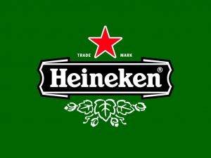
Undoubtedly one of the most recognizable logos in the world, the Heineken trademark was designed in the 1950. And it was so successful that it later became a typeface, not the other way around. The font was originally created in-house for the brewery, with a major contribution from Alfred Henry Heineken, CEO of the company for almost 80 years, from 1923 until 2002. ‘Freddy’ Heineken, as he was known, famously introduced what is now called the ‘laughing e’, a gleeful version of the classic version due to its inclined cross line. The base font used was a traditional art deco fat-face, restyled by the design team under Freddy Heineken’s supervision. The custom typeface has remained in place ever since, with only small alterations.
In the late 90’s, the Heineken logo – most specifically, its centerpiece lettering – became the outset for an entire typeface family. The developer was a Dutch design company called Eden. The final touches and the emblematic look was achieved by the designer Lucas de Groot. The font family is called Heineken Sans / Heineken Serif and was unveiled in the year 2000, containing 11 different weight versions. The fonts managed to keep a touch of the XX century influences, while the Sans Serif versions help bring a new, modern look to the lettering.
Carlsberg
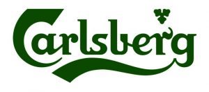
The ‘Probably best beer in the world’ couldn’t go with anything less than probably one of the best logos. And, fortunately for them, they found it over a hundred years ago. The Carlsberg logo was introduced in 1904, designed by a Danish architect called Thorvald Bindesbøll and has remained in use ever since.
The Carlsberg font, however, was created more recently. In 2007, the Carlsberg management decided the brand needs a facelift. So they hired Kontrapunkt, a leader brand agency based in Denmark. The logo wasn’t changed in any way, but the new visual identity of Carlsberg included a new, fresh font to be used on all its products and advertising materials. It is called simply Carlsberg Sans, a clean, clear balance for its intricate logo, thus ensuring it will complement the emblematic trademark rather than be a distraction from it. “Carlsberg Sans was created to stylistically sit comfortably alongside the Carlsberg logo, something that no other typeface had managed before”, the Kontrapunkt graphic teams explains.
In its group design guide, Carlsberg elaborates on how the typeface should be used best: “Working with display text and headlines, we use our Carlsberg Sans typography in a flexible and bold way, playing around with it to gain a vibrant and modern expression. One principle is dividing our typographic sentences either to the left or to the right of the margin, using an invisible dividing line in the centre.”
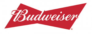
America’s favourite beer has been around since 1876, when it was first brewed by Adolphus Busch. Its logo, however, has changed significantly since then. The emblematic bow-tie shaped trademark has been a part of their visual identity for a few decades now, and so has the cursive lettering at its center.
The current typeface in display was released in 2000, but it has very few changes from the previous lettering. In fact, it is still heavily based on the 1800-inspired typography used for the very first Budweiser logo. The cursive, signature style font was designed specifically for the brewery.
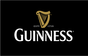
Guiness
The strong, dark beer began its journey to international fame with a completely different logo than the one we know today. The original lettering at the core of the trademark were an actual signature by the brewery’s founder, Arthur Guinness. This was back in 1862. This was gradually replaced by a more legible font, starting from 1934. It took about 30 years to find just the right typeface. In the 60’s, Guinness introduced the Hobbs lettering, named after Bruce Hobbs, the artist that worked for the advertising agency hired by Guinness. The font was originally used only for promotional material and made its way on the bottles only in 1968.
Since then, the strong, all caps lettering has undergone several minor alterations, but maintained the bold and tall look.
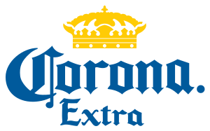
Corona
The Mexican brewery was inspired by obsolete calligraphy when it designed its logo. The Corona trademark is written in Medieval style lettering, with intricate capital letters similar to those used in the first prints. If that reminds you of old Bibles and other religious books, you are not at all out of line. In fact, Corona’s entire logo is said to be based on a famous cathedral in the city of Puerto Vallarta.
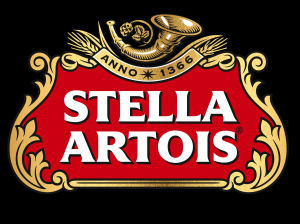
Stella Artois
Let’s finish today’s article with the oldest logo in the world. Stella Artois, the high-end brew loved by Europeans, has the oldest trademark in the world, according to Time magazine. Apparently, the horn logo displayed on top of the current Stella Artois trademark has been around since the late 1300, when the brewery was bought by Sebastian Artois, who renamed it after himself. The lettering displayed on the logo is, however, much younger.
The typeface first appeared on bottles in the 70’s. It was still inspired by the previous version, released in 1962, but became much thinner and elongated. The custom design of the lettering featured sharp edges and curved endings.
Technical lead at WhatFontIs since 2010 with a (healthy?) obsession for fonts.

