Ever wanted to make your own font?
When you consider packages such as Typekit and Google Fonts, you will find there are practically limitless options for choosing the correct font for your project.
However, you’re still choosing something that another person has created. There are plenty of things to motivate you to create your own font, and there are plenty of options for doing that.
But, why would you consider making a font?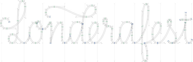
Creating a font can be highly technical, time-consuming, and also expensive. Therefore, before even looking at how to make your own font, figure out how deep you want to dive in. What you want to use it for will tell you whether learning how to create a font is worth it.
If you only need it for fun, you don’t need to know how to create fonts, a basic font creating tool should do it.
If it’s for a specific project, taking the time to learn some key techniques, and using more sophisticated software is important when you want to know how to make a font. This is what we’ll work with when we try to help you learn how to make fonts below.
The fundamentals of fonts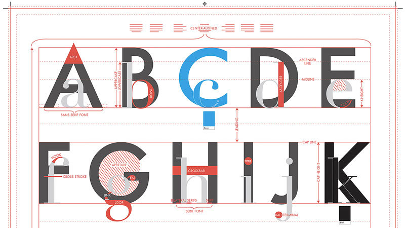
Before you get into the designing part, it’s vital that you understand the structure of typography. Terms like baseline or cap height should be second nature to you. Let’s take a look at the basics.
- The baseline is where the letter sits, something like a shelf that holds all letters.
- Overhang are the rounded bottoms of letters such as B or O, which go just below the baseline.
- X-height is the line which signifies the height of the lowercase letters.
- Cap height is the line that signifies the height of the uppercase letters.
- Ascender height limits the tip of some lowercase letters such as “k” or “h”.
- Descender height limits the bottom of the descending marks of characters like “g” or “q”.
Other terms like ligature or finial are also helpful to know, but they’ll be more useful in some more advanced typefaces. When you’re only getting started, you should know how your letters are organized in a grid system.
Sketching the letterforms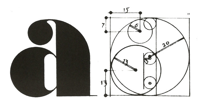
Plenty of the professional forms will include alternative styles, such as bold, italic or small caps. You most likely don’t have the time to do all of these, so focusing on the basics is what you need to do. Begin by drawing a simple, baseline grid with pencil and paper.
Get a ruler, and measure dimensions proportionally, and make perfectly straight lines. You won’t find rules for the relationships between the cap height and x-height, so your judgment will be put to good use.
Begin by making a briefHaving a clear vision of the purpose is key, since designing a typeface can be a long project. The usual practice here is to create a typeface responds to a brief.
Developing the brief will require reflection and research, and the answer to questions such as is it for personal use, or a specific project, or what makes the typeface unique.
There are plenty of options, and there have been typefaces created specifically for academic texts, or maybe as one-offs for public lettering. When you know what you will use the typeface for, is when you can get started on the design.
Some basic choices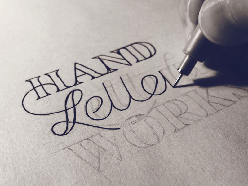
Even at the beginning, you’ll need to deal with some basics. Is it a sans serif, or a serif typeface? Will it be geometric, or writing-based? Will you make a display face which works best when used in a large size, or a text face, which is best used for long sections of copy?
A quick tip is that a sans serif is more difficult to create if you’re a beginner. The features that give these typefaces their exact identity are actually very subtle and difficult to pick up.
Ground zero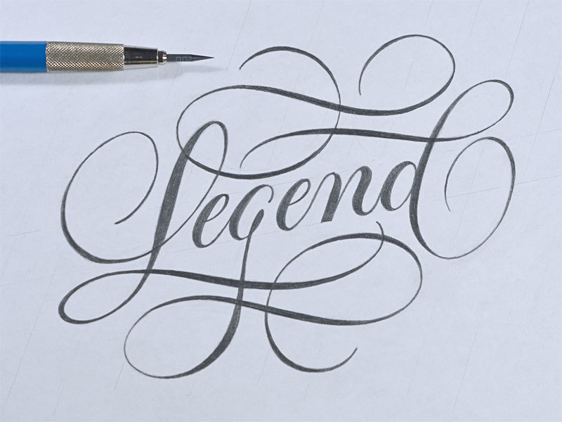
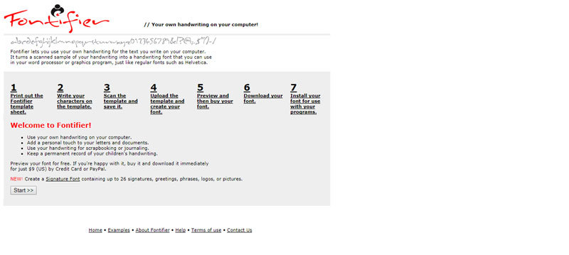
An interesting choice is to digitize your own writing style. Even though this is a useful practice exercise, you should know that handwriting is individual, and without plenty of refinement, you might be restricting yourself to a typeface for personal use.
And, you should avoid using an existing typeface to base your design on. For example, “Helvetica with wings” won’t give you a better typeface, and it won’t help you with developing your skills.
Start with your handsWhen you’re starting off, define your letterforms by hand. Trying to create certain shapes via a computer might be tricky, and will consume plenty of time.
Try to create some shapes on paper for your first few characters, before refining them digitally. You can create the other characters on screen later on by matching some features such as stroke widths and terminal endings.
Your hand usually draws a smooth and accurate curve when you draw a concave arc, pivoted by the wrist and arm. Keep turning your paper instead of adjusting your position to fully take advantage of this.
Begin with the control charactersWhen you create some of the characters first, known as the ‘control characters’, you’ll set the typeface’s style, and bring other characters into harmony.
With the lowercase Latin typeface, these are ‘n’ and ‘o’. For uppercase, ‘O’ and ‘H’ are commonly used.
Move over to the computer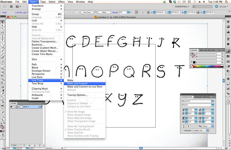
There are plenty of ways to get what you drew on the computer, but manually tracing them is the most precise one of them all.
Most software will require a drawing that is well-defined, so try outlining your characters with a fine tip pen, when you’re happy with the design. To transfer it to the computer, you could take a picture with your phone’s camera.
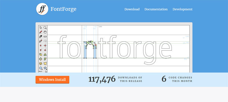
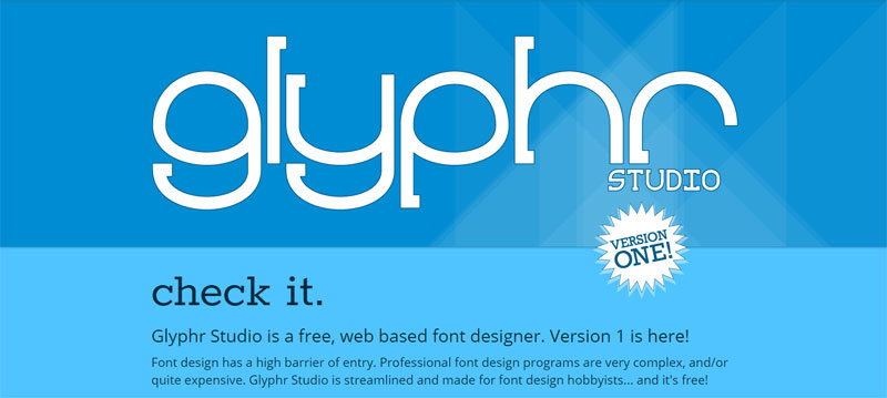
Using software for font creation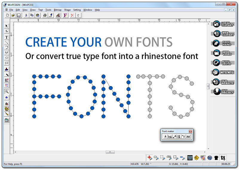
These programs have plenty of options, just like with photo editing programs and graphic design programs.
There are many suggestions you’ll come across, but you will see the same names popping up over and over again. To make a font that is actually usable, you will need such a program. They generate OTF and TTF files, which are essential.
Take them from here: 1. FontLab Studio
Focusing on individual characters is easy during the font creation process. However, you must take into consideration how the font will look like as a whole. Here are a few tips that you could follow when you want to refine your characters.
- Pay attention to the kerning and spacing. Check this by combining a series of characters during the process.
- Try out various sizes, especially if you’re creating a font that can be potentially broadly used.
- Regularly print the work – this makes it much easier to spot some very subtle mistakes.
You’re actually almost there. You have designed the font, you’ve learned the software, made the font digital, and you have refined it as much as possible. Now you just need to upload it.
Choosing a format and exporting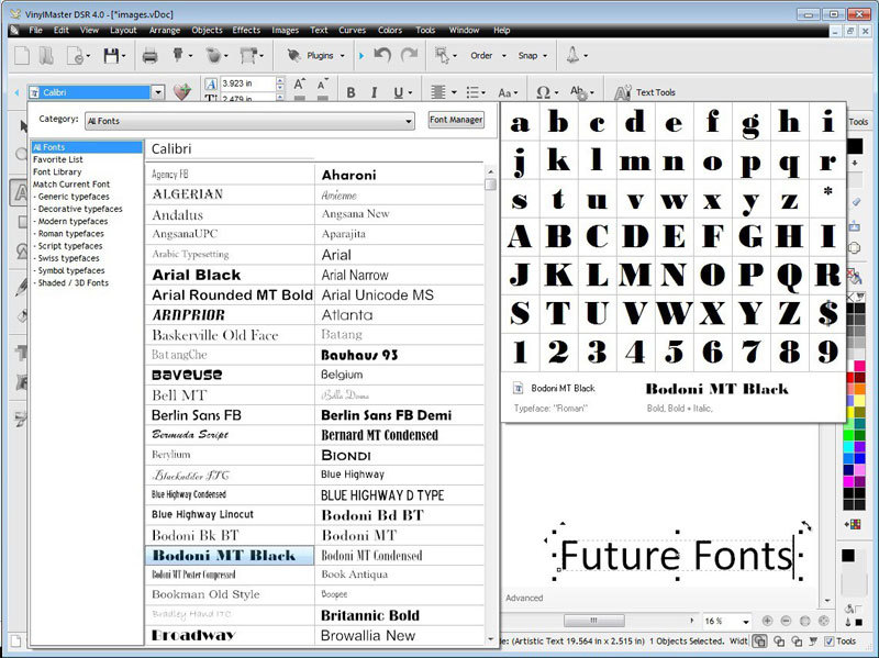
Choosing a format is what you’ll need to do before you can export. The standard is OpenType font, and it works on anything, Mac, Windows, and Linux. This is what you should go for most of the time, but it is completely up to you.
Conclusion on why to make your own fontDesigning a typeface is just like designing anything else – best learned by practice.
Sure, when you don’t know where to start, this can be off-putting advice, and this guide should give you a roadmap. Designing a masterpiece will require years of practice. However, creating your first font only takes a few weeks, and you’ll learn quite a bit.
Technical lead at WhatFontIs since 2010 with a (healthy?) obsession for fonts.