

When travelling, you get the chance to eat out almost every night. Lots of cool places to discover and so little time at your disposal. So what’s the first thing you do when you find yourself in a foreign country and you’re hungry? Without a doubt, you go on a travel website – in our case, Conde Nast traveler – and you search for the best restaurants in town. We did that and we found out the top 5 places to eat in London. And because we couldn’t help our font related curiosity, we searched for these 5 restaurants’ fonts. Check them out down below!
Barrafina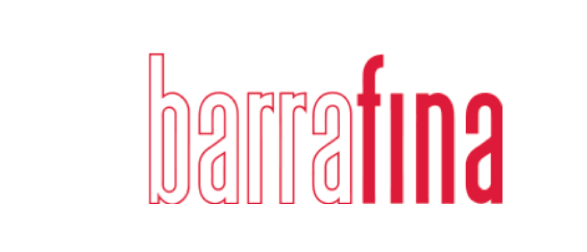
From where we’re standing, Reforma Grotesque Medium looks like a pretty close match. Simple, tall and modern, this font is a keeper.
Bao Fitzrovia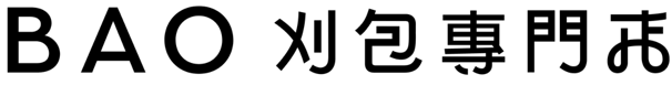
Bold and all caps, Folio Medium font is quite the right choice for an asian restaurant. It has a certain vibe to it that we love and that inspires us.
Clipstone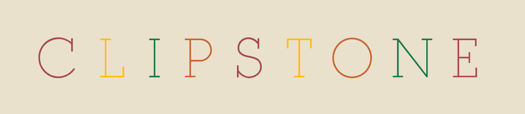
Our closest match for Clipstone, one of London’s minimalist looking places, is the Vicky Ultralight font. Clean and modern, you better add this font to your shortlist!
Honey & Co.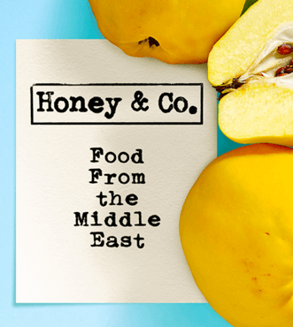
Honey & Co. has a very cool and young vibe to it. We can partly owe that to the font choice. Urania_Piccola_II font looks retro, yet very trendy. It kind of remind us of the stamp looking font we previously talked about here.
KILN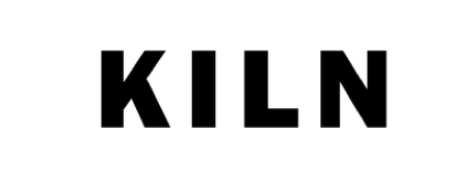
It surely stands out and without a doubt this is due to its boldness and uppercase letters. KILN used Poligon Black font for its name and we think it’s a right choice for this friendly looking font.
If ever curious about fonts that surround you, whether it’s a shop or restaurant, take a picture and upload it on WhatFontIs.com. Without any doubt, you’ll find plenty of similar fonts on our website that you can further use for your own creative projects.
Technical lead at WhatFontIs since 2010 with a (healthy?) obsession for fonts.

