
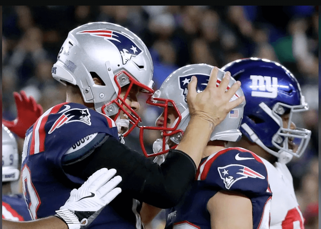
Thursday’s game was undoubtedly won by the New England Patriots with a final score of 35 to the New York Giant’s 14, but there's more than one victory we care about. Professional sports are all about the merchandise and a big part of the design focuses on the fonts used by NFL teams on their official jerseys and other memorabilia.
Whether you are a Pats or Giants fans, odds are you know a thing or two about your team's history – best players, best games, best season. And you have that one lucky shirt you bought at the stadium the day of the final game. Or, if you are anything like me, you just love football jerseys because they make you look like you actually understand what's going on in the field.
Football merchandise looks cool and has become one of the main income sources for the NFL teams. Kids love it even more than you do and they make for great presents. But, besides the traditional colours and logo of each team, there are a few other aspects that go into designing sport items for fans.
The font used is, in our opinion, the central element. Fonts can make or break the success of any particular item because, let’s face it, we all know that mug is not worth 24.99 dollars. What you are actually buying is a piece of support for your team, a proof of your devotion and, if the season goes well, bragging rights for the rest of the year. But what good is that mug or scarf or keychain if the name of your team is blurry? Yeah, that will probably only earn you the laughs at your football parties. So the font in which the name of the team is written is of utmost importance.
Now, there are several factors to take into account when designers choose a font for a specific item promoted as 'official NFL attire '.
Firstly, that font is usually from the same family as the NFL team's official logo. Often, the logo is a bold, heavy version of the font, while the entire name will be written on an item in a lighter version, thus allowing enough space and legibility.
Secondly, when using an official NFL font for any football merchandise, designers have to keep in mind the particularities of the items that font is going to be imprinted on. Leather is different than textiles, so the writing on your football will look different than the one on your hat.
Than, the font used by NFL teams often depends on their colours. One font might simply look awful on a dark background so, even if that is official font used in the logo, it will not be the one used for other equipment designed for fans.
The good news is thou that these fonts have become a lot more easy to customize, so, with the help of a skilled designer, you are sure to find the exact fit for your needs.
Whether you are building a pro football blog and want its theme to look exactly like your favourite team's stadium or you are planning your ten year old's birthday party and want it to be an NFL wonderland, using the official font of an NFL team will surely upgrade your game.
So, we are talking today about the New England Patriots official font and the New York Giants official font. First, we have to understand a bit about each team's logo and visual history.
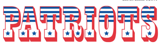
The good old red, white and blue colour scheme has been a part of the Boston based team from its establishment, back in 1959. The name and logo were actually designed by fans and chosen by the team owners after a contest. The winner got a new television set. Their logo changed a few times since then, but the colours have remained in place, even if they have had different proportions over the years. For example, there was a time when the team's equipment was only white and red, no blue. The New England Patriots official font, however, changed more than anything else.
Because even from early on the designers focused on the colours, the font's main job was to accommodate all three of them. Also, we have to keep in mind that the entire design process was print oriented in that age, so the logo was chosen to also look good on paper.
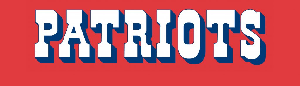
Today, the official New England Patriots font is sans serif, bold, clear and clean. The ratio between the height and width of the letters was also modified, resulting in a shorter font with bigger spaces in between the letters. The Patriot's official font has one main feature that makes you recognize it from anything else.
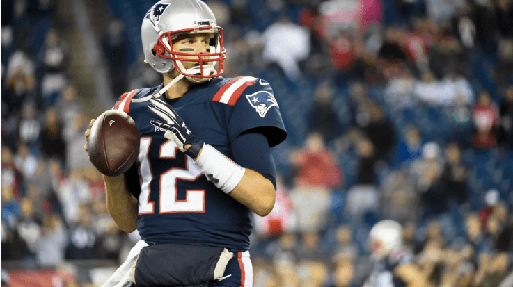
At half height of each character there is a arrowhead pointing outwards. The team or the designers have never clearly explained if there is one specific reason why they choose font – other than looking really cool, that is – but we think the arrowheads actually remind us of the white or black lines footballers sometimes draw on their faces, under their eyes.
The New York Giants official logo has also been a part of the team's visual identity since early on. The team was founded in 1925 and pretty much had the same color scheme: red, white, blue. More recently, grey was added.
Or, to be more precise, re-added. Most football teams had grey incorporated in their equipment in the 1930 and 1940 and that remained almost a fixed feature, although the suits design changed often because. This happened mostly due to the fabrics being used and the way they were sewn back then.
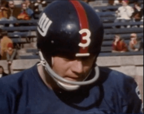
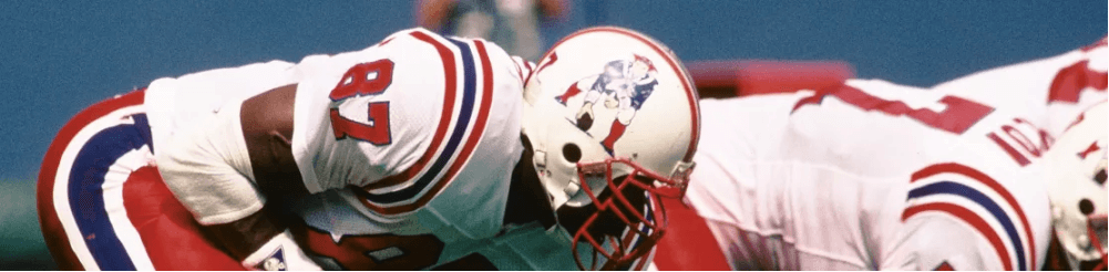
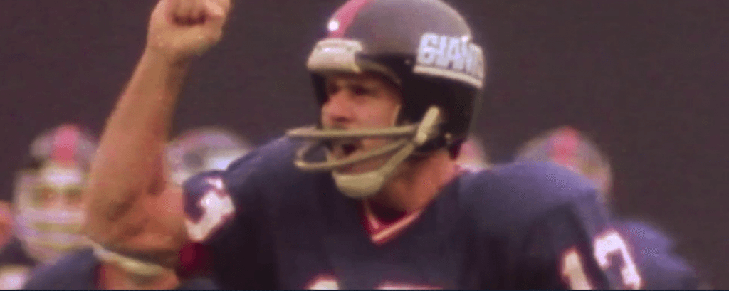
The font used by the New York Giants, however, was a lot more stable. It was first introduced in 1957, when numbers appeared on the side of the helmets for the first time. The fonts used on these vintage Giants helmets was Futura, written in small, white characters.
Ten years later, they changed it to Helvetica and eventually landed on a custom font, which the team used up until the mid 1990.
That was when they switched back to Futura font on all their equipment, the one they use to this day. Basically, the New York Giants logo consists of the letters N and Y written in lowercase Futura.
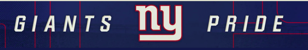
Its extended version features the words GIANTS and PRIDE written in all caps and an italic version. This, designers have explained over the years, was a determined choice as to make the word giants well, look bigger.
We hope this gave you a few useful tips when planning to design something using an official NFL font. But, if soccer is more you game, have no fear! We took a closer look at all the fonts used by the biggest soccer teams during the World Cup. Take a look and let us know if there is any other sports logo or font you want to know more about!
Passionate about fonts or just looking for a quick solution for your lettering woes? WhatFontIs.com provides a catalogue of over 550.000 fonts that you can browse until you find the one that fits you just right.
Also, make sure you check the Blog Section – you might get that cool idea that will help you better define you visual identity.
Technical lead at WhatFontIs since 2010 with a (healthy?) obsession for fonts.

