
Designer labels are a girl’s best friend, so the next time you check one just to make sure it’s the real deal keep in mind that you’re not paying just for the famous name, but also for the way it’s written. The devil is hidden in the details – and she always wears Prada.
We previously took a closer look on the two pillars of fashion magazines typography – the Didone ‘modern’ aesthetic versus the grotesque sans serif avant-garde – dominate the publishing industry when it comes to everything revolving fashion. But many fonts from both sides have transitioned from writing about fashion to being fashion, after having been chosen by the biggest designers to literally represent their brands.
So today let’s focus on typefaces of the fashion industry itself. Although we might be tempted to think the fonts used in fashion are all about beauty and creativity, let’s think again. ‘At least my fake wallet says Prada, not Prado, like yours’, bicker two leading ladies in the movie ’Serendipity’. Well, yes, legibility has become a weapon to be used against fashion houses in the age of fake. Many of them have remained true to their established brand, bringing few to none changes to their namesake logos.
And because these names have broken all cultural and language barriers and today they are recognisable all around the world, it may be hard to see the typefaces they used as revolutionary or modern. Nonetheless, that’s exactly what some of them are.
Let’s begin – how else? – with Chanel. It’s logo, the intertwining back-to-back C’s, an epitome of elegance and simplicity. But just as recognisable as the Chanel little black dress is the Chanel little black lettering. Of course, we’re talking about the label on the No. 5 perfume, unequivocally the brand’s most successful product. Pinned on a perfectly white background, little black all capital letters, sans serif, writing the billion dollar name. Chanel released this perfume, with this label, while all its competitors were in awe of the Didone style, the polished and refined finesse of the serif font. Mademoiselle Coco Chanel went against the current, but true to herself – let’s not forget she’s the one who threw corsets away in favour of the more relaxed, clean cut lines and fabrics. So she was one of the first to find resonance between a font used for a product and the creative concept of the designer. She paired the simple, clear font – used in different weights – with an apothecary style bottle to create her flagship perfume.
An opposite approach was chosen by Dior, for whom a transitional serif style was chosen. The house brand is written in Nicholas Cochin font that borrows from the Didot and Bodoni school the combination of thick and thin lines that creates contrast and substance, all resulting in evergreen elegance.
But only one of the ‘big ones’ was caught on camera while realising the importance of getting their logo just right. It was 1962 and a young Yves Saint Laurent was putting his finishing touches on his very first fashion collection released under his own designer name. Pierre Boulat, one of the biggest fashion photographers of that era, captured an preoccupied Saint Laurent while holding in his hands two cards. Both had his name – Yves Saint Laurent – written in Didot font, but one was written in black against a white background, the other featured white lettering on a black background. Apparently, none of them rose up to the perfectionist designer’s satisfaction. The next year, he commissioned A.M. Cassandre, a poster designer, to create a bespoke logo. Today, we recognise that as the intertwining YSL signature, known all around the world.

On the other side, Armani relies on the Didot font from the Didone family, a modern serif complimented by tall, all capital letters. Created in 1799, in France, before the font was a fashion must-have, the name Didot belonged only to a family business specialised in printing and publishing. One of their many versions is now synonymous with the Giorgio Armani logo. The exaggeration between the widths generates an almost dramatic effect, with thick, heavy lines combining with razor thin ones.
Prada is also part of the modern serif family, with a personalised font for its logo, created just for them. They also make use of the contrast resulting from different widths, but stand out from others due to the shorter characters. Because of that, the logo is on the bold side, with thick strokes that create a strong, long lasting visual impression.
And that brings us to one of the biggest nightmares any true fashion icon can have: you show up at the party and someone else is dressed just like you. Well, not quite identical, but yes, several bespoken version of the modern serif fonts, mostly Bodoni and Didot fonts, are used by many big names in fashion.
Case in point: Prada versus Burberry, who chose the Bodoni version of Bespoke. Burberry’s logo brings a more romantic, detailed appearance for the lettering, all while preserving the short, thick characters we also notice at Prada. Both fashion houses use all capital letters and rely on the thick/thin quotas to create their polished, refined looks.
Gucci, on the other hand, has a more classical style lettering to promote its name. The Granjon font was chosen, an old style serif typeface that manages to be, at the same time, wide and subtle, accentuated and understated. The neatness and cold luxury ensures the viewer know from the quickest glance he’s dealing with the high-end of fashion, even without the gold colour chosen usually to write the logo.
The same can be said about Louis Vuitton, who created a bespoke font for their two letter logo. They worked within the transitional serif to create the iconic ‘LV’ monogram completed with bold serifs and thin, elegant lines. The custom typeface is baes on the Georgia font, but with the width contrast creates a solid, almost robust look.
And since Louis Vuitton eased our transition in accessories territory, let’s look down for a change. It was Christian Dior who said that shoes make or break an outfit, but it was Jimmy Choo and Manolo Blahnik who cashed in on that idea. Both brands are so big, they’re not names anymore, they’re nouns. Whoever doubts that, just let me quote from the Gospel of Carrie Bradshaw in ’Sex and the City’, when she pleads with a man robbing her: ‘Please, sir, not my Manolos!’.
Well, if you ever wondered how that name is written, we have the answer: it’s written in Arial, one of the most widespread fonts out there. Part of the Neo Grotesque sans serif family, the all caps name spreads across a white background, The simple, neat lines create an aerated look, with a perfect balance between height and thickness.
Jimmy Choo, on the other hand, chose to have a personalised font based on the University Roman typeface, a transitional serif wide lettering paired with tall, thin lines. The style is complimented perfectly by slightly exaggerated proportions, with an extreme contrast between the thinness of the vertical, tall letters as opposed to the width of the round ones.
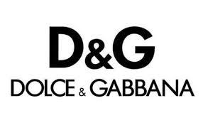
Dolce & Gabanna has a two letter bespoke logo, but decided to use a bold version of the Futura font from the geometric sans serif handbook for their website. The used all caps, pairing wide, round figures with the tallness of the letters. The proportions make the sans serif font work perfectly with the long name of the brand. And if you ever thought there’s something similar between Dolce & Gabanna, one of the biggest fashion houses in the world, and FedEx, the overnight carrier that brings your online shopping to your door, don’t rub your eyes just yet. Yes, the two logos have much more in common than you might think. But we’ll take a closer look at that in our next article.
Technical lead at WhatFontIs since 2010 with a (healthy?) obsession for fonts.

