
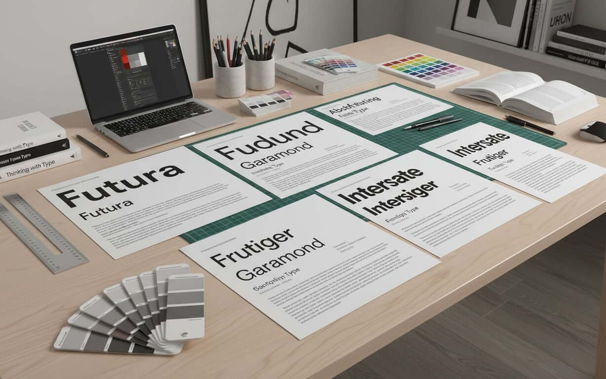
Professional typography is more than an aesthetic choice—it’s a strategic business decision that influences credibility, readability, and brand perception. The right font conveys competence and attention to detail, while poor choices can undermine your message and damage your professional image.
This guide explores the essential elements of professional fonts, offering practical recommendations and insights to help you choose the perfect typography for your business needs. From business documents and branding to stationery and digital applications, we’ll cover the top fonts recommended by designers and provide tips for avoiding common font selection mistakes. Whether you’re crafting a report, designing a logo, or updating your business cards, this guide will equip you with the knowledge to make informed decisions and elevate your professional image through typography.
Table of Contents- What Makes Fonts Look Professional
- Professional Fonts for Business Documents and Reports
- Clean Fonts for Modern Business Branding
- Formal Fonts for Business Cards and Letterhead
- Readable Fonts for Digital and Print Applications
- Top Professional Fonts Recommended by Designers
- How to Choose Professional Fonts for Your Industry
- Common Mistakes When Selecting Professional Fonts
- Frequently Asked Questions
Professional typography is the bedrock of effective business communication. It shapes the initial impression and significantly influences how your message is received. Understanding the characteristics that elevate ordinary text into polished, credible communication involves examining key elements of font selection.
Key characteristics of fonts that look professional- Clarity and readability: Well-defined letterforms and consistent spacing that enable readers to process information effortlessly
- Versatility: Performance across different applications and mediums, from computer screens to business cards
- Balanced proportions: Appropriate x-heights, generous character spacing, and balanced stroke weights
- Psychological impact: Subtle communication of competence, reliability, and attention to detail
These typefaces avoid excessive ornamentation or distracting design elements, prioritizing functional beauty: clean lines, balanced proportions, and optimal character spacing that facilitates smooth reading.
The psychological impact of font choice is significant. Typography subtly communicates competence, reliability, and attention to detail. Fonts that appear dated, overly casual, or difficult to read can inadvertently signal unprofessionalism. Well-chosen typefaces convey authority, trustworthiness, and modern sensibility, making font selection a strategic business decision.
Selecting a professional font involves balancing aesthetics with functionality. The right font should not only look good but also enhance readability and convey the appropriate tone for your message. In the next section, we’ll explore specific font recommendations for business documents and reports, ensuring your written communications project credibility and clarity.
Professional Fonts for Business Documents and ReportsBusiness documents and reports require typography that supports clear communication and projects institutional credibility. This also extends to personal professional documents like resumes, where font choice can significantly impact a first impression. The fonts selected must excel in extended reading, maintain consistency, and create a hierarchy that guides readers through complex information.

- Calibri: Microsoft’s default font since 2007 with rounded letterforms and generous spacing that creates an approachable feel while maintaining formality
- Georgia: Exceptional choice for reports requiring extended reading, designed for screen display with robust letterforms and clear character distinction
- Source Sans Pro: Contemporary approach offering clean, modern aesthetics developed by Adobe with extensive weight options for effective typographic hierarchy
| Font Name | Best Use Case | Key Strength |
|---|---|---|
| Calibri | General business documents | Excellent screen readability |
| Georgia | Extended reading materials | Superior legibility |
| Source Sans Pro | Modern corporate reports | Versatile weight options |
Selecting document fonts should consider the intended audience, distribution method, and content complexity. Technical reports benefit from fonts with clear numerical distinction, while executive summaries might prioritize fonts that convey authority and sophistication.
Choosing the right font for business documents is crucial for conveying professionalism and ensuring readability. Next, we’ll explore clean fonts for modern business branding, focusing on how typography can enhance brand perception and create a lasting impression.
Clean Fonts for Modern Business Branding What makes fonts clean and modern for business branding?Modern business branding needs typography that reflects contemporary values and maintains timeless appeal. Clean fonts are the cornerstone of effective brand identity, communicating professionalism, innovation, and reliability through their refined simplicity and purposeful design.
“Clean” typography refers to fonts that eliminate unnecessary decorative elements, maximizing clarity and impact. These typefaces feature consistent stroke weights, balanced proportions, and carefully considered spacing that creates visual harmony. Clean fonts work well for technology companies, consulting firms, and service-based businesses that want to project competence and forward-thinking approaches.
Top clean fonts for corporate branding- Helvetica: Neutral character and exceptional versatility with ability to convey information without imposing stylistic personality
- Proxima Nova: Modern evolution of geometric sans-serif design offering warmth and approachability while maintaining professional credibility
- Montserrat: Combines geometric precision with subtle personality, inspired by urban typography for creative agencies and design-focused businesses
For brands seeking distinctive character without sacrificing professionalism, Montserrat offers an excellent balance. Inspired by urban typography, this font combines geometric precision with subtle personality, making it effective for creative agencies, architectural firms, and design-focused businesses. Its strong character definition ensures excellent performance across digital platforms while maintaining elegance in print applications. Other modern sans-serif options, such as Corporate S Regular, also provide clean lines and a professional aesthetic suitable for branding and digital interfaces.
The strategic implementation of clean fonts in branding extends beyond simple font selection to encompass spacing, sizing, and application consistency. Successful brands establish clear typographic guidelines that specify how fonts should be used across different contexts, ensuring cohesive brand expression regardless of the medium or application.
Clean fonts are essential for creating a modern and professional brand identity. In the following section, we’ll delve into formal fonts for business cards and letterhead, exploring how typography can make a strong first impression on your business stationery.
Formal Fonts for Business Cards and LetterheadBusiness stationery is the most traditional and formal expression of corporate identity, requiring fonts that convey authority, trustworthiness, and professional competence. The typography chosen for business cards and letterhead creates lasting first impressions and establishes the foundation for subsequent business communications.
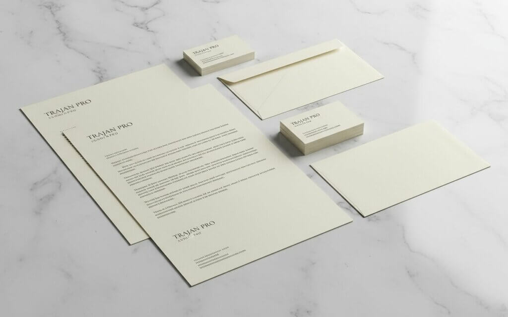
Formal fonts for stationery must excel in small sizes while maintaining character and readability. Business cards present unique challenges due to space constraints and the need for information hierarchy. The selected font must clearly distinguish between names, titles, contact information, and company details while creating an aesthetically pleasing and professional layout.
- Trajan Pro: Classical elegance based on Roman inscriptional letterforms that conveys timeless authority and sophistication
- Minion Pro: Exceptional versatility combining classical proportions with contemporary refinement, suitable for both traditional and modern business environments
- Avenir: Contemporary formal approach providing geometric precision with humanist warmth and clean lines
Implementing formal fonts on stationery requires careful attention to spacing, alignment, and proportion. Successful designs create clear visual hierarchy through strategic use of font weights and sizes, ensuring that essential information is immediately accessible while maintaining overall design elegance. The choice between serif and sans-serif fonts often depends on industry conventions and brand personality, with serif fonts generally conveying more traditional authority and sans-serif fonts suggesting modern efficiency.
Selecting the right fonts for business cards and letterhead is essential for projecting a professional image. Next, we’ll explore readable fonts for digital and print applications, ensuring your message is clear and accessible across all mediums.
Readable Fonts for Digital and Print Applications What makes readable fonts across different mediums?The modern business environment demands fonts that perform well across digital screens and printed materials. This dual-medium requirement presents challenges, as fonts must maintain clarity and character whether displayed on high-resolution monitors, mobile devices, or traditional paper formats.
Readability encompasses character recognition, eye strain reduction, and information processing efficiency. Fonts optimized for cross-platform readability feature generous x-heights, clear character distinction, and appropriate spacing that facilitates comfortable reading across various contexts and viewing conditions.
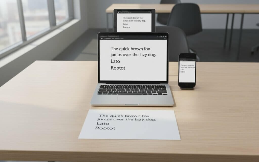
- Open Sans: Breakthrough in cross-platform typography design developed for digital applications while maintaining print excellence
- Lato: Combines geometric structure with humanist details, creating a font that appears modern and approachable with semi-rounded letterforms
- Roboto: Exceptional performance across digital platforms while maintaining print quality, originally designed for Android interfaces
Selecting readable fonts must consider viewing conditions, audience demographics, and content complexity. Technical documents benefit from fonts with clear numerical distinction and consistent character spacing, while marketing materials might prioritize fonts that maintain personality while ensuring accessibility. Testing fonts across intended applications and gathering user feedback can inform final selection decisions.
Choosing fonts that are readable across both digital and print platforms is crucial for effective communication. In the next section, we’ll explore top professional fonts recommended by designers, providing insights from typography experts and design professionals.
25 Top Professional Fonts Recommended by DesignersTypography professionals and graphic designers consistently recommend certain fonts based on their proven performance, versatility, and aesthetic quality. These recommendations reflect years of practical application across diverse projects and industries, providing valuable guidance for businesses seeking reliable typographic solutions.
Designer recommendations often emphasize fonts that offer comprehensive families, excellent technical execution, and broad application potential. These typefaces have demonstrated their value through successful implementation in major branding projects, corporate communications, and digital platforms, establishing them as trusted tools in professional design practice.
Designer-approved professional fontsProfessional designers emphasize understanding each font’s intended purpose and optimal application context. The most successful typographic choices align font characteristics with communication objectives, audience expectations, and brand personality requirements.
Leveraging designer recommendations can help you choose fonts that are both professional and aesthetically pleasing. In the next section, we’ll explore how to select professional fonts tailored to your specific industry, ensuring your typography aligns with your brand and audience expectations.
| # | Font Name | Category | Best Use | Professional Tone |
|---|---|---|---|---|
| 1 | Helvetica | Sans-serif | Branding, corporate comms | Neutral, authoritative |
| 2 | Arial | Sans-serif | Documents, email | Clean, practical |
| 3 | Calibri | Sans-serif | Business documents | Modern, approachable |
| 4 | Georgia | Serif | Reports, long text | Formal, readable |
| 5 | Times New Roman | Serif | Legal, academic | Traditional, authoritative |
| 6 | Garamond | Serif | Editorial, publishing | Elegant, classic |
| 7 | Source Sans Pro | Sans-serif | Corporate reports | Modern, versatile |
| 8 | Open Sans | Sans-serif | Web, digital content | Friendly, professional |
| 9 | Lato | Sans-serif | Web, presentations | Clean, balanced |
| 10 | Roboto | Sans-serif | UI, digital products | Modern, technical |
| 11 | Avenir | Sans-serif | Branding, stationery | Refined, contemporary |
| 12 | Proxima Nova | Sans-serif | Brand identity | Modern, confident |
| 13 | Montserrat | Sans-serif | Marketing, headers | Structured, modern |
| 14 | Futura | Sans-serif | Branding, headlines | Bold, timeless |
| 15 | Frutiger | Sans-serif | Corporate signage | Clear, functional |
| 16 | Interstate | Sans-serif | Headings, signage | Strong, efficient |
| 17 | Minion Pro | Serif | Editorial, stationery | Sophisticated |
| 18 | Trajan Pro | Serif | Luxury, formal branding | Classical, prestigious |
| 19 | Baskerville | Serif | Print, formal docs | Refined, traditional |
| 20 | Merriweather | Serif | Digital reading | Warm, readable |
| 21 | IBM Plex Sans | Sans-serif | Tech, enterprise | Rational, modern |
| 22 | Noto Sans | Sans-serif | Global brands | Neutral, inclusive |
| 23 | Verdana | Sans-serif | Screen-heavy docs | Highly readable |
| 24 | Segoe UI | Sans-serif | Corporate UI, docs | Clean, professional |
| 25 | PT Serif | Serif | Editorial, reports | Balanced, formal |
Different industries have developed distinct typographic conventions that reflect their values, audience expectations, and communication requirements. Understanding these industry-specific considerations enables strategic font selection that supports business objectives while maintaining professional credibility.
Industry-specific font recommendations- Financial Services: Traditional serif fonts like Times New Roman and Garamond for stability and trustworthiness, with modern firms adopting clean fonts like Helvetica or Calibri
- Technology Companies: Sans-serif fonts like Roboto, Open Sans, and custom typefaces that reflect innovation and efficiency with emphasis on digital-first communication
- Legal and Professional Services: Traditional serif fonts for formal documentation with modern fonts for client-facing materials that balance professionalism with approachability
- Healthcare Organizations: Clean, readable fonts like Source Sans Pro or Lato that convey competence while remaining accessible to diverse audiences
- Creative Industries: Custom fonts or distinctive typefaces that serve as brand differentiators while demonstrating design expertise and maintaining professional credibility
Choosing fonts that align with your industry’s conventions can enhance your professional image. In the next section, we’ll explore common mistakes to avoid when selecting professional fonts, helping you make informed decisions and maintain typographic integrity.
Common Mistakes When Selecting Professional Fonts What are the most frequent font selection errors?Font selection errors can undermine professional communication, creating barriers to clear information transfer and potentially damaging brand perception. Understanding these common mistakes helps organizations make informed typographic decisions that support their communication objectives.
How to avoid common font selection mistakes- Prioritize function over form: Balance visual appeal with functional requirements to ensure chosen fonts support communication effectiveness
- Maintain consistency: Establish clear typographic guidelines and use consistent fonts across all materials and platforms
- Consider technical requirements: Verify font licensing, cross-platform compatibility, and file formats before implementation
- Update outdated conventions: Periodically review typographic choices to ensure they support current brand positioning and audience expectations
Avoiding these common font selection mistakes can significantly enhance your professional communication. Finally, let’s address some frequently asked questions about professional fonts to provide further clarity and guidance.
Frequently Asked Questions- What is the most professional font for business documents? Calibri is widely considered a professional font for modern business documents due to its readability, clean appearance, and system compatibility. It balances formality and approachability while performing well across digital and print applications.
- Should I use serif or sans-serif fonts for professional communications? Both serif and sans-serif fonts can be professional when chosen appropriately. Serif fonts like Georgia or Times New Roman convey authority and work well for formal documents, while sans-serif fonts like Helvetica or Arial project efficiency and perform better on screens. Choose based on your industry, audience, and context.
- How many fonts should I use in a professional document? Limit professional documents to a maximum of two fonts: one for headings and another for body text. Too many fonts creates visual chaos. If using only one font, vary weights (bold, regular, light) to create hierarchy.
- What font size is most professional for business letters? Use 11 or 12-point font size for business letters. This size ensures readability while maintaining a polished appearance. Avoid sizes smaller than 10 points, which can strain readers’ eyes, or larger than 14 points, which may appear unprofessional.
- Are Google Fonts suitable for professional use? Yes, many Google Fonts are excellent. Fonts like Open Sans, Lato, and Roboto offer high quality, extensive character sets, and reliable performance across platforms. Google Fonts also provide proper licensing for commercial use and ensure consistent rendering across different systems.
- How do I ensure my chosen font displays correctly on all devices? Choose web-safe fonts or use font embedding techniques for digital applications. For documents, consider converting to PDF format to preserve font appearance. Test your font choices across different devices, browsers, and operating systems to ensure consistent display.
- What fonts should I avoid in professional settings? Avoid decorative fonts like Comic Sans, Papyrus, or Brush Script. Also steer clear of overly stylized fonts, script fonts for body text, or fonts that are difficult to read. These choices can undermine credibility and create accessibility issues.
- Can I use the same font for both print and digital materials? Yes, many modern fonts perform well in both print and digital formats. Fonts like Calibri, Open Sans, and Georgia are designed for cross-platform compatibility. However, always test your chosen font in both contexts to ensure optimal performance.
- How important is font licensing for business use? Font licensing is crucial for legal compliance and professional integrity. Many fonts require commercial licenses for business use, and violations can result in legal action. Always verify licensing requirements and budget for proper font licenses.
- Should different industries use different types of fonts? While font choice can reflect industry character, professionalism transcends industry boundaries. Financial services might favor traditional serif fonts, while tech companies prefer modern sans-serif fonts. However, clarity, readability, and appropriate application matter more than strict industry conventions.
Selecting professional fonts is a critical aspect of business communication, influencing how your message is perceived and ensuring clarity across various mediums. By understanding the nuances of typography and aligning font choices with your industry, brand, and audience, you can enhance your professional image and create lasting impressions. Take the time to experiment with different fonts, gather feedback, and establish clear typographic guidelines to maintain consistency and credibility. Start by auditing your current font usage, identifying areas for improvement, and implementing the recommendations outlined in this guide to elevate your brand through strategic font choices.

I'm a programmer at heart. But in my 20s, I realized there was more to the world of fonts than just Courier.
Driven by endless curiosity, I built a system to explore them.
That project grew into one of the world’s leading font identifier platforms: www.WhatFontIs.com.
By 2024, WhatFontIs is helping nearly one million designers—famous or not—discover the names of the fonts they need.