
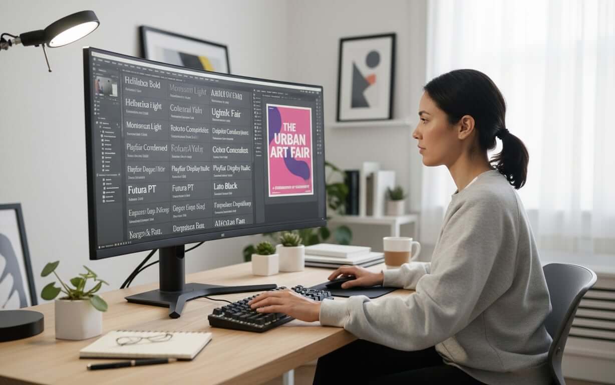
Creating impactful posters hinges on effective typography. Selecting the right fonts for posters is crucial for capturing attention and conveying your message clearly.
This guide provides a comprehensive overview of poster typography, covering fundamental principles, selection criteria, font categories, and practical tips for creating visually compelling and readable designs.
Whether you’re designing a poster for an academic conference, a marketing campaign, or a community event, understanding these typography essentials will help you make informed decisions and achieve your desired impact.
Table of Contents- Understanding Poster Typography Fundamentals
- Best Font for Poster Design – Key Selection Criteria
- Font Categories for Different Poster Types
- Font Size Poster Guidelines and Readability Standards
- Top Sans Serif Fonts for Posters
- Best Serif and Decorative Fonts for Poster Impact
- Font for Poster Board – Physical vs Digital Considerations
- Typography Pairing and Hierarchy in Poster Design
- Frequently Asked Questions
Understanding Poster Typography FundamentalsWhat makes typography effective for poster design?
Typography is the foundation of effective poster design, turning text into a visual communication tool. Your font choices influence how people perceive your message. Unlike books or websites, posters need to grab attention quickly and remain readable from various distances.
The main idea behind poster typography is immediate visual impact. People usually have just a few seconds to understand the information, so choosing the right font is essential. The best posters balance looks with clarity, making sure viewers can easily understand the message without struggling to read fancy fonts.
Key Typography Considerations for Posters- Audience Demographics: Younger people often like modern, bold fonts that show energy. Older people might prefer classic fonts that show reliability.
- Emotional Impact: Sans serif fonts often show a modern, clean look, while serif fonts suggest tradition. Script fonts can show elegance or creativity.
- Display Environment: Indoor posters with good lighting allow for more font choices. Outdoor posters need high-contrast, bold fonts that are easy to read in different lighting and weather.
Knowing your audience is important when deciding on typography. To help with this, a comprehensive guide on font identification techniques and tools can be invaluable for understanding existing styles. Think about age, cultural background, industry standards, and where the poster will be displayed.
Now that we’ve covered the fundamentals, let’s delve into the key criteria for selecting the best font for poster design.
Best Font for Poster Design – Key Selection Criteria What factors should designers consider when choosing the most effective font?Choosing the right font for poster means carefully considering several things that affect how it looks and how well it communicates. Start by clearly understanding what your poster is for and where it will be displayed.
Essential Font Selection Criteria- Test Readability: The font must be easy to read from all distances. Print samples in the actual size and look at them from different distances to make sure they are easy to read.
- Establish Visual Hierarchy: Your poster should guide people through the information in order of importance. Use different font weights, sizes, and styles to separate headlines, subheadings, and body text.
- Maintain Brand Consistency: Your font choices should match your brand’s style while also working well for a poster. This might mean using fonts that your brand already uses, or choosing fonts that fit the brand’s personality.
- Consider Production Requirements: Thin or detailed fonts might not look good when printed in large sizes or on rough materials. Fonts with small details might not work well in digital formats or on low-resolution screens.
- Plan for Longevity: Posters for short events can use more trendy fonts, while permanent signs need fonts that will not look old quickly.
- Work Within Budget: Some fonts require licensing fees. However, there are many free fonts that are good alternatives.
For designers needing to identify fonts from existing materials or competitor posters, a reliable font identification tool can be extremely helpful. For those looking for high-quality options, a curated collection of 7 premium fonts specifically selected for poster design can provide excellent choices. The key is to find fonts that meet your needs while staying within your budget.
With these criteria in mind, let’s explore how different font categories can be applied to various poster types.
Font Categories for Different Poster Types How do font choices vary based on poster purpose, audience, and context?Different posters need different letter fonts for posters, depending on the content, audience, and purpose. Knowing these differences helps designers make good choices that improve how the poster looks and works.
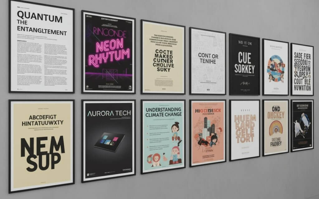
- Academic and Scientific Posters: Sans serif fonts like Helvetica, Arial, or Calibri work well because they are easy to read and look authoritative. These fonts do not distract from the data. For science posters, choose fonts with clear numbers and math symbols.
- Event and Entertainment Posters: More expressive fonts that show the energy of the event. Music posters might use bold fonts that create a visual rhythm, while art posters could use elegant serif fonts. The font should match the event’s style while being easy to read for important information like dates and times.
- Commercial and Business Posters: Fonts that show the brand and help with sales. Retail posters often use clean, modern sans serif fonts that show trust, while luxury brands might use serif fonts that show exclusivity.
- Educational and Informational Posters: Need to be easy to read for different people. These posters usually use sans serif fonts for the main text, with more unique fonts for headlines. Choose fonts with good spacing and clear letters for people who are reading quickly or from an angle.
- Community and Public Service Posters: Need to be easy to understand and appeal to everyone. Simple sans serif fonts are often best, though serif fonts can work if the message needs to sound more serious.
- Artistic Posters: Can use more experimental fonts, where the font is part of the art. These posters might use custom fonts or unusual designs. But even art posters need to balance art with communication.
| Poster Type | Recommended Font Category | Key Characteristics | Example Applications |
|---|---|---|---|
| Scientific/Academic | Clean Sans Serif | High legibility, professional appearance | Research presentations, conference posters |
| Entertainment | Display/Decorative | Expressive, personality-driven | Concert announcements, festival promotions |
| Commercial | Modern Sans Serif | Brand-aligned, trustworthy | Product launches, sales promotions |
Now that we’ve explored font categories, let’s discuss font size poster guidelines and readability standards to ensure your message is effectively communicated.
Font Size Poster Guidelines and Readability Standards What are the optimal font sizes for different poster elements and viewing distances?Choosing the right font size poster means understanding how distance, font styles, and eyesight work together. Unlike books or websites, posters need to be easy to read from different distances.
Poster Font Size Guidelines- Establish Viewing Distance: The basic rule for poster font sizes is that text should be easy to read from the intended distance. For most posters, headlines should be easy to see from at least 10-15 feet away, and body text should be readable from 3-5 feet.
- Size Headlines Appropriately: Headline text usually needs to be between 36 and 72 points, depending on the font and poster size. Bold fonts might work at smaller sizes, while lighter fonts might need to be larger.
- Set Subheading Sizes: Subheading text usually works well in the 24 to 36-point range, creating a clear difference from the body text. Use different font weights along with size changes to make the hierarchy stronger.
- Optimize Body Text: Body text for posters should be between 14 and 24 points, which is larger than text in books. This larger size is needed because of the viewing distance and the need to quickly understand the information.
- Adjust Line Spacing: Good spacing between lines keeps the text from looking crowded and improves readability. A good rule is to use line spacing that is 120-150% of the font size, but this can change based on the font and design.
With a solid understanding of font size poster guidelines, let’s explore some of the top sans serif fonts that excel in poster design.
Top Sans Serif Fonts for Posters Which sans serif fonts provide the best readability and visual impact?Sans serif fonts for posters are popular for poster design because of their clean look, readability, and modern style. These fonts do not have decorative serifs, which makes them easy to read in different sizes and conditions. The best font for poster combines visual impact with readability, making them good for both headlines and body text.
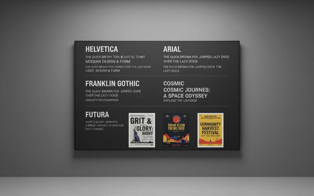
- Helvetica: A top choice for posters because it is versatile and recognizable. Designed in 1957, this font is clear and neutral, making it suitable for almost any poster. Its large family includes different weights and styles, allowing designers to create complex designs within one font.
- Franklin Gothic: A basic sans serif font that has influenced poster design for over a century. Created by Morris Fuller Benton, this font was first used for newspaper headlines before being used in advertising. Its strong character and readability make it good for bold headlines.
- Futura: A geometric sans serif font with a clean, mathematical look inspired by Bauhaus design. This font combines a retro feel with a futuristic appeal, making it good for posters that need to look modern and timeless.
- Arial: While similar to Helvetica, offers advantages for poster design, especially in digital uses. Its availability on computers and good screen display make it a reliable choice for posters that will be shown digitally.
- Proxima Nova: A modern sans serif font that combines geometric precision with a friendly feel. This font is versatile for different posters, from business to creative. Its large family provides many options, allowing for complex designs while maintaining a consistent style.
- League Gothic: A condensed sans serif font that maximizes impact while saving space. This font’s tall, narrow shape creates dramatic headlines that grab attention. Its authoritative style makes it good for serious posters.
Another excellent option for headlines and branding materials requiring strong visual impact is the MultiDisplay Poster Font, a modern sans-serif designed specifically for poster applications.
While sans serif fonts offer clean readability, serif and decorative fonts can add unique character to your poster designs. Let’s explore some of the best options for maximum impact.
Best Serif and Decorative Fonts for Poster Impact When should designers choose serif or decorative fonts for maximum visual impact?Serif and decorative letter fonts for posters give poster designers chances to create unique looks and connect with people. While these fonts need more care than sans serif fonts, they can provide unmatched style when used well. The key is knowing when and how to use these fonts for the best impact.
Premium Serif and Decorative Font Options- Trajan: Shows classical elegance with its inspiration from ancient Roman writing. This all-capitals font brings importance to poster designs, making it good for cultural events or luxury brands. Its carved look works well for headlines, though its uppercase-only style needs attention for longer text.
- Bodoni: Shows the dramatic contrast possible with serif fonts, with strong differences between thick and thin lines that create visual tension. This design brings classical elegance to modern posters, especially for fashion or luxury goods.
- Times New Roman: While common in text, can provide a reliable serif style for posters that need a traditional look. Its familiar appearance shows trust, making it good for schools or government posters.
- Script Fonts: Like Brush Script can add personality to posters, especially for informal events. These fonts work best in headlines where their style helps communication.
- Display Fonts: Designed for large sizes provide another category of decorative options. Fonts like Impact offer bold character that works well for event posters. These fonts usually sacrifice subtle style for bold presence.
- Custom Fonts: Represent the ultimate in decorative poster typography, offering unique character that cannot be copied by standard fonts. While needing more time to create, custom fontscan create memorable posters that stand out.
| Font Category | Best Applications | Advantages | Considerations |
|---|---|---|---|
| Classical Serif | Cultural events, luxury brands | Elegance, authority, tradition | May require larger sizes for clarity |
| Modern Serif | Fashion, contemporary art | Sophistication, visual contrast | Fine details need quality reproduction |
| Script Fonts | Personal events, creative businesses | Warmth, personality, uniqueness | Limited to headline applications |
| Display Fonts | Promotional materials, events | Maximum impact, bold presence | Sacrifice subtlety for visibility |
When selecting fonts, it’s also important to consider whether your poster will be displayed physically or digitally. Let’s examine the key differences and considerations.
Font for Poster Board – Physical vs Digital Considerations How do font choices differ between physical poster boards and digital displays?The way a poster is displayed affects font choice, with physical and digital posters having different needs. Knowing these differences helps designers choose the best fonts for each situation.
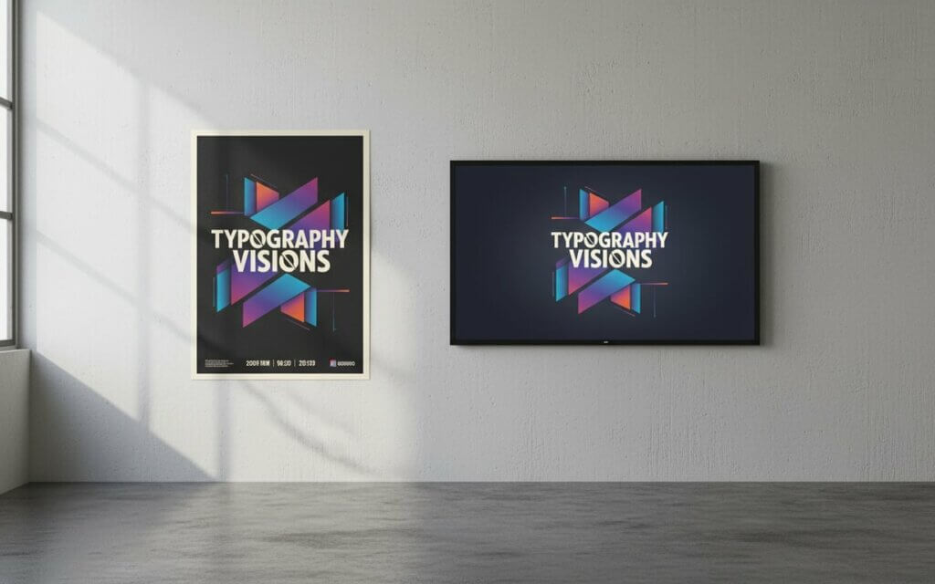
- Lighting Variability: Physical posters need fonts that are clear in different lighting and viewing angles. Natural light changes during the day, and artificial light can create shadows that affect readability. Fonts with strong contrast work better in these conditions.
- Print Resolution Impact: High-resolution printing allows for fine details, while lower-resolution printing needs fonts with stronger features. Consider the printing method when choosing fonts—printing on smooth paper can reproduce fine details that might be lost on rough materials.
- Viewing Duration: People often look at physical posters for longer, allowing for more detailed fonts that enhance the design.
- Screen Resolution Limitations: Lower-resolution screens might not show fine font details clearly, making sans serif fonts with clean lines better choices. Digital posters often compete with other visuals, needing fonts with a strong presence.
- Display Technology Variations: Screen refresh rates can affect how fonts look in digital uses. LED screens might show fonts differently than LCD screens, and outdoor billboards have different needs than indoor monitors.
- Interactive Requirements: Interactive digital posters have additional needs, as people might interact with the content from different distances. Touch-screen applications need fonts that are easy to read up close while maintaining hierarchy for users scanning from further away.
- Color Reproduction Differences: Digital screens usually offer more vibrant colors, while printed materials might have more subtle colors. Choose fonts that work well with your color scheme across both media types if your poster will be in multiple formats.
Finally, let’s discuss poster typography pairing and hierarchy to create visually appealing and well-organized poster designs.
Typography Pairing and Hierarchy in Poster Design How can designers effectively combine multiple fonts and create clear visual hierarchy?Good poster typography pairing creates visual interest while maintaining clear hierarchy in poster designs. Combining different fonts for posters requires understanding how they interact and guide attention. Good pairing enhances both looks and effectiveness.
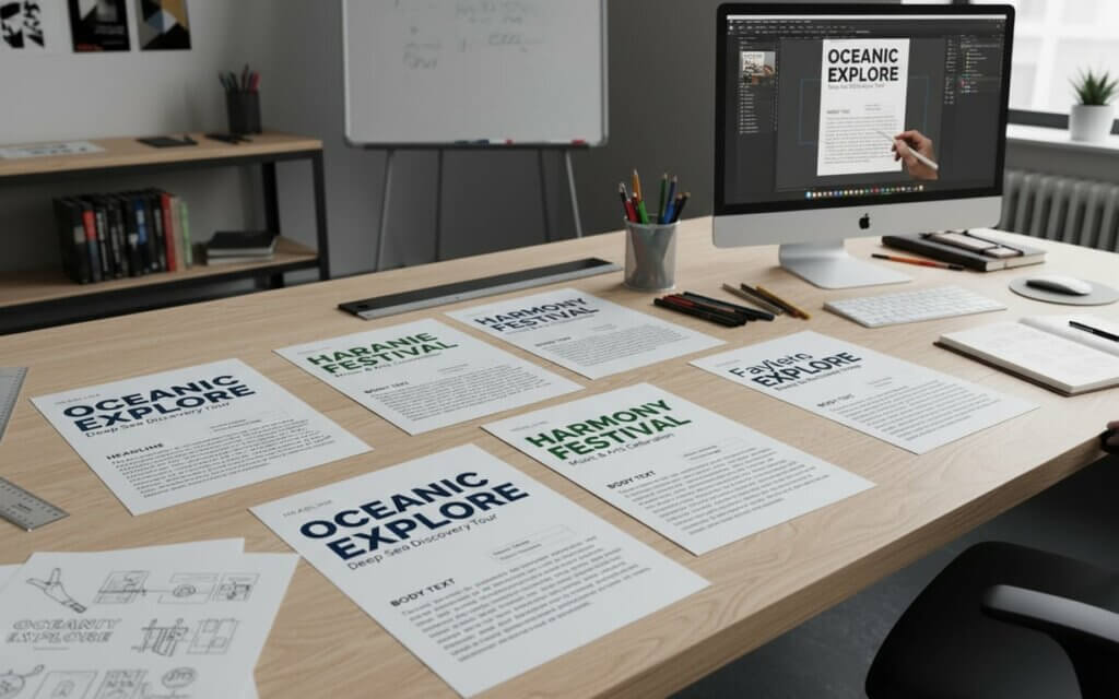
- Create Contrast with Harmony: The main idea of font pairing is to create contrast while maintaining harmony. Contrast can be created through different font categories, weights, or styles. However, the fonts should share some common features to create visual unity.
- Establish Clear Hierarchy: Creating clear hierarchy needs strategic use of font size, weight, and style. The most important information should be the largest, while supporting information uses smaller sizes. This hierarchy should guide people through the poster’s content.
- Limit Font Families: Using fewer fonts usually produces better results than using many different fonts. A good rule is to use no more than two or three font families per poster, using variations within those families to create hierarchy.
- Consider Emotional Associations: Consider the emotional associations of different font combinations. Pairing a traditional serif font with a modern sans serif might suggest a bridge between classic and modern values.
- Test at Actual Size: Testing font combinations at actual size reveals how well the pairing works. Fonts that look good on a computer might not work well when printed at poster size. Create test prints to evaluate your choices.
- Optimize Spacing and Alignment: Spacing plays a crucial role in font pairing. Consistent spacing creates visual unity, while strategic alignment guides the eye. Consider how line spacing works to create readable text that supports the design.
- What is the best font size for poster headlines? Poster headlines should be between 36 and 72 points, depending on the viewing distance. For the best impact, make sure headlines are easy to read from at least 10-15 feet away. Bold fonts may work at smaller sizes, while lighter fonts need larger sizes.
- Should I use serif or sans serif fonts for scientific posters? Sans serif fonts are usually better for scientific posters because they are clear and professional. Fonts like Helvetica maintain readability while showing objectivity. These fonts also ensure clear numbers and symbols.
- How many different fonts should I use in one poster? Use a maximum of two or three font families per poster. This maintains consistency while providing enough contrast. Use variations within font families rather than adding more fonts.
- What fonts work best for outdoor poster displays? Outdoor posters need fonts with strong contrast to remain readable in different lighting. Sans serif fonts like Franklin Gothic work well outdoors. Avoid fonts with fine details that may become invisible in sunlight.
- Can I use decorative fonts for poster body text? Decorative fonts should be limited to headlines rather than body text. Their ornate style can hurt readability when used for longer text. Use decorative fonts for titles where their style helps communication.
- How do I ensure my poster fonts are readable from a distance? Test your font choices by printing samples at actual size. Make sure there is enough contrast between text and background, use good font sizes, and choose fonts with clear letters. Avoid condensed fonts for distance viewing.
- What’s the difference between fonts for digital vs. printed posters? Digital posters benefit from fonts optimized for screen display, usually sans serif fonts that display well at different resolutions. Printed posters can use more detailed fonts, as high-resolution printing can reproduce fine details.
- How do I create effective font hierarchy in poster design? Create hierarchy through font size, weight, and style. The most important information should use the largest size, while supporting details use the smallest size. Maintain consistent spacing to guide viewers.
- Are there free fonts that work well for professional posters? Yes, there are many free fonts that work well for posters. Google Fonts offers options like Open Sans for sans serif needs, while fonts like Libre Baskerville provide serif alternatives. Always check licensing terms.
- How do I choose fonts that match my brand identity? Select fonts that match your brand’s style while meeting poster needs. Modern brands might use sans serif fonts, while traditional brands could use serif fonts. Consider your brand’s guidelines and adapt them for posters.

I'm a programmer at heart. But in my 20s, I realized there was more to the world of fonts than just Courier.
Driven by endless curiosity, I built a system to explore them.
That project grew into one of the world’s leading font identifier platforms: www.WhatFontIs.com.
By 2024, WhatFontIs is helping nearly one million designers—famous or not—discover the names of the fonts they need.