
Contains public sector information licensed under the Open Government Licence v1.0.
Kinneir did not treat signs as decoration. He treated them as decision tools. In fast, noisy, stressful contexts,
every letter, shape, and contrast choice affects reaction time. His work with Calvert turned signage into a disciplined
communication system built for real-world conditions—not for studio perfection.
Road signs are read in motion, often with partial attention, variable light, bad weather, and little time.
Kinneir’s mindset was simple: design for what people can reliably process at speed. That means less ambiguity,
cleaner hierarchy, and stronger visual cues.
“What do I want to know, trying to read a sign at speed?”
That question still sounds like modern product design: what does the user need now, and can they understand it instantly?
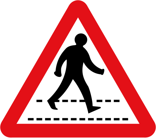
Major contribution: the Transport typeface systemFor UK motorway and all-purpose road reforms, Kinneir and Calvert developed an integrated system:
typefaces, symbol language, color logic, and consistent sign architecture. The Transport typeface became
central to this approach, built for legibility through clear character forms, controlled weight, and strong
word-shape recognition with upper and lower case.
- Test in real conditions, not ideal ones. Design must survive speed, distraction, glare, and stress.
- Reduce cognitive load. Fewer decisions, clearer hierarchy, faster comprehension.
- Design for edge cases first. If it works in poor conditions, it works almost everywhere.
- Prioritize clarity over visual ego. The best interface is the one users understand immediately.
Long before “human-centered design” became a standard phrase, Kinneir and Calvert practiced it at national scale.
Their signage legacy remains a practical blueprint for digital products: make critical information obvious, readable,
and trustworthy when users need it most.

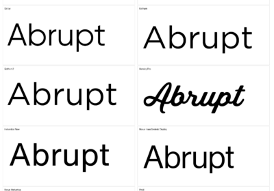
I'm a programmer at heart. But in my 20s, I discovered there was a whole world of fonts beyond Courier.
Curiosity got the better of me, so I started building a system to explore and identify them.
What began as a personal project eventually grew into WhatFontIs.com, one of the world's leading font identification platforms.
Today, WhatFontIs helps nearly one million designers—from everyday creatives to some of the biggest names in the industry—find the fonts they're looking for.