Movie fonts are more than just text; they’re a visual gateway to the cinematic experience. The right typeface can instantly evoke a specific genre, era, or emotional tone, setting the stage for the story to unfold.
This guide explores the captivating world of classic movie fonts, from the elegant Art Deco styles of Old Hollywood to the genre-defining typography of iconic films.
We’ll examine how these fonts create lasting impressions, influence design trends, and continue to inspire modern applications. Whether you’re a designer, film enthusiast, or simply curious about the power of typography, this guide will provide insights into the art and impact of classic movie fonts.
Table of Contents- What makes font movie typography so captivating
- Old Hollywood fonts that defined an era
- Film title fonts across different movie genres
- Typographic movie posters and their visual impact
- Iconic typefaces from legendary films
- How to choose the best fonts for movie titles
- Modern applications of classic movie typography
- Frequently Asked Questions
The psychology behind movie title typography extends far beyond simple text display. When audiences encounter a film title, their brains process multiple visual cues simultaneously, creating instant associations with genre, era, and emotional tone. This phenomenon occurs because typography serves as a visual shorthand for complex narrative concepts.
The captivating nature of movie font style lies in their ability to establish immediate emotional connections. A carefully crafted typeface can evoke nostalgia, tension, romance, or adventure within milliseconds of viewing. This psychological impact stems from our collective visual memory, where certain letterforms have become deeply associated with specific cinematic experiences through decades of consistent usage.
Movie title typography also functions as a promise to the audience. The visual treatment of a film’s title creates expectations about production quality, storytelling approach, and target demographic. When designers successfully align typography with narrative content, they create a cohesive brand experience that enhances viewer engagement and memorability. This alignment between visual presentation and story content represents the fundamental principle that makes film typography so compelling and effective in the entertainment industry. Now that we’ve explored the captivating nature of movie typography, let’s delve into the specific fonts that defined the golden age of Hollywood.
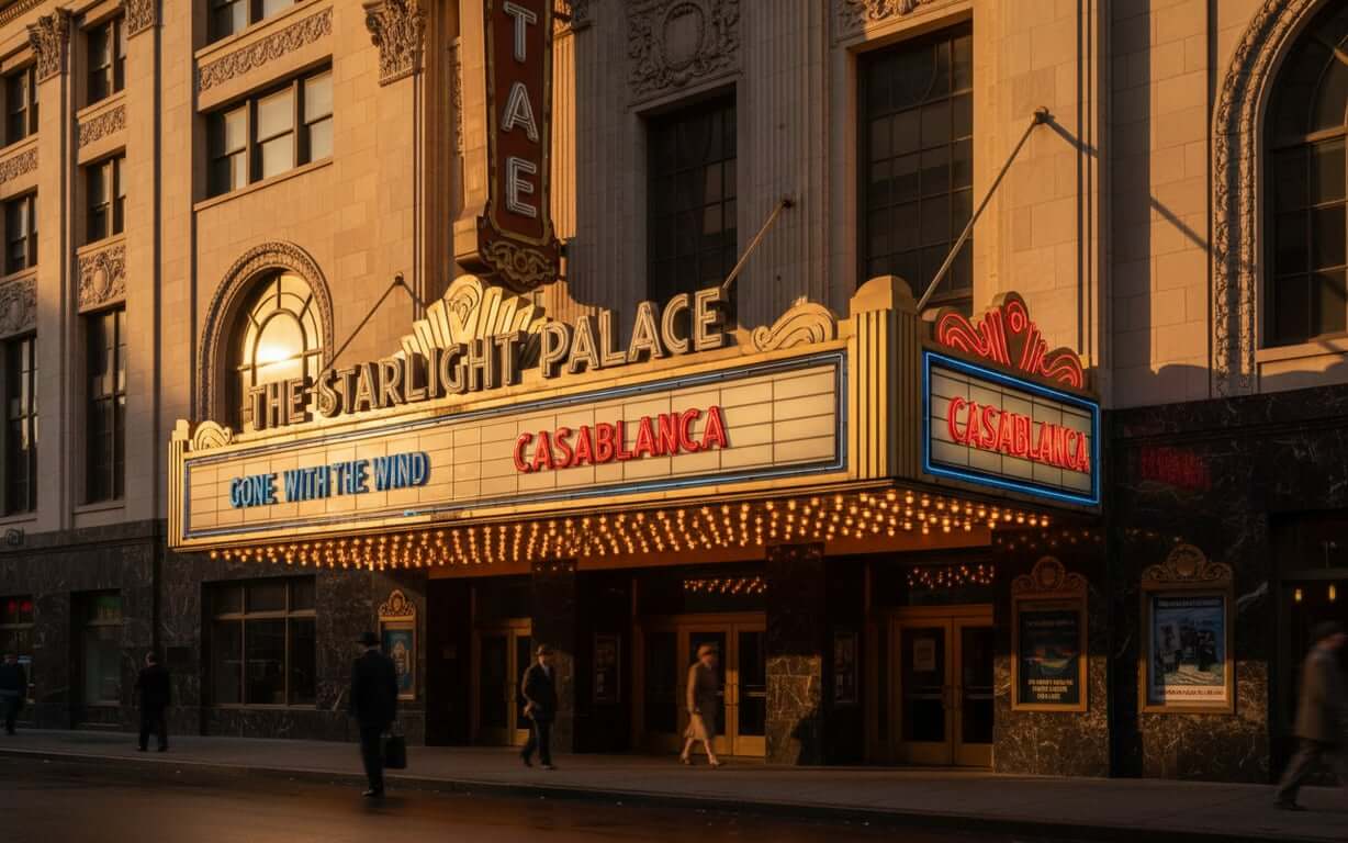
Old Hollywood fonts that defined an eraThe golden age of Hollywood established typography standards that continue to influence modern cinema. During the 1930s through 1950s, studios developed distinctive visual languages that reflected the glamour, sophistication, and optimism of American entertainment culture. These classic film fonts, such as the bold, retro Fifties Movies Font, embodied the era’s aesthetic values while serving practical marketing purposes.
Art Deco influences dominated early Hollywood typography, with geometric letterforms and elegant serifs becoming synonymous with prestige productions. Fonts such as Theater District JNL Font, with its bold, geometric Art Deco influences, perfectly represent the golden age of cinema typography. Typefaces like Trajan, with its carved Roman capital letters, became the foundation for epic historical dramas and prestigious studio releases. Meanwhile, script fonts and decorative serifs conveyed romance and sophistication in dramatic productions. Another example of a font ideal for movie posters and retro-themed designs is Cinerama-Regular Font, with its bold, shadowed, three-dimensional look.
The studio system’s approach to typography emphasized consistency and brand recognition. Major studios like MGM, Paramount, and Warner Brothers developed signature typographic styles that audiences could instantly recognize. This systematic approach created visual hierarchies that distinguished A-list productions from B-movies, establishing typography as a crucial element of film marketing and audience expectations.
Retro film fonts from this period possessed unique characteristics that modern designers still emulate. Hand-lettered titles, custom ligatures, and carefully crafted spacing created distinctive personalities for each production. The craftsmanship evident in these vintage typefaces reflects an era when typography was considered an art form integral to cinematic storytelling, not merely functional text display. Fonts like Home Movies JNL Font, with its bold, geometric, vintage movie poster style, exemplify this attention to detail. Each letterform received meticulous attention, with designers spending weeks perfecting curves, weights, and proportions to achieve the desired emotional resonance. Having explored the fonts that defined Old Hollywood, let’s examine how typography varies across different movie genres.
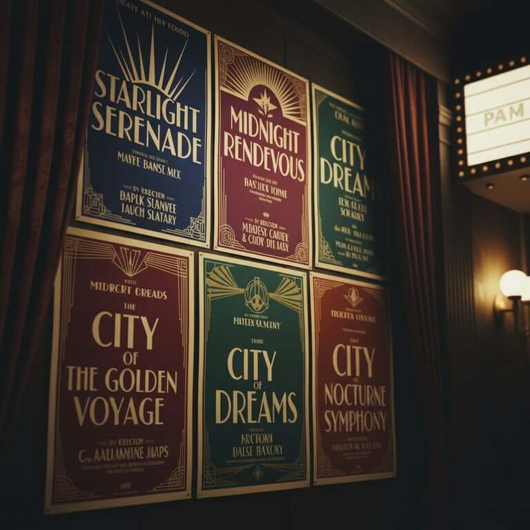
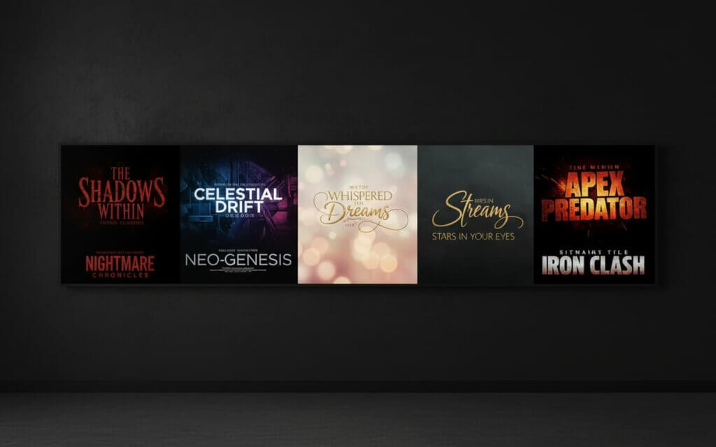
Film title fonts across different movie genresGenre-specific typography serves as an immediate communication tool, allowing audiences to identify film categories before reading plot descriptions or viewing trailers. This visual categorization system has evolved through decades of consistent associations between letterform characteristics and narrative themes.
Horror films traditionally employ distressed, angular, or blood-dripping typefaces that suggest danger and unease. These fonts often feature irregular spacing, broken letterforms, or organic textures that mirror the genre’s emphasis on fear and supernatural elements. Classic examples include the jagged lettering of slasher films and the gothic serifs of supernatural thrillers, where each letterform seems to carry its own sense of menace.
[Image suggestion]: Comparison of typography styles used across different movie genres from horror to romance
Science fiction productions favor clean, futuristic typefaces that suggest technological advancement and otherworldly settings. Sans-serif fonts with geometric precision, extended letterforms, or digital-inspired treatments communicate themes of progress, space exploration, and technological innovation. The best fonts for movie titles in this genre often incorporate subtle lighting effects or metallic textures that reinforce the connection to advanced technology and distant futures.
Romantic comedies and dramas typically utilize elegant serif fonts or flowing script typefaces that convey warmth, intimacy, and emotional connection. These choices reflect the genre’s focus on human relationships and personal growth. The typography often features softer edges, graceful curves, and harmonious proportions that mirror the genre’s optimistic worldview.
Action and adventure films demand bold, dynamic typography that communicates energy and excitement. These titles frequently use condensed or expanded letterforms with strong vertical or horizontal emphasis, creating visual tension that mirrors the genre’s high-stakes narratives. The typography needs to feel powerful and immediate, capturing attention while suggesting the physical intensity of the film’s content.
| Genre | Typical Font Characteristics | Emotional Impact |
|---|---|---|
| Horror | Distressed, angular, irregular | Fear, tension, unease |
| Science Fiction | Clean, geometric, futuristic | |
| Romance | Elegant serifs, flowing scripts | Warmth, intimacy, emotion |
| Action/Adventure | Bold, dynamic, impactful | Excitement, energy, power |
Genre-specific typography is a powerful tool for filmmakers. Next, we’ll explore how typography impacts movie posters and their visual appeal.
Typographic movie posters and their visual impactTypographic movie posters functions as the primary visual hook in competitive entertainment markets. For a comprehensive analysis of movie poster fonts and design choices, exploring resources on Poster Design for Movies can provide valuable insights. The strategic placement, sizing, and styling of text elements can determine whether potential viewers pause to examine a poster or continue scrolling past promotional content. This critical first impression often influences box office performance and audience engagement.
Effective typographic movie posters balance multiple competing elements while maintaining clear information hierarchy. The film title must dominate the composition without overwhelming supporting imagery, while cast names, taglines, and release information require strategic positioning for maximum impact. Successful designs create visual flow that guides viewer attention through all essential information in a natural reading sequence.
The relationship between typography and imagery in movie posters requires careful consideration of contrast, color harmony, and spatial relationships. Text must remain legible across various backgrounds while complementing photographic or illustrated elements. This challenge has led to innovative solutions including custom lettering, creative text treatments, and integrated typographic designs that become inseparable from the poster’s overall aesthetic.
Classic movie title treatments often become more memorable than the films themselves, demonstrating typography’s power to create lasting cultural impact. Iconic poster designs establish visual languages that influence entire genres and inspire countless imitations. The most successful typographic movie posters achieve perfect synthesis between textual information and visual storytelling, creating unified artistic statements that enhance the film’s marketing effectiveness while standing as compelling design works in their own right. From posters, we move to iconic typefaces and their impact on legendary films.
Iconic typefaces from legendary filmsCertain movie fonts have transcended their original contexts to become cultural touchstones, instantly recognizable symbols that evoke specific films or entire cinematic movements. These typefaces demonstrate typography’s power to create lasting emotional connections and influence popular culture beyond the entertainment industry.
The Star Wars opening crawl typography, based on News Gothic, established a visual language for space opera that countless productions have referenced or imitated. This font choice, combined with the distinctive yellow text treatment, created an immediately recognizable brand element that has remained consistent across decades of franchise expansion. The typeface’s clean, authoritative appearance perfectly complements the saga’s epic scope and mythological themes, while its readability ensures the scrolling text remains legible even as it recedes into the distance.
Saul Bass revolutionized movie title typography through his work on films like “Vertigo,” “North by Northwest,” and “Psycho.” His innovative approach combined custom lettering with kinetic design principles, creating title sequences that functioned as integral story elements rather than mere credits. Bass’s typography choices, often featuring modified Helvetica or custom geometric fonts, established new standards for cinematic visual communication that influenced generations of designers.
The Indiana Jones franchise typography, inspired by adventure serial posters and pulp magazine covers, demonstrates how font selection can instantly communicate genre and era. The distinctive letterforms, with their bold serifs and dynamic spacing, evoke 1930s adventure aesthetics while maintaining contemporary appeal. This successful fusion of historical reference and modern design principles has influenced countless action-adventure productions seeking to capture similar nostalgic excitement.
Horror cinema has produced numerous iconic typographic treatments, from the dripping letters of “The Shining” to the distressed metal typography of “Alien.” These fonts often become as memorable as the films’ visual imagery, contributing to the genre’s ability to create lasting psychological impact through purely typographic means. Each letterform carries the weight of the film’s atmosphere, transforming simple text into visceral visual experiences. With so many options, how do you choose the best fonts for movie titles?
How to choose the best fonts for movie titlesSelecting appropriate typography for film titles requires balancing multiple considerations including genre expectations, target audience preferences, and practical marketing requirements. The decision-making process should begin with thorough analysis of the film’s core themes, visual style, and intended emotional impact on viewers.
Genre conventions provide essential starting points for font selection, but successful titles often subvert expectations while maintaining enough familiar elements to communicate effectively with audiences. The best fonts for movie titles achieve this balance by incorporating subtle variations on established patterns, creating fresh interpretations of recognizable typographic languages that feel both familiar and innovative.
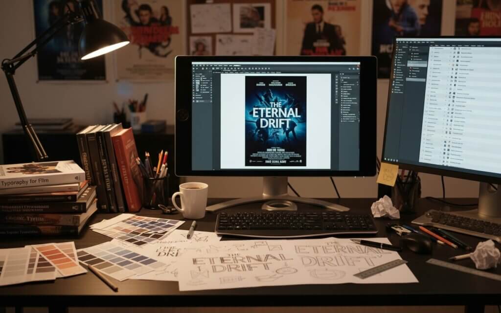
Legibility across multiple media formats represents a crucial practical consideration in modern film marketing. Typography must remain effective on large theater screens, small mobile devices, social media thumbnails, and print advertisements. This requirement often favors fonts with strong contrast, clear letterform definition, and appropriate spacing for various reproduction sizes. Testing typography at different scales during the selection process helps ensure consistent performance across all marketing channels.
The relationship between title typography and supporting design elements requires careful coordination throughout the marketing campaign. Font choices should complement poster imagery, trailer graphics, and digital marketing materials while maintaining consistent brand identity across all touchpoints. This comprehensive approach ensures maximum marketing effectiveness and audience recognition, building a cohesive visual language that strengthens the film’s presence in the marketplace. Finally, let’s explore modern applications of classic movie typography.
Modern applications of classic movie typographyContemporary designers increasingly draw inspiration from vintage Hollywood typography, adapting retro film fonts for modern projects while respecting their historical significance. This trend reflects growing appreciation for craftsmanship and authenticity in an increasingly digital design landscape where audiences crave connections to tangible creative traditions.
Streaming platforms and digital media have created new opportunities for retro film fonts to reach contemporary audiences. Netflix, Amazon Prime, and other services frequently employ vintage-inspired typography for period productions, documentary series, and nostalgic content that benefits from historical visual references. These applications demonstrate how old hollywood fontsmaintain relevance in modern entertainment contexts, bridging past and present through thoughtful typographic choices.
Brand identity projects often incorporate classic movie typography to convey heritage, quality, and emotional connection with consumers. Restaurants, fashion brands, and luxury products frequently reference golden age Hollywood aesthetics through carefully selected vintage-inspired typefaces that suggest sophistication and timeless appeal. The association with cinema’s glamorous past lends products an air of established credibility and cultural refinement.
The key to successful modern applications lies in understanding the cultural context and emotional associations of classic typography while adapting these elements for contemporary communication needs. Effective implementations respect the original design principles while updating technical specifications and usage contexts for current media requirements. This approach allows designers to honor typographic heritage while creating work that feels fresh and relevant to today’s audiences.
Frequently Asked Questions What font is most commonly used in movie titles?Trajan Pro is widely considered the most popular movie title font, especially for epic and dramatic films. Its carved Roman capital letters convey authority and timelessness, making it ideal for historical dramas, action films, and prestige productions.
How do I identify fonts used in classic movies?Font identification tools like WhatFontIs.com can help identify movie typography from screenshots or poster images. Additionally, film typography databases and design blogs often catalog famous movie fonts with detailed information about their usage and availability.
Are classic movie fonts available for commercial use?Many classic movie fonts are available through commercial font foundries, though some require licensing fees. Custom lettering created specifically for films may not be available as complete typefaces, but similar alternatives are often offered by font designers.
What makes a movie font “timeless”?Timeless movie fonts typically feature balanced proportions, clear letterforms, and design elements that transcend specific trends. They successfully communicate their intended message without relying on temporary stylistic flourishes that may appear dated over time.
How has digital technology changed movie typography?Digital technology has expanded creative possibilities for movie typography through advanced effects, animation capabilities, and precise control over letterform details. It has also increased the importance of designing fonts that work effectively across multiple digital platforms and screen sizes.
What role does color play in movie title typography?Color significantly impacts the emotional effect of movie typography, with different hues conveying specific moods and genre associations. Red suggests danger or passion, blue implies technology or coldness, while gold conveys luxury and prestige.
Can I use movie fonts for my own projects?Usage rights depend on the specific font’s licensing terms. Many movie-inspired fonts are available for commercial use, while others may be restricted to personal projects. Always check licensing agreements before using fonts in commercial applications.
What’s the difference between custom lettering and movie fonts?Custom lettering is created specifically for individual films and may not include complete character sets, while movie fonts are complete typefaces that can be used for various text applications. Custom lettering offers unique design solutions but limited versatility.
How do movie fonts influence audience expectations?Movie fonts create immediate psychological associations that help audiences categorize films by genre, quality level, and target demographic. These visual cues influence viewing decisions and set expectations about the film’s content and production values.
What trends are currently popular in movie typography?Current trends include minimalist sans-serif fonts for contemporary dramas, retro-inspired typography for nostalgic content, and custom lettering that integrates with poster imagery. There’s also growing interest in variable fonts that can adapt to different media formats while maintaining consistent brand identity.
Timeless Typography: A Lasting ImpressionClassic movie fonts continue to shape visual culture, influencing design trends and evoking powerful emotions. From the golden age of Hollywood to modern streaming platforms, these typefaces create lasting impressions that resonate with audiences. By understanding the history, psychology, and practical applications of movie typography, designers and film enthusiasts can appreciate the art and impact of these iconic visual elements. As you explore your next design project or watch your favorite film, consider the subtle yet powerful role that typography plays in shaping our cinematic experiences.