
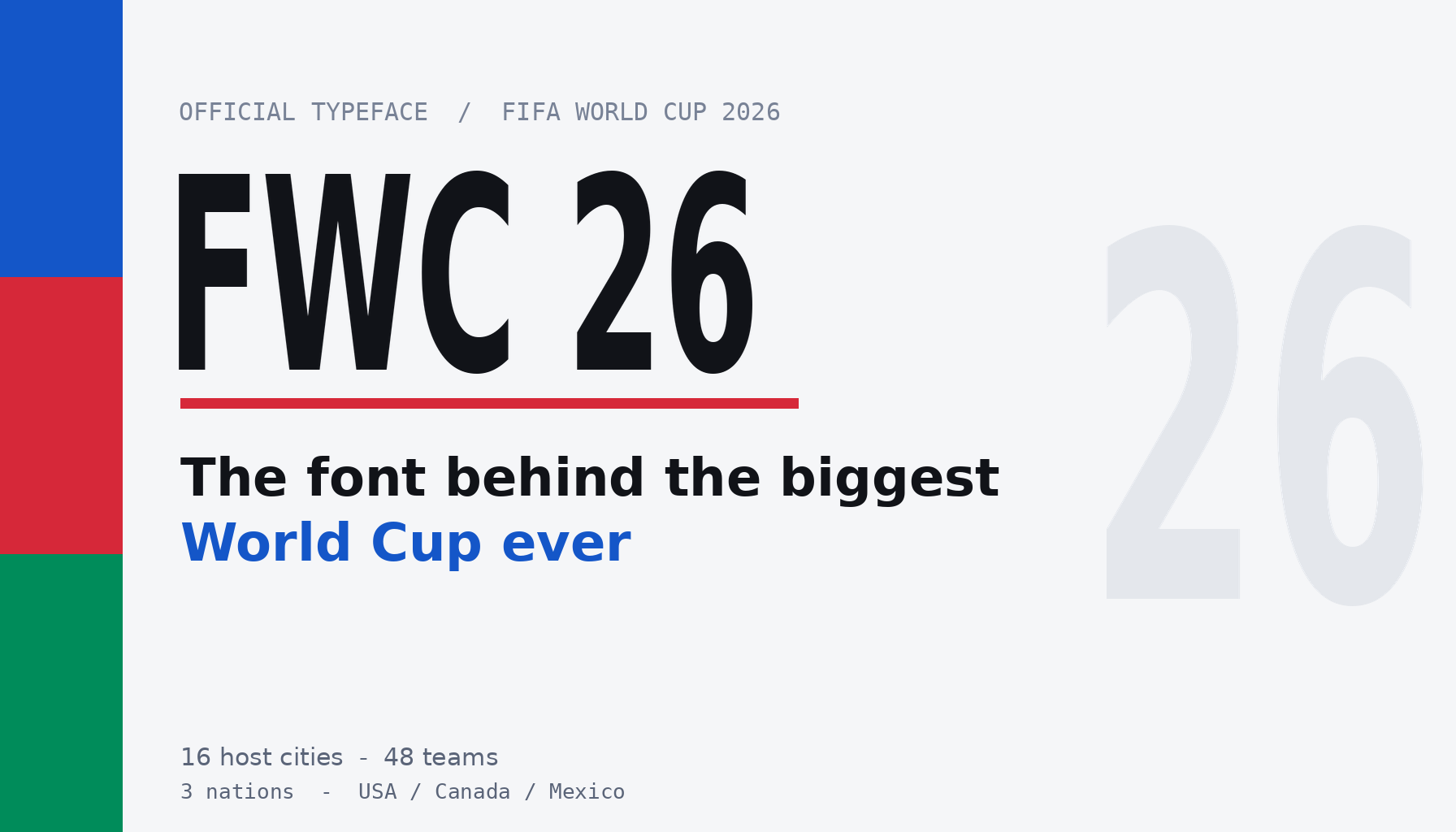
The 2026 World Cup kicks off this month, and it’s a monster: 48 teams, three host countries, and matches sprawled across the United States, Canada, and Mexico. Before a single ball is kicked, though, there’s a quieter star already plastered on every banner, ticket, and stadium tunnel. It’s the tournament’s custom typeface, FWC 2026, and the story of who made it is more interesting than you’d expect.
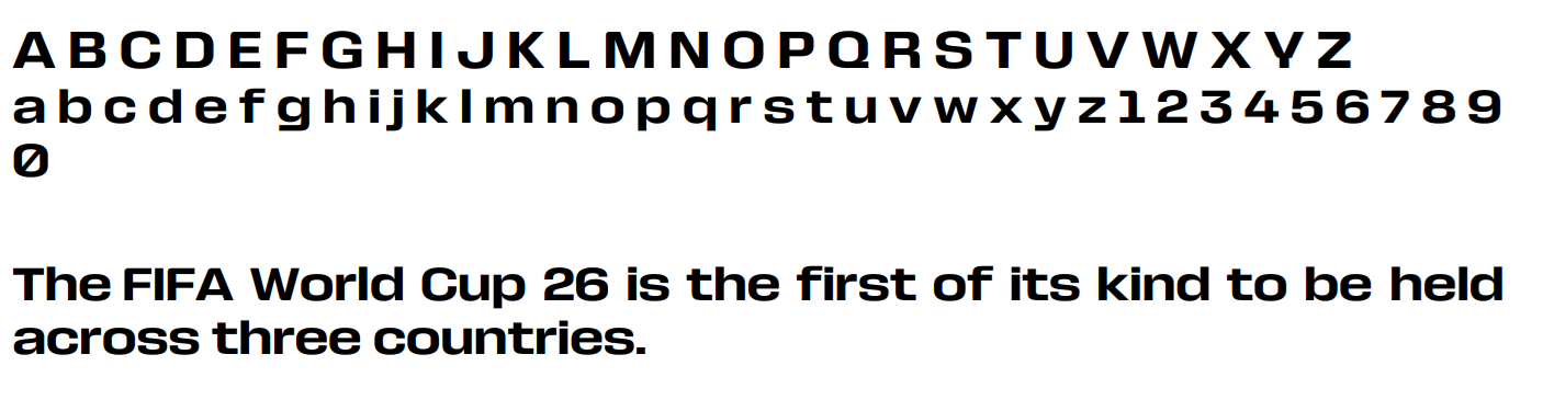
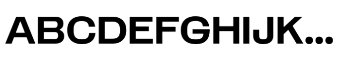
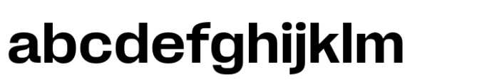
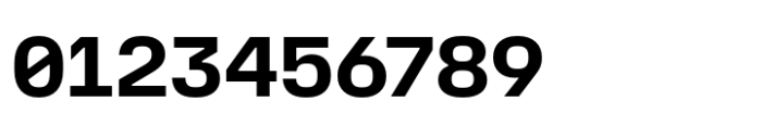
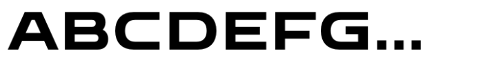
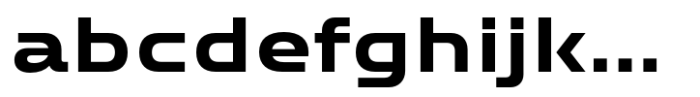
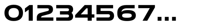
Meet FWC 2026FIFA didn’t reach for an off-the-shelf sans this time. The official tournament face — the FWC 2026 font (you’ll also see it written FWC 26) — is a custom ultra-condensed black geometric sans-serif. Translated out of type-nerd speak: the letters are tall, tightly packed, very heavy, and built on clean geometric shapes. It’s the kind of lettering that looks like it’s sprinting even when it’s standing still.
That’s by design. FIFA wanted typography with high impact, something condensed and extra-bold that reads as dynamic from across a stadium. A secondary font, Noto Sans, does the quieter supporting work, especially around the stylized “26” in the logo. But FWC 2026 is the voice of the tournament, the face you’ll see on everything from the official schedule to the giant signage hanging over the pitch.
The surprising choice of foundryHere’s the part that made me sit up. FWC 2026 has been widely attributed to Pangram Pangram, the Montreal-based foundry, although FIFA’s public IP materials focus mainly on the typeface’s protected status rather than a full design credit. Pangram Pangram built its reputation partly by giving away genuinely good fonts for personal use and charging fairly for commercial licenses — a favorite among younger designers and indie studios, not the sort of giant corporate type house you’d assume FIFA would hire for its flagship event.
If that credit holds, it means the world’s most-watched sporting event handed its lettering to a foundry beloved by the design-Twitter crowd. That would be a real shift. For years, mega-events leaned on the big legacy foundries. A pick like Pangram Pangram would signal that FIFA wanted something with contemporary edge and craft credibility, not just safe institutional polish — a quiet win for the idea that a smaller, sharper studio can land the biggest job in the room.
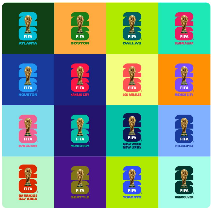
“One For All”: designing for three countries at onceThe typeface lives inside a broader identity FIFA calls “One For All”, a nod to the unusual three-nation hosting setup. The whole system leans on dynamic shapes meant to echo the movement and speed of the game, and the color palette pulls vibrant blues, reds, and whites straight from the flags of the US, Canada, and Mexico.
Designing for three countries is harder than it sounds. You can’t lean too hard into any one nation’s visual clichés, and the lettering has to feel at home next to English, French, and Spanish, with all the accents and special characters those languages demand. A condensed geometric sans is a smart base for that job. It reads as modern and neutral enough to feel shared, while still carrying enough personality to be unmistakably this tournament and not a generic sports template.
Why condensed-and-black actually works hereThere’s a practical reason FIFA went heavy and narrow. Condensed letters let you fit big, loud words into tight spaces, which matters enormously on jerseys, tickets, app screens, and signage where every pixel and inch is fought over. Black weights hold up at a distance and punch through the visual noise of a packed stadium. When 80,000 people and a few hundred million TV viewers need to register a word in half a second, subtlety loses. Impact wins.
It also photographs well. Broadcast graphics, social clips, and motion design all favor type that stays legible while it’s flying around the screen. A sturdy, geometric, condensed face survives being animated, stretched, and slapped over fast-moving footage in a way that a delicate serif simply wouldn’t.
Short answer: no, and that trips a lot of people up. Every World Cup, fans and small brands try to grab the official font to make their own posters and merch. FWC 26 is a proprietary typeface of FIFA’s, and the official FIFA World Cup 26 IP Guidelines are blunt about it: the typeface was made specifically for the tournament and is protected by copyright where applicable, plus design registration in various jurisdictions. It is not a public download.
If you want the look, the honest route is to license a similar commercial condensed black sans. Plenty exist, and several are genuinely excellent — see the picks below. Reaching for a pirated copy of the official face for a “harmless” fan graphic is the kind of thing that gets cease-and-desist letters flying, especially around an event this heavily policed. Worth knowing before you fire up your design app this summer.
Similar fonts you can actually licenseWant the FWC 26 attitude without the legal headache? A few condensed, expanded, and geometric sans options get you surprisingly close. Here are some worth a look on WhatFontIs:
Norwige Bold — a punchy bold sans with the same confident, no-nonsense weight.


Taktika Sans Demi — clean and technical, and slightly condensed — great for that sporty, systematic look.
Bantat Expanded Semi Bold — wide and heavy, for when you want letters to fill the frame.
Bizmo Semi Bold — chunky and geometric, the closest cousin to the FWC 26 vibe.


Tournament branding is one of the few times typography reaches a truly massive, non-design audience. Billions of people will read FWC 2026 without ever clocking that someone agonized over its letterforms. That’s the strange power of good event type: it’s everywhere and invisible at the same time, doing emotional work most viewers never consciously notice.
For designers, the takeaway is encouraging. A studio known for thoughtful, accessible fonts just put its hands on the most visible canvas in sport. It says craft and personality can win the brief, not only scale and legacy. So as the matches roll in, take a second to actually look at the lettering on screen. Do you think the heavy, sprinting style nails the energy of the biggest World Cup yet, or would you have wanted FIFA to take a bigger swing? I’m curious where you land.
What font is the World Cup 2026 logo?The FIFA World Cup 2026 Font — officially the FWC 2026 font (also written FWC 26) — is a custom ultra-condensed black geometric sans-serif that has been widely attributed to Pangram Pangram, the Montreal-based foundry, though FIFA’s public materials emphasize the typeface’s protected status more than a full design credit. It carries the tournament’s bold, fast-moving look across the logo, signage, and broadcast graphics, with Noto Sans doing the secondary supporting work around the “26” emblem. Because the FWC 2026 font is proprietary to FIFA and protected by copyright and design registration, it isn’t available for public download — so for a similar look, designers reach for the licensable alternatives listed above.

I'm a programmer at heart. But in my 20s, I realized there was more to the world of fonts than just Courier.
Driven by endless curiosity, I built a system to explore them.
That project grew into one of the world’s leading font identifier platforms: www.WhatFontIs.com.
By 2024, WhatFontIs is helping nearly one million designers—famous or not—discover the names of the fonts they need.

