
Imagine you ship a game update on Friday… and on Monday you find out the fonts inside your build just became 52× more expensive. That’s not a thought experiment. It hit a large chunk of Japanese game developers recently, and it’s a useful warning for anyone who ships products with fonts baked in—apps, websites, brand systems, packaging, ads.
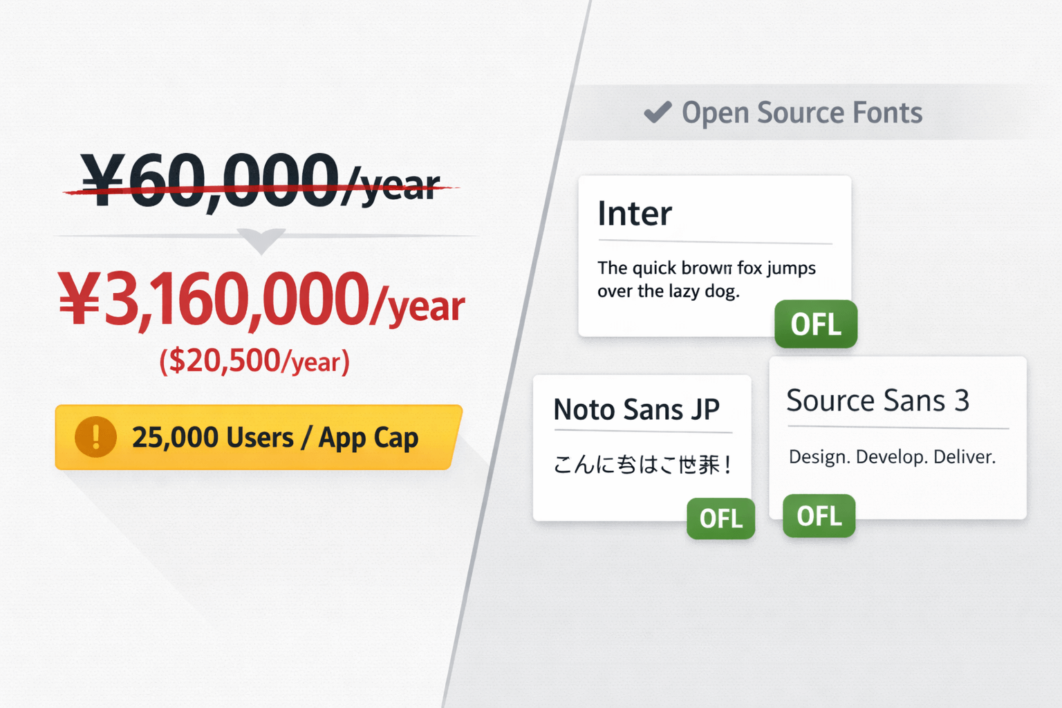
What happened: Fontworks, Monotype, and a 5,200% jumpFontworks (Tokyo) ended its long-running LETS (Leading Edge Type Solution) subscription in late November 2025. For many studios, LETS was the “sane” way to license high-quality Japanese fonts: about ¥60,000/year (roughly $380) for commercial use.
The replacement offer—managed under Monotype—landed like a hammer: about $20,500/year, plus a 25,000-user cap per application. If you publish a mobile title with any momentum, that cap can disappear in a weekend.
This didn’t come out of nowhere. In 2023, Monotype acquired Fontworks and gradually moved services toward a global subscription model. That approach can be “fine” for Western-language projects where there are countless alternatives. Japanese typography is different: each family needs coverage across thousands of kanji (plus hiragana and katakana), which makes production slower, harder, and expensive—so affordable substitutes aren’t always available.
Why you should care even if you don’t ship in JapanThis isn’t only a Japan story. It’s a signal about where font licensing is trending: fewer companies controlling more type IP, and subscription models that can change quickly. When ownership consolidates, pricing power concentrates—and the shock eventually reaches everyone, not just one market.
At the same time, demand keeps expanding. More creators, more products, more UI, more marketing assets—more fonts everywhere. That pressure is exactly why more people actively look for “safe” licensing options and fallback families, rather than building a product around a single foundry’s terms.
The real cost of ignoring font licensingThe Fontworks case is extreme, but licensing pain shows up in smaller ways all the time. If you use a font with the wrong rights—or you lose access mid-project—the bill is often paid in time, not just money:
- Forced rebrand or redesign. A license change can mean swapping type across your website, app UI, packaging, ads, and templates.
- Legal exposure. Foundries do enforce licenses, and disputes can be expensive (sometimes calculated per unlicensed use).
- Blocked releases. For games/apps, unclear embedding rights can slow or stop updates and patches.
One Japanese developer described the fallout bluntly: switching providers wasn’t just “pick another font.” It meant redoing integration, running QA again, and updating every piece of collateral that referenced the old typefaces.
5 practical habits that prevent font surprisesWhether you’re a freelancer building client sites or a studio shipping software, these five habits reduce the odds of getting trapped.
- Audit licenses once per year (minimum).
Keep a simple spreadsheet: font name, where it’s used, license type (desktop/web/app/ePub), foundry/vendor, renewal terms, and the exact files in your repo/CDN. - Identify the font before you commit.
If you spot a typeface you like in the wild, verify what it actually is and what it costs to use properly. Tools like WhatFontIs help you upload a screenshot and identify a font, then compare lookalikes (including free options). - Build a “safe” library of open fonts.
Maintain a shortlist you can ship confidently. For UI/body text, families like Inter, Source Sans 3, and Noto are popular for a reason: quality, coverage, and predictable licensing. - Avoid single-vendor dependency for critical products.
If one provider controls your entire type system, you have a single point of failure. Spread core type choices across at least two sources (or have vetted backups ready). - Watch caps: users, pageviews, installs, embedding rights.
The “gotcha” is often not the price—it’s the fine print. User caps and embedding rules can put you in breach the moment your product succeeds.
Licensing drama is real, but good work in typography hasn’t stopped. A few recent releases and updates worth keeping an eye on:
- Aeonik Soft (CoType Foundry) — a warmer, rounded companion to the neo-grotesque; multiple scripts and variable support.
- Neue DIN 2.0 (Fontwerk) — major expansion with new italic and slanted variants, pushing the family into “system” territory.
- 29LT Azahar — an ambitious variable superfamily spanning Latin/Cyrillic/Arabic in a cohesive design system.
Also worth noting: a broader swing toward typographic maximalism (type as the hero, not the supporting actor) and more intentionally human, imperfect letterforms as a counterweight to overly-polished AI aesthetics.
Frequently Asked Questions Can I use any font I find online in a commercial project?No. Fonts ship with licenses that define where and how they can be used. Some are personal-use only, others allow commercial use, and many require separate rights for desktop, web, apps, or embedding. If you’re unsure what you’re looking at, you can upload a sample to WhatFontIs to identify it and then check license options.
Why are Japanese fonts so expensive compared to Latin fonts?Japanese typefaces typically need thousands of glyphs (kanji + hiragana + katakana), often far beyond what a Latin-only family contains. That means more design, more QA, more time—plus fewer foundries producing top-tier Japanese families at scale.
What’s the safest way to use fonts on the web without licensing headaches?Use fonts with explicit open licenses (for example, SIL Open Font License). Self-host the files when possible so you control availability, and document exactly which fonts and versions your project depends on.
How do I find a free alternative to an expensive font?Start by identifying the exact font (for example with WhatFontIs), then compare visually similar alternatives. Many tools and directories let you filter for free/open options so you can choose something you can ship confidently.
Font licensing isn’t glamorous—but it’s one of the few “boring” details that can quietly blow up budgets and timelines. Track what you use, understand the terms, and keep realistic backups ready. Then you won’t be hostage to the next policy change.
*Image: AI-generated (generative AI)

I'm a programmer at heart. But in my 20s, I realized there was more to the world of fonts than just Courier.
Driven by endless curiosity, I built a system to explore them.
That project grew into one of the world’s leading font identifier platforms: www.WhatFontIs.com.
By 2024, WhatFontIs is helping nearly one million designers—famous or not—discover the names of the fonts they need.

