Fonts play a crucial role in design, acting as a visual cue that conveys mood, tone, and emotion to your audience. Selecting the right font for your project can significantly impact how your message is perceived. Fonts are generally divided into several major categories, each offering unique characteristics. Let’s explore the most common font types and when to incorporate them into your designs.
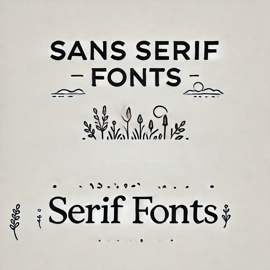
1. Serif FontsSerif fonts are characterized by small lines or strokes attached to the ends of their letterforms. These embellishments, called “serifs,” give the fonts a more classic and formal look. Serif fonts are often chosen for print media such as books, newspapers, and magazines because they provide an easy-to-read experience in large blocks of text.
Examples: Georgia, Times New Roman, Garamond
Serif fonts are perfect for professional, traditional projects such as business documents, academic writing, and high-end branding materials.
2. Sans Serif FontsSans serif fonts, as the name suggests, lack the decorative strokes found in serif fonts. Their clean, modern design makes them ideal for digital applications, where readability on screens is paramount.
Examples: Arial, Helvetica, Open Sans
Sans serif fonts work well in web design, mobile apps, and user interfaces, as they maintain clarity across a range of screen sizes. Use these fonts to create a modern, approachable look in your digital projects.
3. Script FontsScript fonts are inspired by the fluidity of handwritten text and can range from formal calligraphic styles to more playful, casual scripts. These fonts add a personal touch to designs, but due to their elaborate nature, they are best used sparingly.
Examples: Brush Script, Pacifico, Lobster
Script fonts are ideal for invitations, logos, and decorative elements that call for elegance or uniqueness. However, they can become difficult to read in long passages of text, so use them strategically for emphasis.
4. Display FontsDisplay fonts are designed to capture attention. Often elaborate and decorative, these fonts are typically reserved for headlines or specific design elements rather than body text. Their intricate details can create visual impact, but they should be used in moderation.
Examples: Impact, Bebas Neue, Playfair Display
These fonts shine in posters, advertisements, or anywhere you need to make a bold statement. Just be cautious not to overuse them, as they can overwhelm the overall design.
5. Monospaced FontsMonospaced fonts have uniform spacing between each character, which makes them a popular choice in coding and typewriting. The even character alignment helps improve readability, especially in programming environments where precision is essential.
Examples: Courier, Consolas, Source Code Pro
Monospaced fonts are frequently used in programming, typewritten documents, or any project that requires exact alignment, ensuring each character lines up perfectly.
ConclusionThe right font can make or break a design. Serif fonts offer tradition and formality, sans serif fonts deliver modernity and clarity, script fonts bring elegance and creativity, display fonts grab attention, and monospaced fonts ensure uniformity. Understanding the unique attributes of each font category helps you make informed design choices that align with your project goals, ensuring your content resonates with your audience.

I'm a programmer at heart. But in my 20s, I realized there was more to the world of fonts than just Courier.
Driven by endless curiosity, I built a system to explore them.
That project grew into one of the world’s leading font identifier platforms: www.WhatFontIs.com.
By 2024, WhatFontIs is helping nearly one million designers—famous or not—discover the names of the fonts they need.