Font psychology explores the intersection of visual design and human cognition, examining how typefaces influence our thoughts, emotions, and behaviors, both consciously and subconsciously. This field investigates the psychological mechanisms behind our responses to typography, revealing how typeface choices can significantly alter our perception of written content.
For a more comprehensive guide exploring the emotional impact of fonts in design, delve deeper into this fascinating subject.
Table of Contents- What is font psychology and why does it matter
- The science behind how fonts trigger emotional responses
- Typeface psychology across major font categories
- Emotional spectrum of fonts – from calming to aggressive
- Font meaning in text and contextual interpretation
- Designing with fonts – practical application strategies
- Real-world examples of font psychology in action
- Best practices for choosing fonts that align with your message
- Frequently Asked Questions
The psychology of fonts operates on the idea that every visual design element carries meaning beyond its functional purpose. When we read text, our brains process the words and evaluate the typeface’s visual characteristics, making quick judgments about credibility, personality, and intent. This happens so rapidly that we’re often unaware of typography’s influence.
Why font psychology matters in communication- Credibility Enhancement: Typography aligns with your message and audience expectations, creating a natural, trustworthy experience
- Emotional Influence: Font choices can evoke emotions, guide user behavior, and complement or even override the presented content
- Communication Effectiveness: Mismatched fonts can create dissonance, undermining your message and damaging credibility
- Instant Impact: A seemingly simple choice like using Comic Sans in a professional document can instantly erode trust
For more fascinating insights into font psychology and personality studies, explore some rare facts about fonts.
Now that we’ve established the importance of font psychology, let’s delve into the science that explains how fonts trigger emotional responses.
The science behind how fonts trigger emotional responses How the brain processes typographyThe link between typography and emotions arises from neurological processes that occur almost instantly when we view text. When we see different typefaces, our brains activate pattern recognition systems shaped by cultural conditioning and personal experiences. These systems automatically link visual characteristics with specific qualities, emotions, and contexts.
Cognitive psychology research shows that font personality emerges from our brain’s tendency to anthropomorphize visual elements. We unconsciously assign characteristics to typefaces, just as we describe people as “bold” or “gentle” based on appearance. A font with thick, angular strokes might seem aggressive or powerful, while one with flowing, curved lines could feel elegant or friendly.
The emotional impact of fonts is amplified by historical and cultural associations. Serif typefaces, used for centuries in formal documents, books, and academic publications, carry connotations of authority and tradition. Sans-serif fonts gained prominence during modernism, linking them to progress, clarity, and innovation.
Neuroimaging studies show that different fonts activate brain areas associated with emotion processing, suggesting that our responses to typography have neurological foundations, not just learned behaviors. These responses occur rapidly, often within 50 milliseconds, demonstrating how fundamental font emotions are to visual processing.
This neurological basis underscores the importance of considering font choices carefully, as they can have a profound and immediate impact on the reader’s emotional state.
Having explored the science behind font-triggered emotions, let’s now examine how these principles manifest across major font categories.
Typeface psychology across major font categories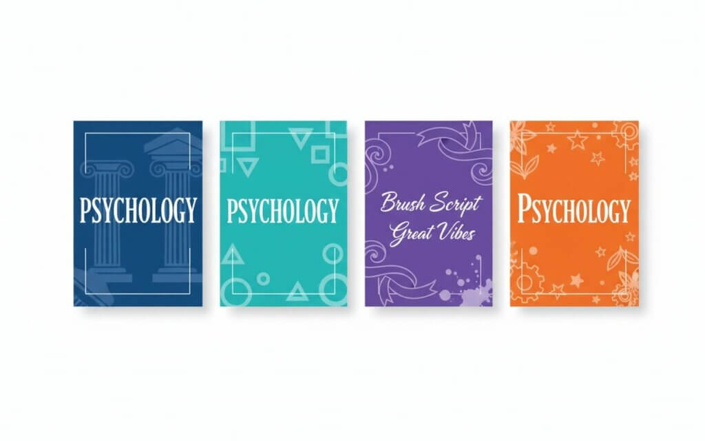
Understanding typeface psychology means examining how different font categories create distinct impressions through their visual characteristics. For a deeper dive into understanding the fundamental differences between serif and sans-serif fonts, it’s crucial to recognize their unique psychological associations. Each category has developed specific associations that influence how viewers perceive and respond to text, making font style a critical decision in communication design.
The psychological impact of different font examples becomes clear when we consider how visual elements translate into emotional responses. Thick strokes might convey strength and stability, while thin lines suggest delicacy or sophistication. The presence or absence of decorative elements, the contrast between thick and thin strokes, and the geometric structure all contribute to a font’s psychological profile.
Font styles meaning extends beyond aesthetics to encompass cultural and psychological associations. These associations have been reinforced through consistent use in specific contexts, creating predictable emotional responses that designers can leverage to enhance communication.
| Font Category | Key Characteristics | Psychological Associations | Best Use Cases |
|---|---|---|---|
| Serif | Small decorative strokes, traditional structure | Authority, trustworthiness, tradition | Academic texts, legal documents, newspapers |
| Sans-serif | Clean lines, no decorative strokes | Modernity, clarity, approachability | Digital interfaces, corporate communications |
| Script | Flowing, handwritten appearance | Elegance, creativity, personal touch | Invitations, luxury branding, artistic projects |
| Decorative | Unique, stylized design elements | Creativity, playfulness, distinctiveness | Headlines, logos, themed designs |
Serif typefaces have gained a reputation as authoritative fonts through centuries of use in formal and academic settings. The small decorative strokes, or serifs, were originally practical elements that helped guide the eye along lines of text in printed materials. Over time, these functional elements became associated with the gravitas and reliability of the institutions that used them.
The psychology behind trustworthy fonts in the serif category stems from their historical connection to institutions like universities, newspapers, and government organizations. When readers see serif fonts, they unconsciously tap into these associations, lending credibility and weight to the content. This makes serif fonts effective for conveying expertise, tradition, and institutional authority.
Classic examples of authoritative fonts include Times New Roman, designed for newspaper use and carrying connotations of journalistic integrity, and Garamond, whose Renaissance origins evoke scholarly tradition. These typefaces work well where establishing credibility is paramount, such as legal documents, academic publications, and financial communications. Think of the New York Times, a publication that relies heavily on serif fonts to convey its long-standing reputation for journalistic integrity.
Sans-serif fonts – modern and approachableSans-serif fonts embody modernist design principles, removing decorative elements to focus on functionality and clarity. This minimalist approach creates a font personality that feels contemporary, efficient, and accessible. The absence of serifs gives these typefaces a clean appearance that translates well across different media and screen resolutions.
The psychological appeal of sans-serif fonts lies in their association with progress and innovation. As these typefaces gained prominence during the 20th century’s technological advancement, they became linked with forward-thinking organizations and cutting-edge ideas. This makes them ideal for technology companies, startups, and brands seeking to project a modern image.
Different font examples in the sans-serif category demonstrate varying degrees of personality while maintaining their core characteristics. Helvetica projects neutral professionalism, Arial offers familiar readability, and Futura combines geometric precision with humanist warmth. Each brings its own subtle nuances while maintaining the category’s modern appeal. Consider how tech giants like Google and Apple utilize sans-serif fonts to project an image of innovation and user-friendliness.
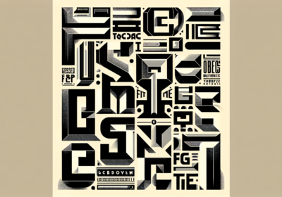
Script and decorative fonts – expressive and emotionalScript and decorative fonts are the most emotionally expressive category in typography, offering designers tools for conveying font personality and creating memorable impressions. These typefaces break free from functionality, embracing artistic expression and individual character.
The font emotions evoked by script typefaces often center around elegance, sophistication, and personal connection. Because they mimic handwriting, script fonts create an intimate feeling that suggests personal attention and craftsmanship. This makes them effective for luxury brands, wedding invitations, and contexts where creating an emotional connection is more important than maximizing readability.
Decorative fonts push the boundaries of font personality further, often incorporating thematic elements that directly support specific messages or contexts. A font designed to look like wood grain might evoke rustic authenticity, while one with technological elements could suggest innovation. The key to using these typefaces effectively lies in ensuring their personality aligns with the intended message and audience expectations. For instance, a playful, cartoonish font might be perfect for a children’s book but entirely inappropriate for a legal document.
Now that we’ve explored the major font categories and their psychological associations, let’s examine the emotional spectrum that fonts can evoke, ranging from calming to aggressive.
Emotional spectrum of fonts – from calming to aggressiveThe emotional range that fonts can evoke spans from soothing to energizing, with each typeface carrying the potential to influence mood and perception. Understanding this spectrum allows designers to make strategic choices that support their communication goals and create desired responses in their audience.
Calming fonts and their characteristics- Soft, rounded edges: Create visual comfort and reduce tension
- Moderate contrast: Between thick and thin strokes for gentle appearance
- Generous spacing: Creates breathing room and peaceful reading experience
- Examples: Avenir with its humanist qualities, or Georgia with gentle serif treatment
Think of the fonts used in meditation apps, which often prioritize these calming qualities to create a serene user experience.
Aggressive fonts and their impact- Bold weights: Command attention and convey strength
- Sharp angles: Create visual tension and urgency
- High contrast: Between elements for dramatic effect
- Condensed letterforms: Create pressure and intensity
Consider the fonts used in action movie posters, which often utilize bold, angular typefaces to convey excitement and intensity.
The concept of a sad font illustrates how typography can evoke complex emotional states. Fonts with drooping characteristics, thin weights that suggest fragility, or irregular spacing that creates instability can contribute to melancholic moods. However, context plays a crucial role—the same font might feel contemplative in one setting and elegant in another. Imagine a handwritten-style font with slightly uneven strokes used in a letter of condolence; it can convey a sense of personal grief and empathy.
Between these extremes lies a spectrum of emotional possibilities. Playful fonts with bouncing baselines or quirky character shapes can evoke joy. Sophisticated fonts with refined details can suggest luxury. Understanding how to navigate this landscape enables designers to fine-tune their choices for maximum impact. For example, a children’s brand might use a bubbly, rounded font to evoke a sense of fun and playfulness, while a high-end fashion brand might opt for a sleek, minimalist font to convey sophistication and exclusivity.
Having explored the emotional spectrum of fonts, let’s now consider how font meaning is shaped by context and interpretation.
Font meaning in text and contextual interpretationThe interpretation of font meaning extends beyond the characteristics of individual typefaces, encompassing the interplay between typography, content, cultural context, and audience expectations. The same font can convey different messages depending on how and where it’s used, making contextual awareness critical for typographic communication.
Factors that influence font interpretation- Cultural background: What appears authoritative in one culture might seem outdated in another
- Surrounding design elements: A sleek sans-serif font paired with minimalist design will feel modern, while the same font surrounded by ornate elements might appear more traditional
- Content context: A clean font used in a medical context might convey professionalism, while the same font in an artistic context could feel sterile
- Audience expectations: The subject matter, tone, and intended audience all contribute to how typography is perceived
This creates opportunities to reinforce a message or create intentional contrast for dramatic effect. For instance, using a playful font for a serious news article could create a jarring and inappropriate effect, undermining the credibility of the content.
Now that we’ve examined the importance of context in font interpretation, let’s move on to practical strategies for designing with fonts.
Designing with fonts – practical application strategies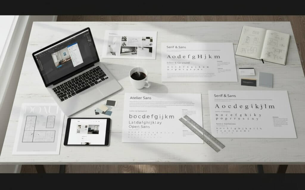
Applying the psychology of fonts requires a systematic approach that balances emotional impact with readability, brand consistency, and technical constraints. For those looking for an ultimate guide to using fonts for branding and choosing the best one for brand identity, effective font selection involves understanding how typography functions as a communication tool and leveraging that understanding to achieve design objectives.
Strategic font selection process- Define communication goals: Establish what emotions you want to evoke and what level of formality is appropriate
- Understand your target audience: Research what associations will resonate with your readers
- Create visual hierarchy: Use font weight, style variations, and spacing strategically
- Test in realistic contexts: Evaluate font choices with users and in real-world applications
For a practical guide on how font choices directly impact sales and conversions, consider how your typography can influence commercial outcomes.
| Design Goal | Recommended Font Approach | Key Considerations |
|---|---|---|
| Build Trust | Traditional serif fonts | Avoid overly decorative styles |
| Convey Innovation | Modern sans-serif fonts | Consider geometric or tech-inspired options |
| Create Emotional Connection | Script or humanist fonts | Balance personality with readability |
| Maximize Readability | Well-tested body text fonts | Prioritize clarity over personality |
Font pairing strategies require understanding how typefaces interact. Successful combinations often involve contrasting characteristics that complement each other. A classic approach pairs a serif font for headlines with a sans-serif for body text, creating visual interest while maintaining readability. More adventurous combinations can work when the fonts share structural similarities or when the contrast serves a purpose.
Technical considerations play an important role as content appears across platforms. Web fonts must load quickly and render clearly, while print fonts need to maintain their character at various sizes. Understanding these constraints helps designers make choices that preserve their intended impact.
Testing and iteration are essential. What works in theory may not translate to real-world applications, making it important to evaluate font choices with users and in realistic contexts. This can reveal unexpected responses or practical issues. A/B testing different font combinations on a website landing page, for example, can provide valuable data on which fonts resonate best with your target audience.
Now that we’ve covered practical application strategies, let’s examine real-world examples of font psychology in action.
Real-world examples of font psychology in action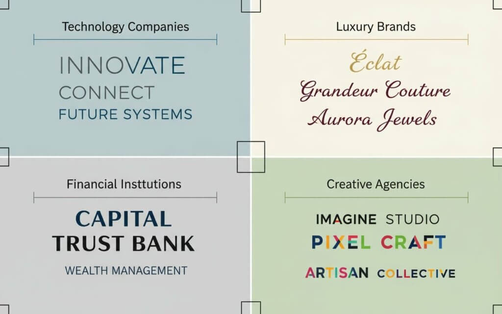
Examining how successful brands apply typeface psychology provides insights into the practical implementation of font selection. These applications demonstrate how thoughtful typography can reinforce brand identity, enhance communication, and create memorable experiences that resonate with audiences.
Industry-specific font psychology applications- Entertainment (Netflix): Uses bold sans-serif fonts for action content to convey excitement, while employing serif typefaces for period dramas to suggest sophistication
- Financial Services (Wells Fargo): Serif fonts communicate stability and reliability, essential for institutions handling money
- Technology (Google): Custom sans-serif wordmark projects accessibility while maintaining clarity, with geometric foundation suggesting precision
- Luxury Automotive (Cadillac): Script logo evokes elegance and handcrafted quality that aligns with luxury positioning
- Nonprofit (ASPCA): Clean sans-serif fonts avoid distracting from imagery, ensuring emotional impact comes from content
The Red Cross, for example, uses a simple, clean font to convey a sense of neutrality and trustworthiness, allowing the organization’s mission to take center stage.
Having explored real-world examples, let’s now outline best practices for choosing fonts that align with your message.
Best practices for choosing fonts that align with your messageDeveloping a systematic approach to font selection ensures that your typography choices support your communication objectives while avoiding pitfalls that can undermine message effectiveness. These practices provide a framework for making informed decisions that leverage the psychology behind fonts to create impactful communications.
Essential font selection guidelines- Analyze your foundation: Begin by examining your brand identity, target audience, and communication goals to define personality traits and emotional responses you want to convey
- Prioritize accessibility: Ensure readability and accessibility in all font decisions, considering factors like x-height, character spacing, and contrast ratios
- Develop systematic pairing: Create font combinations that share structural characteristics while offering enough contrast for visual interest
- Consider the user journey: Recognize that typography needs may vary across different touchpoints and develop flexible systems
- Stay culturally informed: Research cultural and generational differences in font perception, especially for diverse audiences
- Implement regular reviews: Set up quarterly reviews of your brand’s typography to ensure alignment with evolving brand identity
Consider setting up a quarterly review of your brand’s typography to ensure it remains aligned with your evolving brand identity and target audience.
Now that we’ve covered best practices, let’s address some frequently asked questions about font psychology.
Întrebări frecvente despre psihologia fonturilor- How quickly do people form impressions based on font choices? Research indicates that people form initial impressions about fonts within 50 milliseconds of viewing them. This rapid response occurs at a subconscious level, meaning that font psychology impacts perception before conscious evaluation begins. This makes font selection crucial for creating positive first impressions.
- Can the same font evoke different emotions in different contexts? Yes, font meaning is heavily influenced by surrounding design elements, content, cultural context, and audience expectations. A simple sans-serif font might feel professional in a corporate setting but sterile in an artistic context. This is why understanding your specific use case is essential.
- Are there fonts that universally convey trustworthiness? While certain font categories like traditional serifs tend to convey authority across many contexts, no font is universally trustworthy. Cultural background, industry norms, and audience expectations all influence how fonts are perceived. Testing with your specific audience is the best way to ensure your font choices build trust.
- How many fonts should I use in a single design project? Most design experts recommend limiting yourself to 2-3 fonts maximum. Using too many fonts can create visual chaos and dilute your message’s impact. Focus on finding fonts that work well together and serve different functional purposes.
- Do font psychology principles apply equally to digital and print media? While the principles remain consistent, technical considerations can affect how fonts are perceived across different media. Screen resolution, viewing distance, and lighting conditions can all influence readability and emotional impact. It’s important to test your font choices in their intended viewing context.
- How do I know if my font choice is working effectively? Effective font choices should feel natural and support your message without drawing attention to themselves. User testing, engagement metrics, and feedback can help you evaluate whether your typography is achieving its intended impact. If people comment on your font choice, it may be too prominent.
- Can decorative fonts ever be appropriate for body text? Generally, decorative fonts should be reserved for headlines, logos, or short text elements where their personality can shine without compromising readability. Using decorative fonts for body text typically reduces reading comprehension. The impact of decorative fonts is best leveraged in small doses.
- How do cultural differences affect font psychology? Cultural background significantly influences font perception. Fonts associated with authority in Western cultures might not carry the same weight in other cultural contexts. Additionally, cultures with different writing systems may have different associations with Latin fonts. Always consider your audience’s cultural background.
- Is it better to follow font trends or stick with classic choices? The best approach depends on your brand positioning and audience. Trendy fonts can help you appear current but risk becoming dated quickly. Classic fonts offer timeless appeal but might seem conservative. Consider your brand’s personality and longevity goals.
- How can I measure the psychological impact of my font choices? You can measure impact through user testing, A/B testing different font options, analyzing engagement metrics, and gathering qualitative feedback about brand perception. Surveys asking users to describe the personality traits they associate with your typography can provide insights into whether your fonts are conveying your intended message.

I'm a programmer at heart. But in my 20s, I realized there was more to the world of fonts than just Courier.
Driven by endless curiosity, I built a system to explore them.
That project grew into one of the world’s leading font identifier platforms: www.WhatFontIs.com.
By 2024, WhatFontIs is helping nearly one million designers—famous or not—discover the names of the fonts they need.