Ever wondered about the clean, modern fonts you see everywhere, from logos to websites? Chances are, you’re looking at a sans serif font.
But what exactly *is* a sans serif font, and how does it differ from other typefaces? This article will break down the definition, characteristics, and best uses of sans serif fonts, providing you with the knowledge to make informed design choices. We’ll explore popular examples, delve into their unique features, and guide you on when and how to use them effectively in your projects. Let’s dive in and uncover the world of sans serif typography!
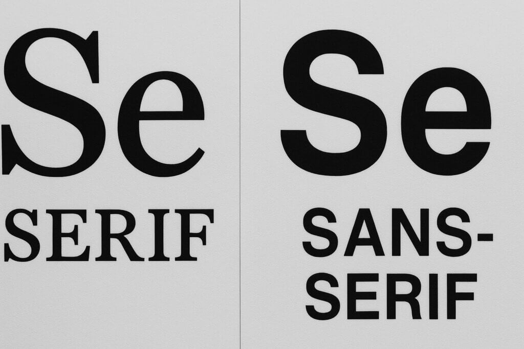
Table of ContentsThe term sans serif comes from French, where “sans” means “without.” This perfectly describes what makes these fonts unique: they are typefaces lacking the small decorative strokes, called serifs, that extend from the main strokes of letters. If you’re wondering what a sans serif is, think of it as the minimalist approach to typography. To fully grasp the distinction, it’s helpful to understand what a serif font is.
Sans serif characteristics include clean, straight lines and generally uniform stroke widths. These fonts embody a modern, streamlined aesthetic synonymous with contemporary design. The sans serif definition encompasses typefaces prioritizing clarity and simplicity, making them instantly recognizable for their unadorned appearance.
Understanding the sans serif definition helps explain why these fonts are so common in digital design. Their straightforward construction makes them highly legible across various media, from computer screens to mobile devices. The definition of sans-serif as “without serifs” might seem simple, but it has significant implications for how we perceive and use these typefaces.
Now that we’ve defined sans serif fonts, let’s explore the key difference that sets them apart from their serif counterparts.
Understanding serifs – the key differenceTo really understand the difference between serif and sans serif fonts, you need to know what serifs are. Serifs are the small decorative strokes or “feet” that extend from the main strokes of letters in some typefaces. These flourishes serve both functional and aesthetic purposes. You can explore a wide range of serif fonts to see these characteristics in action.
The presence or absence of serifs creates a fundamental division in typography. Serif fonts feature these extensions, which historically helped guide the eye along lines of text in printed materials. Sans-serif fonts deliberately eliminate these elements for a cleaner, more modern appearance that works well in digital environments. For a deeper dive into their differences, explore the serif vs. sans-serif fonts battle.
The serif vs sans serif distinction affects how fonts are perceived. Serif fonts often convey tradition, authority, and formality, while sans-serif fonts communicate modernity, approachability, and simplicity. This difference helps designers choose the right typeface for their communication goals.
With the core difference between serif and sans serif fonts clarified, let’s take a look at some specific examples of popular sans serif typefaces.
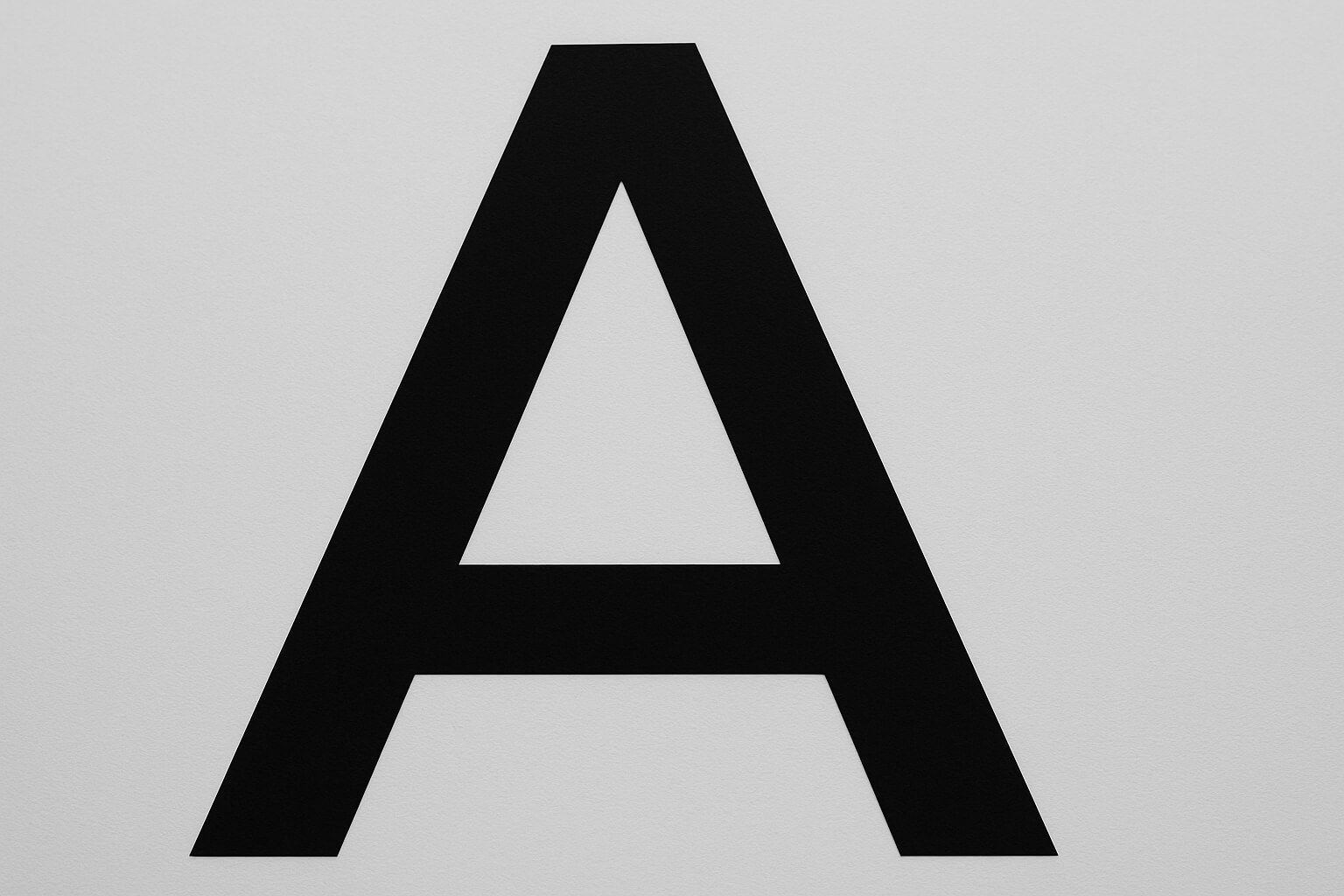
Several iconic sans serif font examples have shaped modern design. Helvetica font, created in 1957, is perhaps the most recognizable sans serif typeface. Its neutral, clean appearance has made it a favorite for everything from corporate logos to public signage.
Arial font is another cornerstone of sans serif typography. Developed in 1982, Arial became common as a default font in many computer systems. While similar to Helvetica, Arial has its own characteristics that make it well-suited for digital applications.
Other notable sans-serif font examples include Futura font, which emerged from the Bauhaus movement in 1927 and embodies modernist design principles. Calibri font served as Microsoft Office’s default typeface for over a decade, and Verdana font was specifically designed for screen readability. This list represents just a fraction of available options, but it demonstrates the versatility and enduring appeal of sans serif design. To discover even more, browse our extensive collection of sans serif fonts.
Now that you’re familiar with some popular examples, let’s delve deeper into the specific sans serif characteristics that define sans serif fonts.
Sans serif font characteristics and typography featuresSans serif characteristics extend beyond just lacking decorative strokes. These fonts typically feature consistent stroke widths, creating a uniform appearance that contributes to their clean, modern aesthetic. The sans serif typography emphasizes geometric precision and optical clarity.
The structural elements of a sans serif font alphabet reveal attention to legibility and visual balance. Letters are designed with open counters (the enclosed spaces within letters like ‘o’ and ‘a’) and clear distinctions between similar characters. This sans font type prioritizes functional communication while maintaining visual appeal through proportion and spacing.
Modern sans serif characteristics also include scalability and versatility across different media. These fonts maintain their clarity whether displayed at large sizes for headlines or small sizes for body text. The consistent stroke weights and simplified letterforms make sans serif fonts effective in digital environments, where pixel limitations can compromise more complex typeface designs. This adaptability has made sans serif typography a preferred choice for user interfaces and websites.
Knowing the characteristics of sans serif fonts, let’s consider when to use sans serif fonts in your design projects.
When to use sans serif fontsWhen to use sans serif fonts depends on your project’s goals, audience, and medium. These fonts excel in digital environments where screen resolution and readability are primary concerns. The best sans serif font choices for websites and digital interfaces leverage the clean lines and high legibility that characterize this font category.
Sans serif fonts examples shine in modern branding and corporate communications, where companies want to project innovation and accessibility. Their clean appearance works well for technology companies, startups, and brands targeting younger demographics. The absence of decorative elements allows the message itself to take center stage.
Consider using sans serif fonts for signage and wayfinding systems where quick recognition is essential. Their simplified letterforms remain legible at various distances and lighting conditions. For lengthy text passages or traditional print materials like books, serif fonts might provide better reading comfort due to their historical association with extended reading experiences.
Beyond general use cases, the sans serif font family offers a variety of types and variations to suit different design needs. Let’s explore these subcategories.
Sans serif font family types and variationsThe sans serif font family includes several distinct subcategories, each with unique characteristics. Geometric sans serif font types, like Futura, are built on mathematical principles and simple geometric shapes, resulting in systematic and modern appearances. These sans serif font types work well for brands seeking to communicate precision.
Humanist sans serif variations draw inspiration from traditional calligraphy and handwriting, incorporating subtle variations in stroke width and more organic letterforms. Grotesque and neo-grotesque categories represent the evolution of sans serif design, with fonts like Helvetica exemplifying the refined neutrality that defines modern sans serif typography.
Within each category, you’ll find variations including sans serif block font styles that emphasize bold, impactful letterforms perfect for headlines. The art of san serif lettering continues to evolve, with contemporary designers creating new interpretations that push boundaries while maintaining the principles of clarity and simplicity.
With a grasp on the different sans serif font types, you’re ready to learn how to choose the best sans serif font for your specific project.
Choosing the best sans serif fonts for your projectSelecting the best fonts sans serif requires evaluating several key factors. The best sans serif font for your project should align with your brand personality, target audience, and intended use. Consider whether you need a neutral, versatile sans font or a more distinctive typeface. If you’re looking to identify a specific font or need guidance on choosing the right one, our guide on how to identify fonts can be a valuable resource.
When exploring what are sans serif fonts can offer your project, examine the complete font family available. The most effective choices provide multiple weights and styles that allow for creating clear visual hierarchy. Look for fonts that include light, regular, bold, and potentially italic variations to ensure maximum flexibility.
Technical considerations also play a crucial role in font selection. Ensure your chosen sans serif font displays properly across different devices and browsers. The best sans serif font choices balance aesthetic appeal with practical functionality, offering excellent legibility at various sizes while supporting the languages your project requires. Test your selected fonts to confirm they meet both your design vision and functional requirements.
Key Takeaways for Using Sans Serif FontsSans serif fonts are more than just typefaces without serifs; they are a versatile tool for modern design. Their clean lines and high legibility make them ideal for digital interfaces, branding, and signage. By understanding the nuances of different sans serif types and considering your project’s specific needs, you can leverage these fonts to create impactful and effective visual communication. So, experiment with Helvetica, Arial, Futura, and other sans serif options to discover the perfect fit for your next design endeavor.
Frequently Asked Questions: Sans Serif FontsA sans serif font is a typeface that lacks the small decorative strokes or “serifs” found at the ends of letterforms. This gives the font a clean, minimalist appearance, making it ideal for modern designs and digital interfaces.
The primary difference is the presence or absence of serifs. Serif fonts have small extensions or decorative elements at the end of each letter stroke, while sans serif fonts do not. This distinction affects both the visual style and the readability in different contexts.
Famous sans serif fonts include Helvetica, Arial, Futura, Calibri, and Verdana. These typefaces are widely used in branding, signage, and digital platforms due to their clean design and versatility.
Sans serif fonts are versatile and suitable for digital interfaces, modern branding, headings, signage, and situations where a clean, contemporary look is desired. They’re especially effective for screen use due to their high legibility.
Yes. Due to their simple shapes and lack of intricate details, sans serif fonts generally display more clearly at various sizes and resolutions, making them a popular choice for websites, apps, and other digital products.
The sans serif font family includes categories such as geometric, humanist, grotesque, and neo-grotesque. Each type has distinctive characteristics—from the mathematical forms of geometric fonts to the more organic shapes of humanist styles.
While sans serif fonts are especially effective for digital usage, they can also be used in print—particularly for headlines, posters, or minimalist branding. For lengthy printed text, however, serif fonts are sometimes preferred for reading comfort.
Consider your brand identity, audience, context (digital or print), and legibility. Look for font families with multiple weights and styles, test them in your intended environment, and make sure they support the necessary character sets.
Sans serif fonts are ideal for brands that want to convey a modern, approachable, or innovative feel. However, for brands seeking a traditional, formal, or authoritative image, serif fonts might be more appropriate.
You can browse extensive collections of sans serif fonts on font websites such as WhatFontIs to discover new options and download them for your projects.

I'm a programmer at heart. But in my 20s, I realized there was more to the world of fonts than just Courier.
Driven by endless curiosity, I built a system to explore them.
That project grew into one of the world’s leading font identifier platforms: www.WhatFontIs.com.
By 2024, WhatFontIs is helping nearly one million designers—famous or not—discover the names of the fonts they need.