Typography deserves more recognition as a design hero. Often disregarded despite its great power, it has the ability to transform an ordinary design into a stunning work of art. When it comes to typography, font pairing is key. A design’s readability and aesthetic value are both affected by the fonts used.
In this guide, we will go into the basics of typography, the psychology behind fonts and practical methods for choosing and combining fonts. After reading this article, you will know how to mix fonts effectively to make designs that are both aesthetically, pleasing and functional.
Here’s what you will discover in this article:
The golden rules of font pairing
Practical advice for font pairing that really works
Typical mistakes to avoid when pairing fonts
What is typography?Typography refers to the practice and art of using type arrangement to create clear, readable, and aesthetically pleasing displays of written language. Choosing fonts, altering font sizes, spacing, and page layout are all part of the process. One of the most basic aspects of design, typography influences our perception and interpretation of information.
Key Typographic Terms- Font family: A collection of fonts that share a common design, such as Times New Roman or Helvetica.
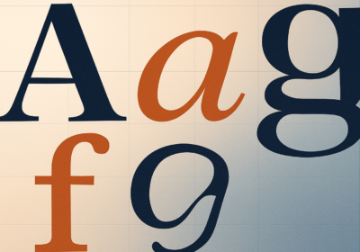
- Serif fonts: Characterized by small strokes (serifs) at the ends of letterforms. They are often considered more traditional and formal.
- Sans-serif fonts: Lack the serifs, giving them a cleaner and more modern appearance.
- Script fonts: Mimic handwriting and are often used for decorative purposes.
- Monospaced fonts: All characters have the same width, making them suitable for code and tabular data.
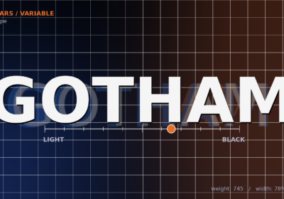
- Font weight: Refers to the thickness of a font’s strokes. Common weights include Regular, Bold, Light and Black.
- Font style: Indicates the slant of a font. Common styles are Regular (upright) and Italic (slanted).
- Font size: Measured in points, it determines the height of a character.
- Letter spacing (tracking): The space between individual letters, used to adjust the visual density of text.
- Line spacing (leading): The vertical space between lines of text, affecting readability.
How we interpret information is greatly affected by fonts. Some typefaces have the power to bring forth particular feelings and memories. A delicate script typeface, for instance, can imply grace and femininity, while a strong sans-serif font might express confidence. For good design, knowing how fonts make people feel is essential.
Readability and legibility are essential factors in typography. Readability refers to how easily text can be read and understood, while legibility is the clarity of individual characters. Factors that affect readability and legibility include:
- Font choice: Selecting appropriate fonts for the intended audience and purpose.
- Font size: Ensuring sufficient size for easy reading.
- Line length: Keeping lines of text relatively short to avoid eye strain.
- Line spacing: Using appropriate leading to improve readability.
- Contrast: Creating sufficient contrast between the text and the background.
By understanding these fundamental principles of typography, you can effectively use fonts to create visually appealing and communicative designs. In the next section, we’ll delve into the rules of font pairing.
The golden rules of font pairingBy carefully choosing and blending fonts, designers can achieve aesthetically pleasing and harmonious results. Font harmony, contrast and hierarchy are the three pillars upon which a well-executed font pairing rests.
The use of different font styles to create visual appeal is known as contrast. Combining serif and sans-serif fonts, like Arial and Times New Roman, is a timeless example. A striking contrast between the two extremes of formality and informality is provided by this pairing. A dynamic and attention-grabbing effect can be achieved by combining typefaces of different weights, such as a bold and a light font. Combining script with sans-serif fonts is another trendy and amusing combination that may bring a dash of sophistication or humorous charm to any design.
When choosing fonts, it’s important to keep things balanced and consistent for harmony. If you want your fonts to look like they belong together, use ones from the same family. Another way to make a good font pairing is to choose two fonts that enhance each other’s qualities. For example, a serif and a sans-serif with comparable x-heights would look great together. One more thing that can help the fonts work together is a uniform color scheme.
The use of font size, weight, and style to visually demonstrate importance is known as hierarchy. Headings, which should highlight crucial information, are best written in bold, bigger fonts. Body content is best written with a clear and legible typeface. Accent fonts, which are decorative typefaces used sparingly, can be employed for branding or emphasis.
Timeless combinations of fonts, such as Times New Roman and Arial or Georgia and Verdana, are commonplace. Bold and lively combinations, like Helvetica and Pacifico, or clean and modern pairings, like Roboto and Montserrat, tend to appear in modern pairings. Ingenious combinations can combine contemporary and classic elements, such as a geometric sans-serif font with a handwritten script, or produce a striking and refined appearance by combining display and serif fonts.
Next, we’ll go over some practical advice for font pairing that really works and typical mistakes to avoid when choosing your fonts for a design.
Practical advice for font pairing that really worksThinking about the bigger picture of your design is essential for getting the fonts to work together. Your font choices should be informed by the design’s purpose and the intended audience. A whimsical script font would be more appropriate for a children’s book than a formal document using a traditional serif font.
Restricting your font palette is another crucial piece of advice. Confusion and visual clutter can result from using an excessive number of fonts in a single design. Never use more than two or three typefaces, and make sure they appear uniform throughout.
Finally, play around with different font combinations and don’t be scared to make mistakes. See what works best by trying different combinations. If you want to see how the fonts will seem combined, making a prototype or mockup is a good first step. You can discover the ideal combination of fonts for your design by experimenting and iterating.
Typical mistakes to avoid when pairing fontsWhen combining fonts, it’s easy to make the mistake of picking ones that are too close or too distinct. A boring and uninspiring design can result from using two almost identical fonts. However, visual inconsistency and worse readability might result from using fonts that conflict significantly. Finding an optimal balance between two extremes is key. Excessive use of ornamental fonts is another error.
Although beautiful fonts can spruce up a design, an excess of them can make the text hard to read. Decorative fonts are best used sparingly as accent pieces. One typical problem is neglecting readability. Clear and legible fonts should always take precedence, particularly when it comes to body text.
Any designer’s toolbox should include font pairing. Careful consideration of font matching may elevate your work and improve communication, whether you’re making a logo, a poster, or a website.
Keep in mind that there’s more to it than meets the eye when it comes to font pairing. Your design’s context, your intended audience, and your message as a whole are all taken into account. Find the ideal combination by trying different things and refining your pairings. By following these rules and putting in some practice, you may become an expert at font pairing and make designs that are beautiful and practical.
Remember to use WhatFontIs.com and find the best fonts for your upcoming project, a great tool for designers and typography enthusiasts, that can detect fonts in photos and online pages. Finding the actual fonts is the next step, after coming up with some fantastic ideas for font pairings. Determining which typeface is which is the challenging part. While various font identities exist, the majority of them are limited to commercial fonts.
In this case, WhatFontIs.com is a lifesaver since it can tell the difference between commercial typefaces and Google typefaces. Just snap a photo of the font you’re fascinated with and upload it to our homepage! It only takes a click to find the right font pairing for you.

I'm a programmer at heart. But in my 20s, I realized there was more to the world of fonts than just Courier.
Driven by endless curiosity, I built a system to explore them.
That project grew into one of the world’s leading font identifier platforms: www.WhatFontIs.com.
By 2024, WhatFontIs is helping nearly one million designers—famous or not—discover the names of the fonts they need.