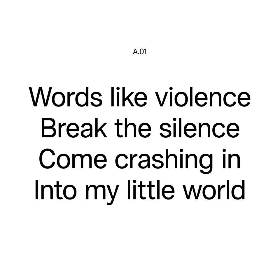
We all know the struggle of remembering all kinds of information. And, to be honest, we have already tried pretty much everything when it comes to writing important things down. Although, there’s one thing we have never tried before: writing things in hard-to-read fonts.
In case you missed out the news, ZARA rebranded itself at the end of January and ambushed us with a new logo. After eight years of glory, the old breezy and minimalistic logo retired.
The public enemy no.1 of all graphic designers, Comic Sans still remains one of the most known and used fonts in the entire world. But what makes us dislike it so much? Here is a short story about Comic Sans, the font we all love to hate.
For at least 80 years, comic books were significant part of our popular culture and, oh well, of our lives. But we don’t know much about one of the most notorious fonts that ever existed: the comic book font.
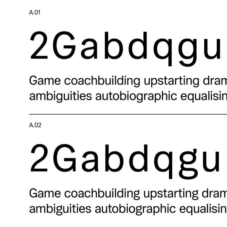
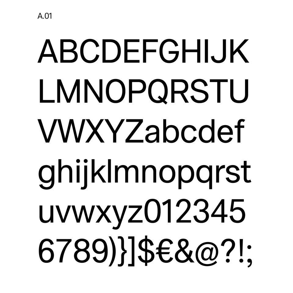
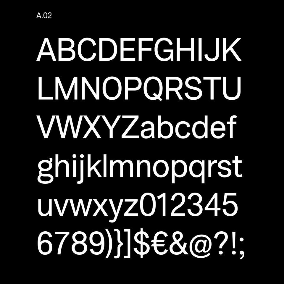
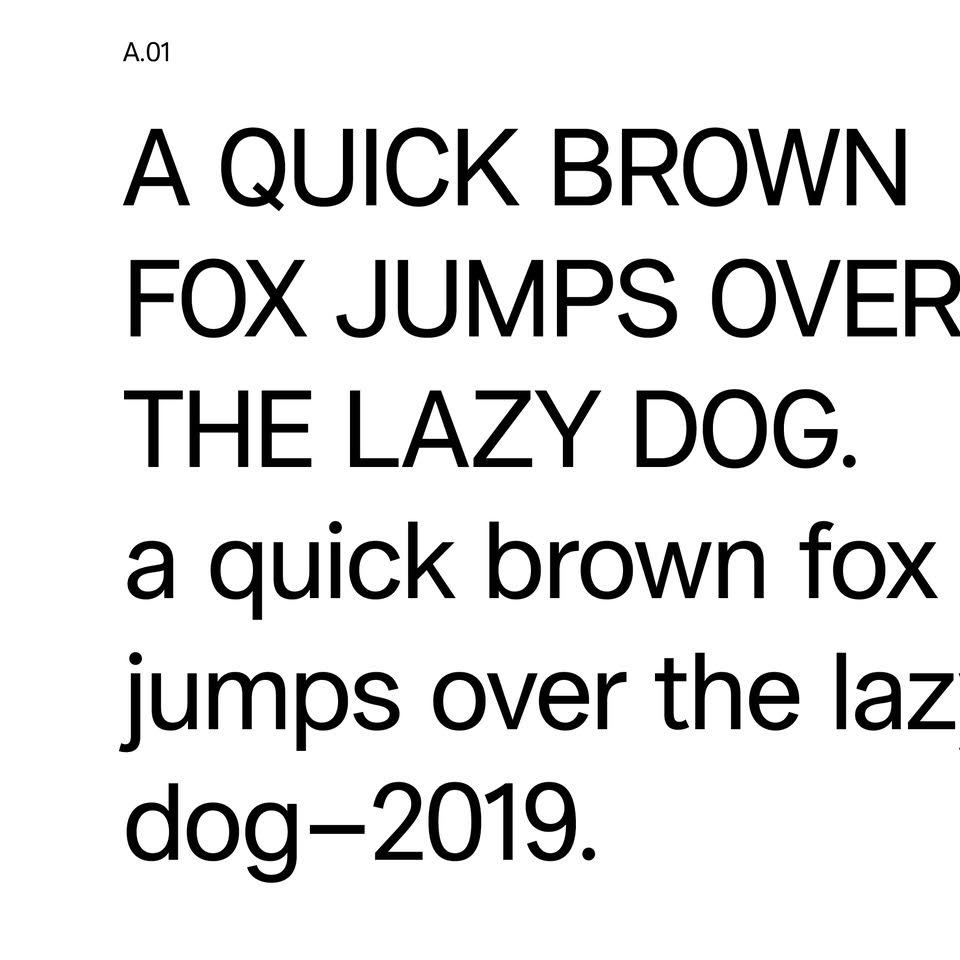
Hello World! Since November 2018, together with Sabina Chipara, we started developing a new custom font that will be available to WhatFontIs users for free. After a hundreds hours’ work we face a tough dilemma on deciding which one to release, so we need help 🙂
We thought to ask you which one you like best. And if you have a name suggestion, that would be great too 🙂
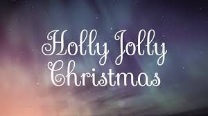
Holidays are coming! I am pretty sure that you’ve already heard this. And if not…then look around! Take a look at the stores, take a look on your street, in your own town!
Winter holidays are a rough time of the year…some say. Find a present…the perfect present for the loved one, clean up the house, cook the perfect food…find a Christmas tree…not just any tree…but THE TREE…Did I forget anything? Yes and no! I would say yes because what is Christmas without a card? But still, how many of us offer a card to go along with that perfect present? Not too many, I guess.
Nevertheless, there was a time when people enjoyed sending Christmas cards, especially to the beloved and especially when the loved ones were…far away.
Let’s see which are the most used fonts for these special cards.
It is a little bit gothic, right? I agree! Probably this is why many people enjoy it so much…it combines a touch of calligraphy with some flourishing characters…everything on a perfect dark cover. In case you wonder… Chris Hansen created it and although it is used on Christmas cards…it has nothing to do with it. Hansen has created this font (and many other) when we was about 16-17 years old. It took him about half of a year…and it was a perfect hobby during the time he spent with his mother in Australia. He admits it…being away from his Denmark friends was rough…so he needed something to help him spend better times. Funny thing: his girlfriend does not believe that this font belongs to him and that it was created when he was a teenager.
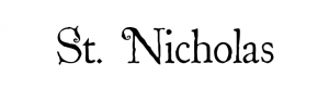
Here is something that is strongly connected to Christmas. No, I am not crazy! St. Nicholas is Santa Claus in many cultures…so this font is his special font…
It was created by The Scriptorium- their website is a bit gothic in my opinion…but you should have a look!- over a decade ago. Its creators say that it is the most popular holiday font and that it is based on the title lettering from the early 20th century children’s magazine St. Nicholas. In case you have no idea what this magazine is about…I can tell you that it was published by Frederick Warne company, the same company that has published Beatrix Potter’s work. Back to our story- this font is special because of the embellished loop serifs on the upper case characters. Somehow, this font has a rustic touch and makes you dream about a white Christmas in the mountains, in a special place with a warm and friendly chimney! If you are not interested in using this in your Holiday project, maybe it will inspire you to have a special Christmas.
Pacifico
There are some good news about this special font: that is…if you are lucky you can use it for free. It is true, you’ll have to dig a bit for it…but…Christmas is preety close!
So…This font was created by Vernon Adams and it is famous due to the fact that you can use it for free! This guy, Vernon, may be a no name for you, but he was licensed by Google and created fonts for a lifetime. This one, Pacifico, was created in 2011. Vernon was talented indeed and I thought that I should mention him here…Unfortunatelly he died in 2016 in a tragic scooter accident.
I don’t know about you, but this font is peaceful and quiet and it makes you cuddle in a warm blanket and drink some hot cocoa or wine…or simply eat an apple or an orange.
Time is money and Atreyu’s creator knows that… therefor…this font is not for free. If you want to use it you’ll have to pay 20 bucks. This font has a quite contemporary look but you have to know that it was inspired by Gothic Illuminated Manuscripts of the 14th Century Germany. Probably not the best choice for Christmas, unless you want to be special indeed and draw some attention.
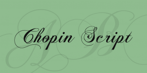
Chopin Script
Sounds good…almost like Chopin’s music…although I am not quite sure that it has something to do with this piano guy. In fact, Dietes Steffmann was its creator… This German fellow is a trained typesetter but he got bored and stopped doing his jobs some years ago, in 1966. Afterwards, he started created fonts, many of them…available for free.
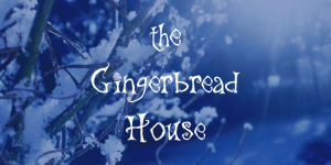
Remember Chris Hansen? Well…he is back and has something special for your Christmas card. The Gingerbread House font is a bit creepy, but that’s what it makes it so special and loveable. It gives a touch of a menace to your Christmas card…enough is enough regarding peace and quiet during winter holidays.
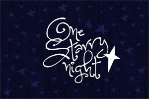
One Starry Night
I don’t know how or why but this font really makes me think about Christmas. It was designed by Brittney Murphy. This lady is obsessed with fonts and spends all the time in the world creating them. She likes saying that she is working to make the world less ugly…since 1983. She is into reading and writing, into history, dark chocolate and….Kraft Macaroni.
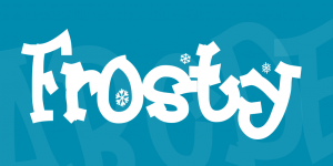
Frosty
No, it is not about the funny snowman…we are talking about Christmas cards’ fonts here. Well…. It looks a little bit frosty…indeed! And it makes you dream about that special white Christmas! There is a small catch here. The funny snowman that I have mentioned previously has something to do with this font. No, it did not creat it. But…it inspired Fontalicious, its creators. It may look funny but this special font, regardless those joyful snowflakes, is quite stable. You shoud try it!
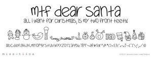
MTF Dear Santa
Santa Baby…there is something made especially for you! This font, of course…and some milk and cookies under the tree. It looks like someone is writing something to Santa. I would say a teenager…because don’t call Santa…Baby. But the handwriting belongs to a child. In fact, this was the sourse of inspiration for Miss Tiina. If you want this Christmas flavoured font for your use only…it is for free…If you want to use it to promote your business…you’ll have to pay 5 bucks for it.
I simply love this one! It is perfect! It combines in such a great manner traditional handwriting witrh a modern design. It was created by Richard Mitchell and it will make your Christmas PERFECT.
Those are just 10 of the most used and loved fonts…and I must admit it…it is a personal choice. Feel free to add any font you enjoy. After all, Christmas is about being good to another and…inspire them in search of the perfect gift…or card.
Some of the most recognizable lettering out there came from rock and roll. Today, let’s take a look at the fonts used by the biggest bands for their logos, album covers and the T-shirt you are wearing right now (or you wish you could wear at work)
Designer labels are a girl’s best friend, so the next time you check one just to make sure it’s the real deal keep in mind that you’re not paying just for the famous name, but also for the way it’s written. The devil is hidden in the details – and she always wears Prada.
We previously took a closer look on the two pillars of fashion magazines typography – the Didone ‘modern’ aesthetic versus the grotesque sans serif avant-garde – dominate the publishing industry when it comes to everything revolving fashion. But many fonts from both sides have transitioned from writing about fashion to being fashion, after having been chosen by the biggest designers to literally represent their brands.
This is a translation in english of an interview that Alexandru Cuibari (the owner and technical lead of) gave in one of the leading marketing magazine in Romania, Iqads.
Alexandru Cuibari: „ This idea came to life from a need of my own. During highschool, I used to make greeting cards.”
As a highschool student, Alexandru Cuibari, used to impress girls and teachers through an ingenuous method at that time: by creating greeting cards for them in an editing program on a 386 (or was it a 486?) computer, which didn’t even belong to him. Looking back, he referred to that moment as the starting point of his fonts obsession (not at all unhealthy) to which he would come back many years later. Around 2010, when he realized that there is no tool on the market to identify free fonts, he began designing the algorithm for one.
If until recently, Whatfontis has been a personal project, now Alexandru is planning to turn it into a business.
And it has all the prerequisites to become a successful one: the site receives 700,000 designers worldwide every month, the traffic has been growing annually by 15-20% throughout the 8 years of the project.
Do yourself a favour and don’t make back to school season harder than it has to be. Choose your books wisely – and choose the fonts you use for their layouts even more wisely.