Something interesting happened in typography over the past year. After a long stretch of AI-everything, designers didn’t just quietly adopt AI-generated typefaces — they pushed back hard. Walk through any serious design feed in April 2026 and you’ll see the same pattern: fonts that look algorithmic are getting roasted, and the ones getting shared are the ones that feel unmistakably hand-made.
What the Backlash Actually Looks LikeThe clearest signal is on social. AI-generated type that used to get polite engagement is now getting dragged. Designers are calling out soft, round, geometric sans-serifs that look like they came out of a prompt, and the replies are brutal. The Creative Bloq piece on AI fonts being “roasted” captured the mood, but it’s been building for months. The criticism isn’t really about technical quality anymore — it’s about character, or rather the lack of it.
Type designers have been blunt about why. The training-data question hasn’t been answered cleanly by any major AI font generator. Brands who quietly used AI-generated faces in 2024 and 2025 are starting to get letters from foundries whose work looks suspiciously like the source material. The legal risk alone is making creative directors nervous, and nobody wants to be the case study in the first big lawsuit.
The “Blanding” Era Is Officially Over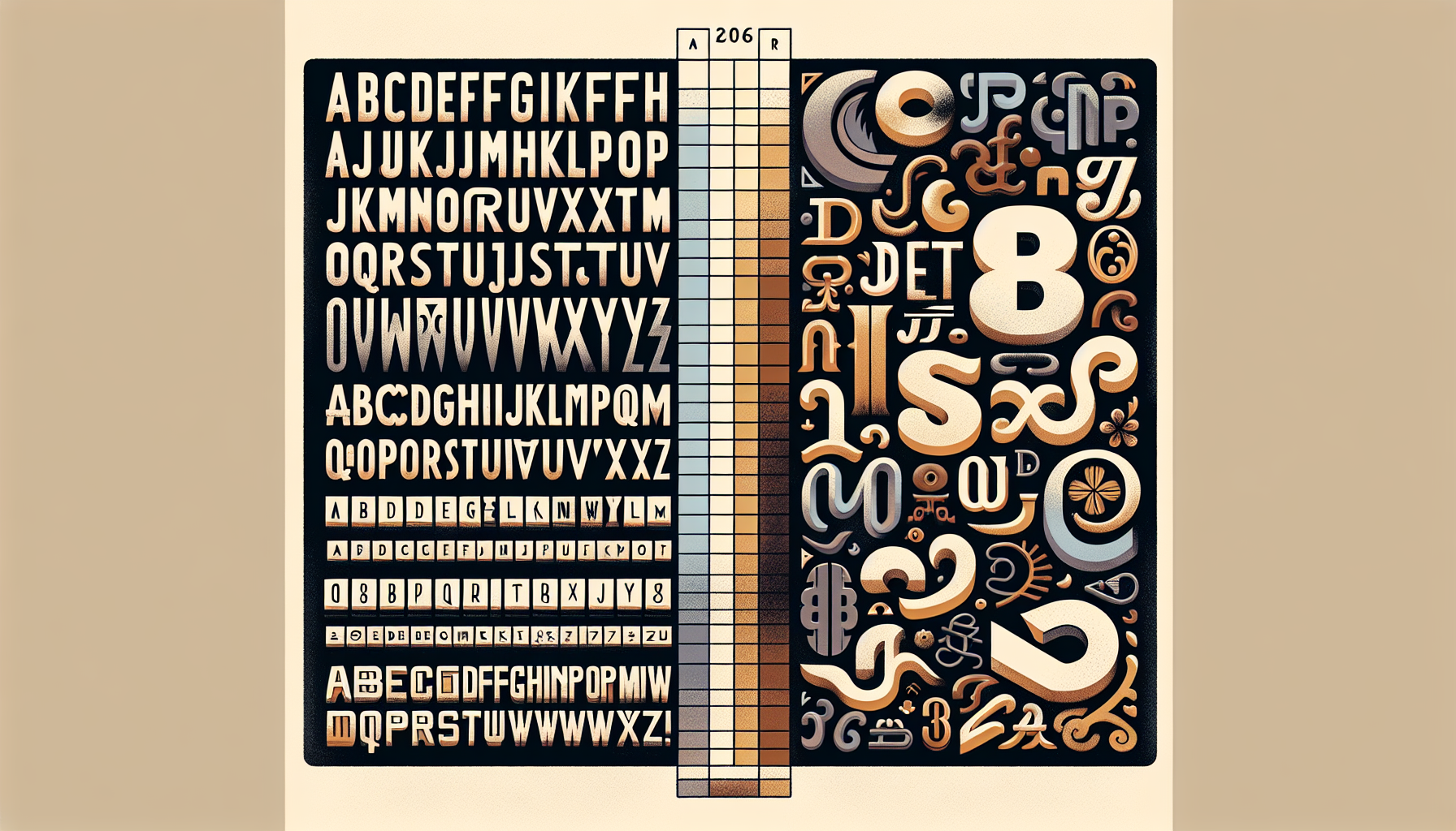
For about a decade, brand identity trended toward what people started calling “blanding” — clean geometric sans-serifs, minimal contrast, neutral personality. AI fonts slotted perfectly into that aesthetic because that’s exactly what algorithms are best at: smoothing things out, averaging things down, removing the weird.
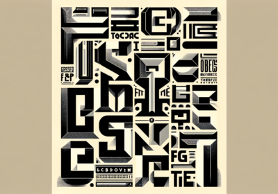
In 2026, that aesthetic is getting actively rejected. Look at the type releases getting attention right now. Neville Brody is pulling from revolutionary agitprop and constructivist brutalism. Fred Wiltshire is riffing on an 1880s Herman Ihlenburg display face. Sofia Mohr’s Autêntica Sans is explicit about its name — it’s refusing to blend in. These are not fonts that could have come out of a diffusion model, and that’s the whole point.
The reason is simple and a little brutal: in a world where every brand can spin up passable AI visuals in thirty seconds, the thing that actually signals taste is the thing AI can’t easily fake. That turns out to be typography, and specifically typography with visible human decisions behind it — optical corrections that aren’t mathematically optimal, weird ink-trap solutions, ligatures someone actually thought about.
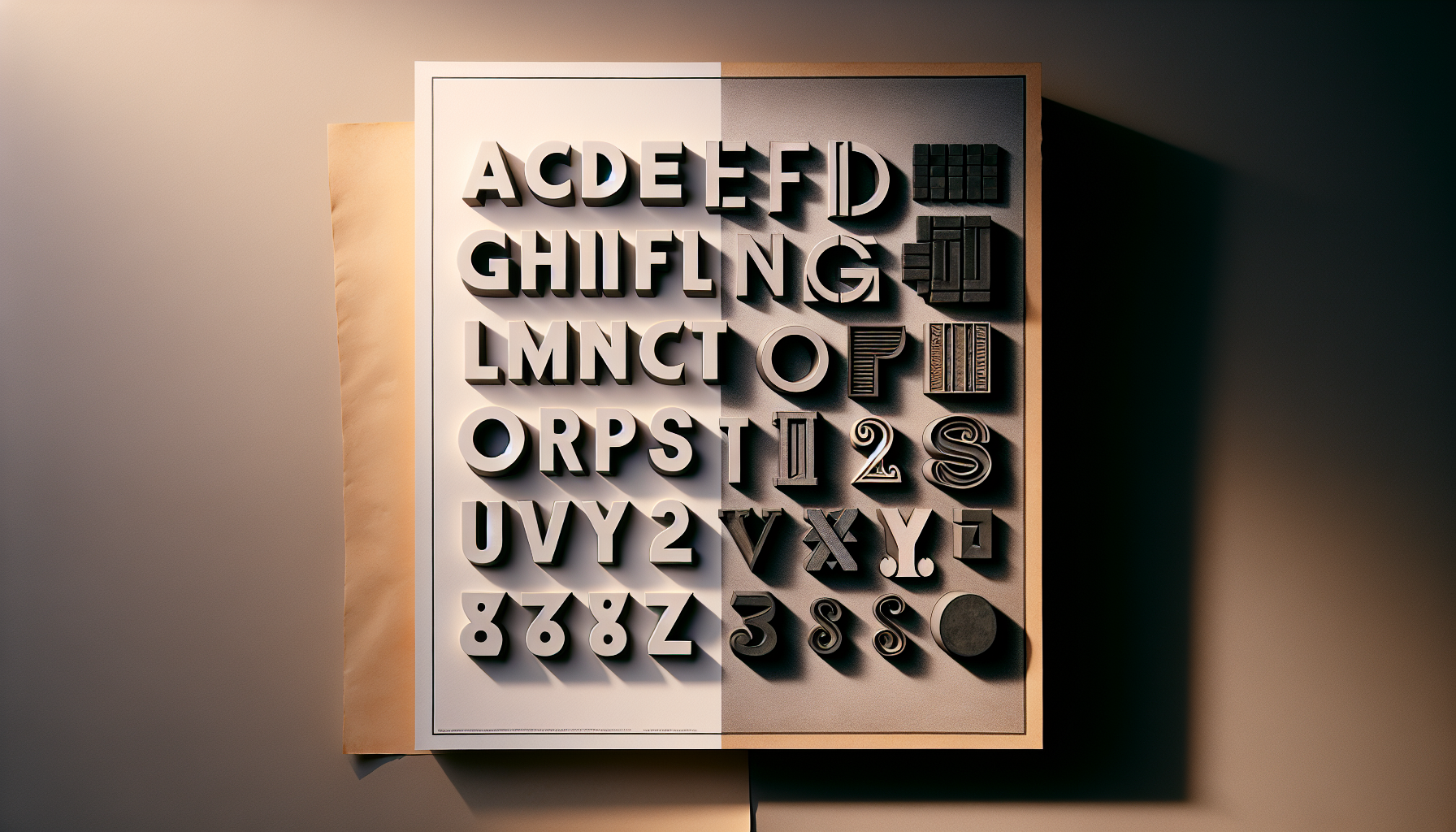
Why Type Designers Are Uniquely Angry About ThisThere’s a specific reason the typography community is louder about the AI backlash than, say, the illustration community. A typeface is not a single image. It’s a system — hundreds of glyphs that have to work together at every size, in every combination, across every language the designer cares about. Getting that system right takes years.
AI font generators usually produce a plausible-looking set of Latin uppercase and lowercase, and then completely fall apart once you ask for proper kerning, optical size variants, diacritics for Eastern European languages, or anything beyond the core set. Professional type designers look at the output and see not a finished font but a very expensive ransom note. The gap between “looks like a font” and “is a font” is enormous, and AI has been consistently underselling how wide that gap is.
Add the ethics question and you get today’s tone. The craft takes humanity, perception, taste, and genuine care — qualities that don’t come out of model weights. When a designer spends three years on a typeface and then sees a prompt-generated rip get celebrated on a brand site, the reaction is not subtle.
What’s Replacing AI-Generic in 2026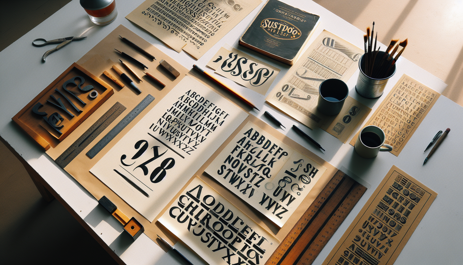
Three things are replacing the algorithmic sans-serif on brand briefs right now.
Chunky, juicy serifs are having a moment. See the Eventbrite rebrand by Buck, which ditched a minimalist sans logo for a bouncy serif that has more personality in one glyph than most AI fonts have in the full set. Brands are finally comfortable with serifs that aren’t apologizing for existing.
Expressive italics are the second big trend. Not the italics you use for emphasis, but italics as the whole identity — liquid, bubbled, vintage, sometimes intentionally weird. This is the category designers point to when they say “AI can’t do this yet,” and for the most part, they’re right.
Historical references are the third. Type designers are digging through 19th-century specimens, constructivist propaganda, obscure regional lettering traditions, and adapting them with modern production values. The move signals that a brand has actual taste and a story, which is something no prompt can plausibly claim yet.
Practical Takeaways If You’re Picking Type Right NowA few things to keep in mind if you’re working on identities or web projects in 2026.
If a font feels like it came from a prompt, your audience probably thinks so too. The uncanny-valley effect has gotten sharper over the past year, and “generic sans-serif that could have been anything” is now actively read as a signal that nobody cared enough to choose properly. Spend the extra afternoon picking something with a story.
Variable fonts are helping the human side, not the AI side. Tools like Google Sans Flex and the new wave of variable releases from independent foundries give designers more creative control, not less. The axes are decisions, not defaults, and using them well is a craft skill.
Licensing matters more than it used to. If you can’t point to the foundry, the designer, and the exact license, assume the font will cause a problem at some point. Clients’ legal teams are starting to ask questions they didn’t ask in 2023.
Where This Goes NextThe AI backlash doesn’t mean AI disappears from type work entirely. It means it shifts roles. Designers are using AI for exploration, ideation, moodboarding, and rough drafts, then throwing that work out and drawing the actual letters themselves. The AI becomes a very fast, very dumb assistant. The finished typeface stays human.
That hybrid workflow is where 2026 is heading, and it’s a healthier place than either “AI does everything” or “AI is banned.” The visible output — the fonts that actually ship — gets more personality, more craft, and more identity. The invisible part — the exploration and iteration behind them — gets faster.
So here’s the question. When you look at your last three brand projects, how many used a typeface you could confidently defend as chosen rather than close enough? The answer probably says a lot about where your work sits on the 2026 curve.

I'm a programmer at heart. But in my 20s, I realized there was more to the world of fonts than just Courier.
Driven by endless curiosity, I built a system to explore them.
That project grew into one of the world’s leading font identifier platforms: www.WhatFontIs.com.
By 2024, WhatFontIs is helping nearly one million designers—famous or not—discover the names of the fonts they need.