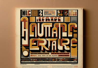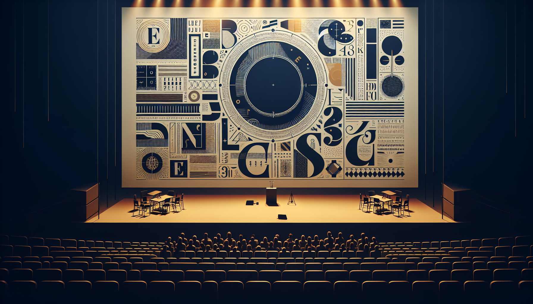
This Thursday, March 13, the Type Directors Club is doing something it hasn’t done since before the pandemic: hosting a live, in-person conference. Type Drives Commerce takes over the Pope Auditorium at Fordham University’s Lincoln Center campus in New York City, and it’s built around a question that most design conferences dance around — what does typography actually do for a business, and how do you measure what it’s worth?
Why This Conference Feels DifferentDesign conferences tend to follow a familiar rhythm. Beautiful slides. Inspirational case studies. A closing keynote that leaves you feeling motivated but vaguely unsure what to do on Monday morning. Type Drives Commerce is deliberately stepping away from that formula. Chaired by Jolene Delisle, founder of The Working Assembly and a TDC Board Member, the event opens with what might be the most honest question in the typography world right now: what does type actually do for a brand, and how do we prove it?
That shift from inspiration to accountability is overdue. Designers have always known intuitively that typography matters — that the right typeface can make a brand feel trustworthy, a headline feel urgent, a product label feel premium. But translating that gut feeling into language that a CFO or a marketing director can act on? That’s the hard part. And it’s exactly where this conference aims to dig in.
The Speaker Lineup Means BusinessThe roster reads like a cross-section of people who’ve figured out how to make type work in the real world, not just in portfolio pieces. Charles Nix from Monotype is talking about typography as a scalable ecosystem — think design systems, brand consistency across hundreds of touchpoints, the kind of infrastructure that global companies need when they operate in dozens of markets simultaneously. Jeremy Mickel of MCKL brings the custom type perspective, showing how bespoke typefaces built for specific brands create value that off-the-shelf fonts simply can’t match.
James Edmondson of OH NO Type Co. is tackling something that independent type designers rarely talk about publicly: how to build a sustainable type business. For anyone who’s ever wondered how a small foundry actually survives — pricing, licensing, marketing, the whole unglamorous side of running a creative business — this session could be revelatory.
Jessica Hische delivers the afternoon keynote. If you’ve followed her career at all, you know she’s one of those rare lettering artists who’s managed to work with massive clients (Penguin Books, Wes Anderson films, Tiffany & Co.) while maintaining a distinctive personal voice. Teddy Blanks, an Emmy-winning title designer, rounds things out with a look at custom type strategies in film — where typography doesn’t just support the story, it becomes part of the storytelling itself.
The Licensing Conversation We Need to HaveOne of the most anticipated sessions is a panel called “The Law of the Letter,” which dives into font licensing. If that sounds dry, you haven’t been paying attention. Font licensing is one of the messiest, most misunderstood areas in the entire design industry. Designers routinely get it wrong. Companies expose themselves to legal risk without realizing it. And the rules keep changing as digital use cases multiply — web fonts, app embedding, variable font licensing, AI training datasets.
The panel brings together legal and industry experts to unpack these issues. For in-house creative teams especially, this could be the most practically useful hour of the entire event. Understanding licensing isn’t just about avoiding lawsuits. It’s about making smarter purchasing decisions, negotiating better contracts, and building font libraries that actually serve your organization’s needs instead of creating compliance headaches down the road.
A Small Room on PurposeType Drives Commerce caps attendance at around 300 people. In a world where design conferences routinely pack thousands into convention halls, that’s a deliberate choice. The event is single-track — no parallel sessions, no FOMO about which talk to attend. Everyone sees the same presentations, hears the same ideas, and has the same reference points for hallway conversations afterward.
That intimacy matters more than you might think. The target audience is senior creative professionals, in-house creative leaders, and brand decision-makers. These are people who don’t just pick fonts — they sign off on type investments, defend typography budgets, and need ammunition to explain why a custom typeface is worth six figures when a free Google Font technically works. Putting them in a room together, with speakers who’ve solved these exact problems, is where the real value gets created.
The Global Type ShowcaseBeyond the main stage, the conference includes a Global Type Showcase featuring curated films from multiple countries. It’s a smart addition that broadens the conversation beyond Latin typography. Type design is increasingly a global discipline — multiscript families, right-to-left considerations, CJK typography, and the growing demand for typefaces that work seamlessly across writing systems. Showcasing international work reminds the audience that the business case for typography isn’t limited to English-speaking markets.
What This Signals for the IndustryThe fact that TDC chose “commerce” as the framing word tells you something about where the typography conversation is heading. For decades, type conferences focused on craft, aesthetics, and cultural significance. Those things still matter enormously. But there’s a growing recognition that if typographers and type designers want a seat at the strategic table — not just the production table — they need to speak the language of business outcomes.
That’s not selling out. It’s growing up. When you can demonstrate that a typeface rebrand increased brand recognition by measurable percentages, or that optimizing web fonts cut page load times and improved conversion rates, you’re not diminishing the art of type design. You’re giving it the respect it deserves by proving its impact in terms that everyone in the organization can understand.
Zipeng Zhu of DAZZLE and lettering artist Lauren Hom are hosting the day, which should keep the energy high and the tone accessible. And with tickets still available through conference.tdc.org, there’s time to grab a spot if you’re in or near New York.
Whether you attend in person or just follow the conversations online, Type Drives Commerce feels like a turning point. Typography has always driven commerce — every price tag, every packaging label, every call-to-action button uses type to persuade. This conference just makes that connection impossible to ignore. What do you think — is the industry ready to put hard numbers on what good typography is worth?

I'm a programmer at heart. But in my 20s, I realized there was more to the world of fonts than just Courier.
Driven by endless curiosity, I built a system to explore them.
That project grew into one of the world’s leading font identifier platforms: www.WhatFontIs.com.
By 2024, WhatFontIs is helping nearly one million designers—famous or not—discover the names of the fonts they need.