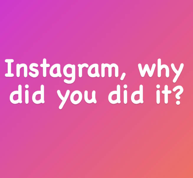
Instagram shocks the world by adding a font similar to a hated one, why did they do that?
The team added a font that looks very similar to a font that is super hated in the world. It seems like a terrible bad move for a huge corporation like Instagram.
You probably know which is the most hated font in the history, right? You will find the answer below.
Its name is Comic Sans and it isn’t bad at all (when used correctly) but it gathered huge hate from all over the world.
Two typographers, Holly and David Combs, started a “Ban Comic Sans” movement in 2002, just imagine that. Others designers joined and the movement gained worldwide traction. Who can ban a font that is 100% legal?
Who took the decision at Instagram to introduce this font? Did Instagram made on purpose ? They did a mistake or it is an intentional move of Instagram, so they will be in the middle of the spotlight for several weeks?
Instagram shocks the world by adding a font similar to a hated one – Comic Cans. Let’s see where it started.
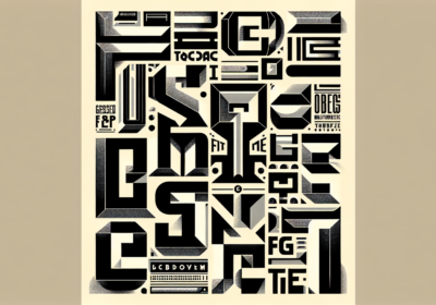
The history of Comic SansTo understand why everybody hates Comic Sans, we need first to know its history.
Inspired by DC and Marvel comic books, Vincent Connare created Comic Sans in 1994 by using a mouse and cursor to draw intentionally sloppy letters.
Vincent designed the font for Microsoft home computers; Comic Sans was indented to be used in the speech bubbles of an animated cartoon dog that would help people navigate the Microsoft Windows interface for very first time.
Comic Sans was a perfect fit for its mission, as the Microsoft dog needed a special, playful font and he received it. The inspiration came from comic books.
Companies like Apple, Bmw and Burberry used with success Comic Sans in different applications like newspapers, titles, and store signs.
Why Comic Sans become the most hated font in the history?Even Vincent Connare, the creator of Comic Sans, says about the font he created in 1994: “If you love Comic Sans you don’t know much about typography. And if you hate Comic Sans you need a new hobby.”
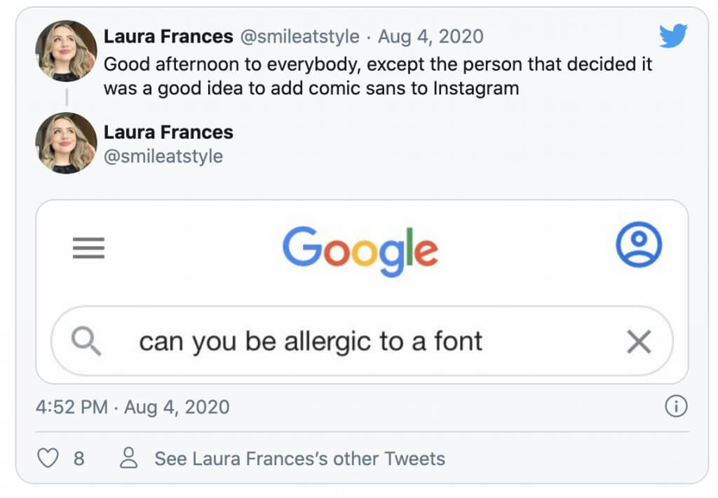
If you search the internet for Comic Sans font, you will find literally tons of hate messages, some being super funny, like this one.
The reason why Comic Sans became the number one enemy in the design world, is simple and can be easily explained in one short paragraph.
Nonprofessionals started to use Comic Sans everywhere – in formal documents, in emails, on signs, in ads, and even on billboards.
The Comic Sans font was not intended for this, and as any font used incorrectly, it will create a bad design.
The internet is still full of bad designs with Comic Sans and people without typography experience still use this font incorrectly.
Maybe it would be great to have How to use information for each font? This could have a huge impact in the typography world.
I know that some fonts have clear instructions of how to use them and for which scopes.
Comic Sans is a super good example of You need to carefully pick the font for your projects. If not, a disaster can occur.
ConclusionsIt is a mystery why Instagram choose to add a font similar with the most hated in the world.
I think their ad agency did this super trick to attract huge attention. The cost is minimal and the impact was huge. This is what we all try to achieve with our ads, right?
And let’s be honest, is the font on Instagram unusable, or bad? No, it isn’t. We can easily use it with success on our stories.
Find here the best fonts for Instagram, an article wrote by us in 2019.

I'm a programmer at heart. But in my 20s, I realized there was more to the world of fonts than just Courier.
Driven by endless curiosity, I built a system to explore them.
That project grew into one of the world’s leading font identifier platforms: www.WhatFontIs.com.
By 2024, WhatFontIs is helping nearly one million designers—famous or not—discover the names of the fonts they need.