italic feminine font, letters connect
13 years ago
2 replies (18 days ago)
Maybe or Unanswered
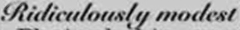
Sorry about the image quality.. It reads "ridiculously modest" and the letters are somewhat close together and connect. All of the thick upright parts like i, l, and the m have a very uniform thickness except at the top and bottoms.. I hope that makes sense, I don't know all the correct terminology!
13 years ago
Hello
Maybe you can use:
http://www.whatfontis.com/G-Unit.font?text=Ridiculously%20modest
Alex
Our system helps everyday thousands of designers (famous or not) to find the fonts they need to complete their work. Using a database of 1,200,000 fonts the automatic font finder system identifies the font from images.
Yet sometimes the images are very complex, so other users need a bit of help.
If you recognize the font from the samples posted here don't be shy and help a fellow designer.
If you need help, first try the font finder. At the end of the process if the results are bad you will find a link that lets you post the image to the forum so other users can help you.