Can't find exact t and k and U
9 years ago
4 replies (7 years ago)
Maybe or Unanswered
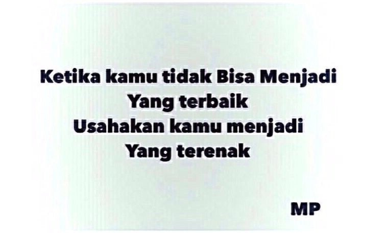
Hope the text is readable enough
9 years ago
Hello
Similar:
http://www.whatfontis.com/Museo-Sans-Display-Black-exljbris.font?text=Ketika%20kamu%20tidak%20Bisa%20Menjadi
Alex
9 years ago
Thanks. But not quite though. Lowercase e is totally different especially in the tail section
9 years ago
Hello
Maybe:
http://www.whatfontis.com/Matiz.font?text=KetikakamutidakBisaMenjadi
Alex
9 years ago
Oh yes!!! :)
Thought the distortion was from bad resolution image but turns out the font itself is bit not-smooth. Thanks.
Our system helps everyday thousands of designers (famous or not) to find the fonts they need to complete their work. Using a database of 1,200,000 fonts the automatic font finder system identifies the font from images.
Yet sometimes the images are very complex, so other users need a bit of help.
If you recognize the font from the samples posted here don't be shy and help a fellow designer.
If you need help, first try the font finder. At the end of the process if the results are bad you will find a link that lets you post the image to the forum so other users can help you.