Watkins Glen NY trail signs
10 years ago
2 replies (7 years ago)
Maybe or Unanswered
Hello - Making new signs for Watkins Glen and would love to use the historic font that was used on the wooden signs. I searched the website, but The only close font I found were Envoy Small Caps (which the link says is dead), and Andron 1 Corpus Reg. The distinguishing characteristics are the extended R, foreshortened top portions of letters like E and B and S. Fattish verticals on the N, shortened letter adjacent to R and sloping tails (E, S). Sorry, I'm an architect, so my terminology is wrong. Thanks for any help!
10 years ago
Hello
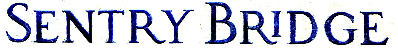
Maybe will help:
http://www.whatfontis.com/OptimusPrincepsSemiBold.font?text=SentryBridge
http://www.whatfontis.com/Anavio-Bold-Small-Caps.font?text=SentryBridge
http://www.whatfontis.com/Jupiter-Bold-canadatype.font?text=SentryBridge
Alex
10 years ago
Close!
I may use a mix. The E and the R are still not right.
The i is an unknown - it may occur only when adjacent to an R or K
Our system helps everyday thousands of designers (famous or not) to find the fonts they need to complete their work. Using a database of 1,200,000 fonts the automatic font finder system identifies the font from images.
Yet sometimes the images are very complex, so other users need a bit of help.
If you recognize the font from the samples posted here don't be shy and help a fellow designer.
If you need help, first try the font finder. At the end of the process if the results are bad you will find a link that lets you post the image to the forum so other users can help you.