Looking for this font
12 years ago
2 replies (1 month ago)
Maybe or Unanswered
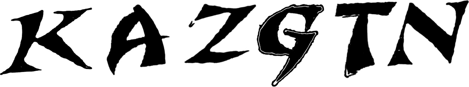
The letters were really warped/skewed originally. To make them suitable for the font finder I did my best in photoshop but it seamed to cause some distortion. The font isn't all wobbly like it is here and the left side of the letter "A" doesn't have that slight curve inwards like it does here. If anybody who doesn't know this font but knows one with a similar style K and A I'd love to know about it as well.
12 years ago
Hello
Maybe:
http://www.whatfontis.com/New-Visigoth-RXSN-Regular-arthurbaker.font?text=KAZGTN
Alex
12 years ago
Thanks! There's also a few other letters I wasn't able to get from the original source (they were too warped/distorted) that match exactly to the font you linked me to as well. The only letters that don't match are the letters A and T so I'm guessing they may of mixed two separate fonts. Again, thanks a lot!
Our system helps everyday thousands of designers (famous or not) to find the fonts they need to complete their work. Using a database of 1,200,000 fonts the automatic font finder system identifies the font from images.
Yet sometimes the images are very complex, so other users need a bit of help.
If you recognize the font from the samples posted here don't be shy and help a fellow designer.
If you need help, first try the font finder. At the end of the process if the results are bad you will find a link that lets you post the image to the forum so other users can help you.