Logo font similar to futura
12 years ago
2 replies (1 month ago)
Maybe or Unanswered
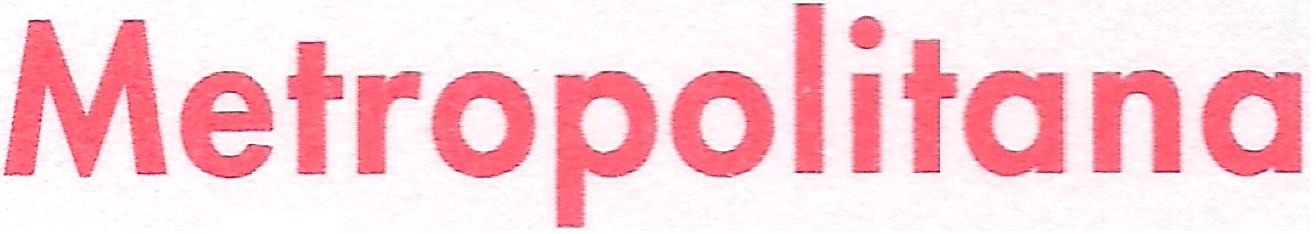
Hi, I've to reproduce this Metropolitana logo in MS word environment. I've tried Futura-Normal (bolded by word) with 95% characters proportion and it's the most similar font but it's not perfect. In particular: - the final part of e doesn't follow the rest of the elliptical shape but it poits outside - the "cut" of t is perfectly divided in 2 instead of being longer on the right side - the inside "rings" (empty parts) of o, a, p are too large - too much space between the "legs" of n - l is too short The only good side is that the "peaks" of M can be easily cutted off to get the flat shape as the logo. Thank you in advance :D
12 years ago
Hello
Futura Heavy is very close.
http://www.whatfontis.com/Futura-Heavy-adobe.font?text=Metropolitana
Alex
Our system helps everyday thousands of designers (famous or not) to find the fonts they need to complete their work. Using a database of 1,200,000 fonts the automatic font finder system identifies the font from images.
Yet sometimes the images are very complex, so other users need a bit of help.
If you recognize the font from the samples posted here don't be shy and help a fellow designer.
If you need help, first try the font finder. At the end of the process if the results are bad you will find a link that lets you post the image to the forum so other users can help you.