The Planets
6 months ago
1 replies (6 months ago)
Maybe or Unanswered
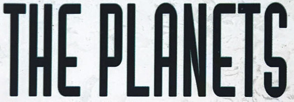
Logotype used on the cover of a space documentary from 1993. S-bend is perfectly horizontal and aligned with the same lowered centerline as the crossbars on E, H and A. N is a regular capital, starting to think it's taken from a second font.
6 months ago
Hello
Maybe you can use:
https://www.whatfontis.com/FF_Ignoto.font?text=EPAES
https://www.whatfontis.com/FF_BivoacRegulerDemo.font?text=EPAES
Alex
Our system helps everyday thousands of designers (famous or not) to find the fonts they need to complete their work. Using a database of 1,200,000 fonts the automatic font finder system identifies the font from images.
Yet sometimes the images are very complex, so other users need a bit of help.
If you recognize the font from the samples posted here don't be shy and help a fellow designer.
If you need help, first try the font finder. At the end of the process if the results are bad you will find a link that lets you post the image to the forum so other users can help you.