Preview with Your Text


Somewhat Expanded font
Publisher
MyFonts.com
License
$ Commercial
Date added
Nov 28 2016
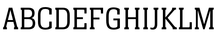
A tall, narrow font with thin, consistent strokes and a modern feel.
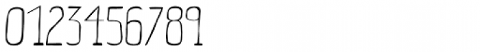
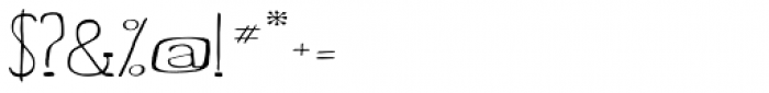
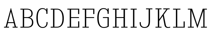
This font features a tall, narrow design with slightly expanded characters. The strokes are thin and consistent, giving it a clean and modern appearance. The uppercase letters are particularly elongated, while the lowercase letters maintain a balanced proportion. The numerals and special characters follow the same slender style, contributing to a cohesive look.
Ideal for modern branding, editorial design, and minimalist posters.
Headlines, Logos
Balanced
Download Somewhat Expanded font.
Ideal for modern branding, editorial design, and minimalist posters.
Headlines, Logos
Balanced
Category
Bold
No
Italic
No
Weight
Light
Width
Expanded
Character spacing
Normal
Line height
Tall
Contrast
Low
Overall style
Modern
X height
Medium
Cap height
High
Similar Free Fonts for Somewhat Expanded
KingsbridgeScEl-Regular Font

$ Free > Personal Use
KingsbridgeScLt-Regular Font
$ Free > Personal Use
Similar fonts for Somewhat Expanded from Adobe.com
Neue Aachen Pro Light Font
$ Commercial > Adobe.com
Demos Next Pro Cn Light Font
$ Commercial > Adobe.com
Similar fonts for Somewhat Expanded from MyFonts.com
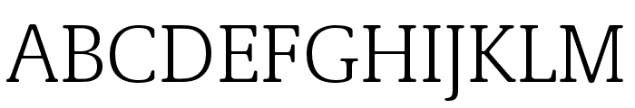
Somewhat Expanded Font
$ Commercial > MyFonts.com
Somewhat Expanded Bold Font

$ Commercial > MyFonts.com
Similar fonts for Somewhat Expanded from CreativeMarket.com
Finalist Round Slab 55 Regular otf (400) Font

$ Commercial > CreativeMarket.com
Finalist Round Slab otf (400) Font

$ Commercial > CreativeMarket.com


Help your fellow font-seekers if you think you can recognize the font. Earn some good karma by doing it :-) Answer & Help
Yet sometimes the images are very complex, so other users need a bit of help.
If you recognize the font from the samples posted here don't be shy and help a fellow designer.
Thousands of designers (famous or not) use the image font detection system to find a font or similar free fonts from an image. Although we have the largest database of fonts, the search for a font from an image gets mixed results like the image above.