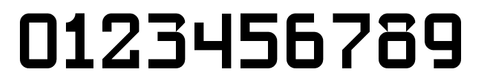

SlabStruct Too Regular font
Publisher
License
$ Free for personal use
Date added
Jan 10 2017
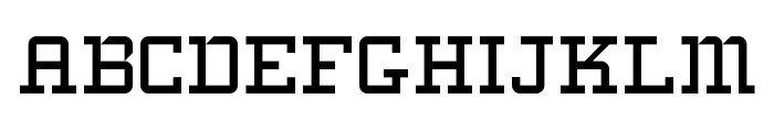
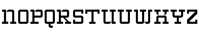
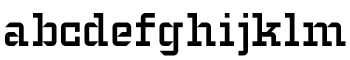
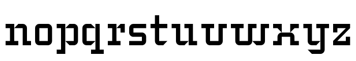
A bold, geometric slab serif font with a mechanical and structured design.
This font features a bold, structured slab serif design with geometric elements. The characters are uniform and have a mechanical feel, with consistent stroke widths and sharp angles. The uppercase letters are blocky and robust, while the lowercase letters maintain the same structured appearance. Numerals are equally bold and clear, making them highly legible.
Ideal for headlines, posters, branding, and any project requiring a strong, industrial aesthetic.
Headlines, Logos
Balanced
Download SlabStruct Too Regular font. SlabStruct Too Regular by Copyright paul hunt 2008
Ideal for headlines, posters, branding, and any project requiring a strong, industrial aesthetic.
Headlines, Logos
Balanced
See the font with your own custom text

Category
Slab Serif
Bold
Yes
Italic
No
Weight
Bold
Width
Normal
Character spacing
Normal
Line height
Normal
Contrast
Low
Overall style
Modern
X height
Medium
Cap height
High
Proposed projects
Ideal for headlines, posters, branding, and any project requiring a strong, industrial aesthetic.
Use case
Headlines, Logos
Ascender descender ratio
Balanced
Similar Free Fonts for SlabStruct Too Regular
SlabStruct Too Regular Font
$ Free > Personal Use
Typo College LC Demo Font

$ Free > Personal Use
Similar fonts for SlabStruct Too Regular from Adobe.com
Factoria Demi Font

$ Commercial > Adobe.com
Factoria Bold Font

$ Commercial > Adobe.com
Similar fonts for SlabStruct Too Regular from MyFonts.com
Cholla Slab Bold Font

$ Commercial > MyFonts.com
Factoria Demi Font

$ Commercial > MyFonts.com
Similar fonts for SlabStruct Too Regular from CreativeMarket.com
Factoria Demi otf (400) Font

$ Commercial > CreativeMarket.com
Factoria Bold otf (700) Font

$ Commercial > CreativeMarket.com
WhatFontIs Blog
Typography in luxury branding: What makes a font look expensive?

Latest from the WhatFontIs Forum
Help your fellow font-seekers if you think you can recognize the font. Earn some good karma by doing it :-) Answer & Help
Yet sometimes the images are very complex, so other users need a bit of help.
If you recognize the font from the samples posted here don't be shy and help a fellow designer.
Thousands of designers (famous or not) use the image font detection system to find a font or similar free fonts from an image. Although we have the largest database of fonts, the search for a font from an image gets mixed results like the image above.