Preview with Your Text


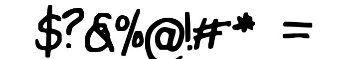
I Tried To Print Neat font
Publisher
License
$ Free for personal use
Date added
Nov 25 2018
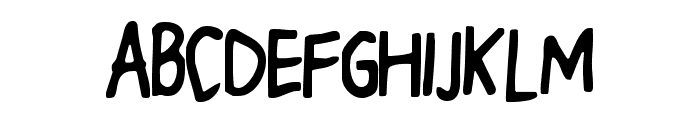
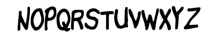
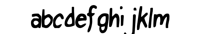
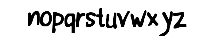
A playful, handwritten font with a casual, tilted style.
This font features a playful, handwritten style with irregular strokes and a casual appearance. The letters are slightly tilted, adding to its informal charm.
Ideal for children's books, greeting cards, and informal invitations.
Headlines, Informal text
Balanced
Download I Tried To Print Neat font. I Tried To Print Neat by Copyright [c] Phillip G Andrade, 2000. All rights reserved.
Ideal for children's books, greeting cards, and informal invitations.
Headlines, Informal text
Balanced
(Dry Heaves - www.drybohnz.com/)
Category
Bold
No
Italic
No
Weight
Regular
Width
Normal
Character spacing
Normal
Line height
Normal
Contrast
Low
Overall style
Casual
X height
Medium
Cap height
Medium
Proposed projects
Ideal for children's books, greeting cards, and informal invitations.
Use case
Headlines, Informal text
Ascender descender ratio
Balanced
Similar Free Fonts for I Tried To Print Neat
I Tried To Print Neat Font

$ Free > Personal Use
B612 Regular Font
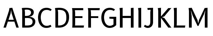
$ Free > Personal Use
Similar fonts for I Tried To Print Neat from Adobe.com
Effra CC Arbc SemiBold Font

$ Commercial > Adobe.com
Effra CC SemiBold Font

$ Commercial > Adobe.com
Similar fonts for I Tried To Print Neat from MyFonts.com
Rysse Bold Font

$ Commercial > MyFonts.com
Foundry Sterling Extra Bold Font

$ Commercial > MyFonts.com
Similar fonts for I Tried To Print Neat from CreativeMarket.com
Stepbuzz-Regular otf (400) Font
$ Commercial > CreativeMarket.com
Crossfire Bold ttf (700) Font

$ Commercial > CreativeMarket.com

Help your fellow font-seekers if you think you can recognize the font. Earn some good karma by doing it :-) Answer & Help
Yet sometimes the images are very complex, so other users need a bit of help.
If you recognize the font from the samples posted here don't be shy and help a fellow designer.
Thousands of designers (famous or not) use the image font detection system to find a font or similar free fonts from an image. Although we have the largest database of fonts, the search for a font from an image gets mixed results like the image above.