Many Similar, none exact
6 years ago
1 replies (6 years ago)
Maybe or Unanswered
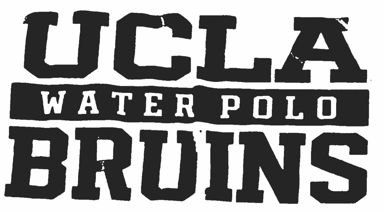
Not sure if this is a frankensteined font of some sort or what. I found a few that have a some of the letters that are really close, then others are off. Please help. Concentrating on the W, A, & R is WATER POLO and well as the S in BRUINS. The Player font family is close for the A & S, but the W & R are too far off. Thanks for the help!!
Our system helps everyday thousands of designers (famous or not) to find the fonts they need to complete their work. Using a database of 1,200,000 fonts the automatic font finder system identifies the font from images.
Yet sometimes the images are very complex, so other users need a bit of help.
If you recognize the font from the samples posted here don't be shy and help a fellow designer.
If you need help, first try the font finder. At the end of the process if the results are bad you will find a link that lets you post the image to the forum so other users can help you.