Apostrophe and Bang trippin me up
2 months ago
1 replies (2 months ago)
Maybe or Unanswered
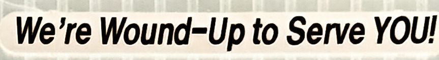
I can get several fonts that close, but not close enough. Something is always off. I'm replacing a sign that was damaged and it is only the 'We're Wound-Up' portion, and they have another sign up that is exactly the same as this (the one I'm using here) so it has to be as close to if not the same font so it doesn't look weird next to each other (slightly large stroke widths, wider/slimmer letter 'e/o's, etc). Although I'm not sure why any would- could this be a mash up of different fonts?
2 months ago
Maybe you can use,
https://www.whatfontis.com/CR_Aksioma-Semibold-Italic-otf-600.font?text=WereWoun
Antonia
Our system helps everyday thousands of designers (famous or not) to find the fonts they need to complete their work. Using a database of 1,200,000 fonts the automatic font finder system identifies the font from images.
Yet sometimes the images are very complex, so other users need a bit of help.
If you recognize the font from the samples posted here don't be shy and help a fellow designer.
If you need help, first try the font finder. At the end of the process if the results are bad you will find a link that lets you post the image to the forum so other users can help you.