FORMLESS
11 months ago
2 replies (11 months ago)
Maybe or Unanswered

SEND THIS FONT NAME PLS
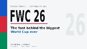
madebyglit Suggested Font: Halogen
11 months ago
It's this font that has been manually modified to remove the ascender/stem on the F and E
CJBranding Suggested Font: Luxury Gold
11 months ago
Luxury Gold by House Industries (https://housefonts.com/hi/luxury_text ) is closer, it has the pointed tips on the M, etc.
If you set character spacing to "Optical" at 110% it lines right up.
Our system helps everyday thousands of designers (famous or not) to find the fonts they need to complete their work. Using a database of 1,200,000 fonts the automatic font finder system identifies the font from images.
Yet sometimes the images are very complex, so other users need a bit of help.
If you recognize the font from the samples posted here don't be shy and help a fellow designer.
If you need help, first try the font finder. At the end of the process if the results are bad you will find a link that lets you post the image to the forum so other users can help you.