Update, October 9, 2026: we re-ran the WhatFontIs side of this benchmark on October 8, after the service started searching several identification models per request. Top-1 went from 84.29% to 92.95% and Top-20 reached 98.56%. The new numbers are in the October 2026 update. The September 18 re-run against GPT-6 Astra, Claude Fable 5.1, and Gemini 3.8 Flash is in the September 2026 update, and the original June results are kept below unchanged. Scripts, prompts, and every raw API response are public at github.com/whatfontis/font-identification-benchmark.
The big AI models can write code, pass law exams, summarize long documents, and describe a painting in three languages. So surely they can name the font in a screenshot, right?
We tested that assumption. We compared the WhatFontIs font-identification API against GPT-5, GPT-5 mini, Claude Opus, Claude Sonnet, Gemini 2.5 Pro, and Gemini 2.5 Flash on a benchmark of 624 real fonts. The result was not close.
How We Set Up the TestWe built a test set of 624 fonts from three different sources:
- 200+ fonts from Adobe Fonts
- 200+ fonts from Google Fonts
- 200+ fonts from dafont.com
That mix matters. Adobe and Google cover many of the clean, professional fonts designers actually use and license. Dafont adds the harder cases: display fonts, scripts, decorative typefaces, hand-drawn styles, and one-off designs you often see on posters, merch, logos, and social graphics.
Each system got the same job: look at an image of a word or phrase and identify the exact typeface. We graded by exact-name match. “Montserrat” counts. “A geometric sans similar to Montserrat” does not. That is a strict benchmark, but it matches the real-world problem. If a client asks “what font is this?”, a vague style description does not get you to the license, download page, or replacement font.
We measured Top-1 accuracy for all tools. For the WhatFontIs API, we also measured Top-5, Top-10, and Top-20 accuracy, because the API returns a ranked shortlist of real font candidates. The full image set is available on GitHub so anyone can reproduce the test: github.com/whatfontis/Font-Finder.
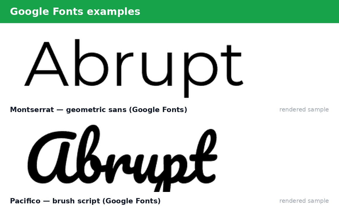
On the full Adobe + Google + dafont benchmark, the WhatFontIs API identified the correct font as its first result 81.4% of the time. Even more importantly, the correct font appeared in the shortlist in most cases:
| Result depth | Correct match rate |
|---|---|
| Top-1 | 81.4% |
| Top-5 | 92.8% |
| Top-10 | 94.5% |
| Top-20 | 96.3% |
That means that for roughly 19 out of every 20 fonts, the correct answer was present in a short ranked list that a designer can scan in seconds. Average response time was about 3.2 seconds per image.
The general-purpose AI models performed very differently. Across GPT-5, GPT-5 mini, Claude Opus, Claude Sonnet, Gemini 2.5 Pro, and Gemini 2.5 Flash, exact Top-1 accuracy was in the 0–1% range. Claude Opus performed best in this group, but still identified only one font correctly.
To be clear, this is our own internal benchmark, and exact-name scoring is intentionally strict. A chatbot may say something useful like “this looks like a bold grotesque, maybe Helvetica or Akzidenz.” That can be a reasonable style description, but it still does not identify the exact font. For font identification, the exact name is the point.
Why General AI Models Struggle With FontsThis is not about whether GPT, Claude, or Gemini are “smart.” They are very capable general-purpose models. The issue is that font identification is not mainly a language problem. It is a visual recognition and retrieval problem.
A chatbot can describe the style of a typeface. It can say whether something looks like a serif, sans-serif, script, geometric font, grotesque, or display face. But when asked for the exact typeface, it often falls back to famous font names it has seen many times: Helvetica, Arial, Futura, Times New Roman, Montserrat, Gotham, or similar common guesses. That may sound convincing, but it is often wrong.
The hard part is not describing the vibe. The hard part is comparing specific glyph shapes, proportions, terminals, curves, spacing, and details against a large catalog of real fonts. That is exactly where a dedicated font-identification engine has an advantage.
What a Dedicated Font Identifier Does DifferentlyThe WhatFontIs API is built specifically for font recognition. It compares the uploaded image against a structured database of more than one million fonts. Instead of producing a single plausible-sounding answer, it returns a ranked list of real font matches. Each result is an actual font candidate that can be checked, licensed, downloaded, or compared visually.
That shortlist is important. Sometimes the first result is not perfect. But in this benchmark, when the first result missed, the correct font was often still nearby in the ranked list. That is why accuracy climbs from 81.4% at Top-1 to 96.3% at Top-20. For practical work, that difference matters. A designer does not need a chatbot to sound confident. They need a short list of real fonts that can be verified quickly.
Want to try it on your own images? You can test the WhatFontIs font-identification API here: whatfontis.com/API-identify-fonts-from-image.html.
Accuracy was the biggest difference, but speed and cost also favored the dedicated API. The WhatFontIs API answered in about 3.2 seconds per image on average. That was faster than every model we tested except a near-tie with Claude, and much faster than GPT-5 at around 14 seconds or Gemini 2.5 Pro at around 10 seconds.
Cost showed the same pattern. Running premium general AI models at volume is not free. In our test, Claude Opus cost several dollars per thousand identifications. That is difficult to justify if the exact-match accuracy is around 1% or lower.
What This Means for Designers and DevelopersIf you are a designer, print shop, brand team, or developer building a “what font is this?” feature, the takeaway is simple: use the right tool for the job. General AI is excellent for brainstorming, rewriting, explaining visual styles, and generating design ideas. But for exact font identification, it is not reliable today.
When a client sends a logo or screenshot and asks, “What typeface is this?”, a confident wrong answer can waste time and damage trust. A dedicated font finder is built for that specific job: compare the image against real fonts and return a ranked shortlist of matches.
Update: September 2026 Re-Run With GPT-6, Claude Fable 5.1, and Gemini 3.8A few readers asked two fair questions after the June article: can we reproduce this ourselves, and does the gap hold up against newer models? So on September 18, 2026 we ran the whole thing again, and this time we published everything.
The new repository, github.com/whatfontis/font-identification-benchmark, contains the same 624 test images (200+ Adobe Fonts, ~200 Google Fonts, 200+ dafont), the scripts that send each image to every API, the exact prompt sent to the general-purpose models, and the raw JSON reply of every single call. Images ship as opaque img_001.jpg to img_624.jpg, so the filename cannot leak the answer. Anyone can re-score a run offline with php scripts/rescore.php, no API key needed.
The June numbers above used exact-name matching. The new run uses a token-based matcher: any weight or style from the correct family counts as a hit (so “Akzidenz-Grotesk Medium Extended Italic” matches “Akzidenz-Grotesk”), and the same matcher scores every system, WhatFontIs included. This is fairer to the chatbots, which rarely return an exact cut name. Scoring exact strings instead drops every system’s numbers sharply, which is part of why the June chatbot results sat near 0–1%.
Everything was fully automated: one POST per image, no cropping, no character hints. The general-purpose models got one fixed prompt asking for up to 20 font names as JSON, with provider defaults (no reasoning settings, no tools, no web search).
The September 2026 numbers| Metric | WhatFontIs API | GPT-6 Astra | Claude Fable 5.1 | Gemini 3.8 Flash |
|---|---|---|---|---|
| Top-1 | 84.29% (526/624) | 14.42% (90) | 8.65% (54) | 4.33% (27) |
| Top-5 | 94.87% (592) | 23.72% (148) | 19.07% (119) | 9.13% (57) |
| Top-10 | 95.51% (596) | 27.56% (172) | 26.60% (166) | 13.94% (87) |
| Top-20 | 96.15% (600) | 27.56% (172) | 33.49% (209) | 18.43% (115) |
| Not in the answer | 24 | 452 | 415 | 509 |
| Avg. time per image | 4.0 s | 26.4 s | 7.2 s | 12.8 s |
| API cost, 624 images | – | $25.65 | $7.80 | $6.77 |
For comparison, the June run scored WhatFontIs at 81.4% Top-1, 92.8% Top-5, and 96.3% Top-20. The September run comes out slightly higher at Top-1 and Top-5 and almost identical at Top-20, which is within the normal variation between runs: the API does not return bit-identical rankings on every call, so a re-run can differ by a few images.
What the new models did better, and where they still fall shortThe honest headline is that the general-purpose models improved a lot. GPT-6 Astra went from roughly zero to 14.42% Top-1, and Claude Fable 5.1 reached 33.49% when you look at its full list of 20 guesses. That is real progress compared to June, and some of it is also the friendlier family-level scoring.
But the gap is still enormous. The best chatbot Top-1 result, 14.42%, is about one sixth of the dedicated API’s 84.29%. Even the best Top-20 result, 33.49%, is a third of the API’s 96.15%. Three quarters of the time GPT-6 Astra simply did not have the right family anywhere in its answer, and for Gemini 3.8 Flash that was four out of five images.
A few details from the raw logs: GPT-6 Astra usually returned only 8–12 names instead of 20, so its Top-20 equals its Top-10. Claude Fable 5.1 refused one image outright (counted as a miss). None of the four systems returned a single API error. And the cost picture is unchanged in direction: the slowest, most expensive model in the test was also the one with the most room to improve.
What this benchmark does not tell youThe test images are clean single-word renders on white. Real uploads have effects, backgrounds, and photo noise, so every score here reads higher than it would on real-world crops. “Correct” means the right family, not the exact weight or italic. And the chatbots ran with one fixed prompt at default settings; a different prompt, higher reasoning effort, or web search could move their numbers, which is exactly why the run script is public. If you get a better result, we would like to see it.
Update: October 2026 Re-Run, After WhatFontIs Started Searching Several ModelsOn October 8, 2026 we ran the benchmark against the WhatFontIs API again: the same 624 images, the same public scripts, the same token-based matcher as in September, one POST per image with no cropping and no hints. The difference is on our side. The service behind the same api2 endpoint now searches several identification models for each request instead of one. The run is published as results/2026-10-08_171bc8af in the benchmark repository, raw responses included, so you can re-score it offline with php scripts/rescore.php.
| Metric | September 18 | October 8 | Change |
|---|---|---|---|
| Top-1 | 84.29% (526/624) | 92.95% (580/624) | +8.66 points |
| Top-5 | 94.87% (592) | 98.08% (612) | +3.21 points |
| Top-10 | 95.51% (596) | 98.56% (615) | +3.05 points |
| Top-20 | 96.15% (600) | 98.56% (615) | +2.41 points |
| Not in the top 20 | 24 | 9 | 15 fewer |
| Median time per image | 3.74 s | 11.95 s | about 3x slower |
| Avg. time per image | 3.96 s | 12.24 s | about 3x slower |
September against October is the like-for-like comparison, since both runs used the same matcher. The right family now comes first for 580 of 624 images, up from 526, and it shows up somewhere in the top 20 for 615. For reference, the June article reported 81.4% at Top-1, but that figure came from the original exact-name scorer, so treat that comparison as a rough guide only.
What moved, image by imageCompared with September, 69 images ranked higher, 10 ranked lower, and 545 stayed where they were. At Top-1 the run gained 60 images and lost 6. Of the 24 September misses, 17 were found this time and 7 are still missing. Two images became new misses: img_447.jpg, which was a Top-1 hit in September, and img_568.jpg, which was ranked 9th. All nine misses are listed in not_found.txt, next to the first font the API returned for each. Results are still not bit-identical between runs, so a re-run can shift a few images either way.
Searching several models costs time. A full 624-image run now takes about two hours instead of about 40 minutes. That puts WhatFontIs roughly level with Gemini 3.8 Flash (12.8 s), slower than Claude Fable 5.1 (7.2 s), and still about twice as fast as GPT-6 Astra (26.4 s). So it is no longer the fastest system in the test. For one image at a time, 12 seconds is easy to live with. For bulk jobs, plan around it.
How the chatbots compare nowOnly WhatFontIs was re-run in October. The GPT-6 Astra, Claude Fable 5.1, and Gemini 3.8 Flash figures are still the September 18 ones, so read them as a snapshot; newer model versions could close some of the distance. With that caveat, the October Top-1 of 92.95% is more than six times the best chatbot Top-1 (14.42%, GPT-6 Astra), and the 98.56% Top-20 is almost three times the best chatbot Top-20 (33.49%, Claude Fable 5.1). The earlier limits still apply: clean single-word renders on white, family-level scoring, and one fixed prompt at default settings for the chatbots.
Try the Test YourselfYou do not have to take our word for it. The full 624-image test set is available on GitHub: github.com/whatfontis/Font-Finder, and the reproducible benchmark with scripts, prompts, and raw responses is at github.com/whatfontis/font-identification-benchmark. Download it, run the images through your favorite chatbot, and count how many exact font names it gets right. Then run the same images through a dedicated font identifier and compare the results.
The question is simple: would you rather use a tool that sounds confident but gets the exact font right around 1% of the time, or one that puts the correct answer in the shortlist 96% of the time?

I'm a programmer at heart. But in my 20s, I discovered there was a whole world of fonts beyond Courier.
Curiosity got the better of me, so I started building a system to explore and identify them.
What began as a personal project eventually grew into WhatFontIs.com, one of the world's leading font identification platforms.
Today, WhatFontIs helps nearly one million designers—from everyday creatives to some of the biggest names in the industry—find the fonts they're looking for.