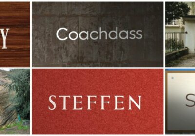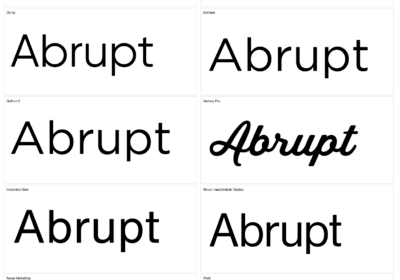
Nobody searches for a font using a seven-letter word on a clean background. They upload a crop of a logo, two letters from a poster, or a single “R” from a shop sign. Our first benchmark didn’t test that. Version 2 does.
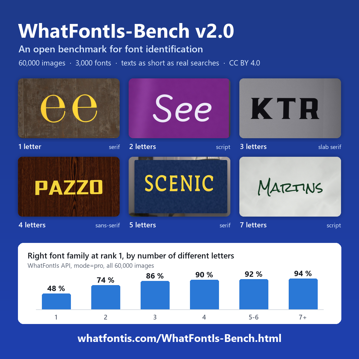
The first WhatFontIs-Bench had 600 fonts and 11,995 images, each showing one word of 7 to 12 letters. Useful, but too easy and not very realistic. WhatFontIs-Bench v2.0 is five times bigger on fonts: 3,000 families, with 20 images each, for 60,000 images in total.
The font mix is 1,059 sans-serif, 1,000 serif, 500 slab serif, 300 script and 141 monospaced. Script fonts are new in v2, since v1 had none. The fonts come from Adobe Fonts, Creative Fabrica, Google Fonts and DaFont, restricted to commercial-use licenses. The font files themselves are not included, only images of text set in them.
Texts that look like real searchesThis is the part we care about most. The strings come from COCO-Text v2, with letter case adjusted to match what people actually search for on WhatFontIs. So 48% of texts are all capitals, 18.2% are capitalised, 18.5% are mixed case, 10.8% are lower case and 4.5% are digits only. About one text in ten contains digits.
Length follows the same logic. Single letters make up 4.5% of images, two letters 6.2%, three letters 14.5%, four letters 16%, five to six letters 31.8% and seven or more 27%. Short, awkward texts are well represented, because that’s what shows up in real life.
Textures, scenes and objectsEach font gets ten texture images (text on close-up surface photos), six scene images (text painted inside a real place) and four object images (text on printed objects). Every image comes in one of three difficulty levels. Easy has large, sharp text and almost even light. Hard means smaller capitals, more blur and noise, heavy JPEG compression and strong uneven light, often with shadows, glare or print wear.
Backgrounds are CC0 photos from Poly Haven, ambientCG and Wikimedia Commons. The images are frontal, with at most a 1.5% corner shift and 1 degree of rotation, so the test is about font recognition and not camera tricks.
The first numbersWe ran the full set through the WhatFontIs API in October 2026. The API searches over 1.2 million fonts, and an answer counts as correct if it matches the font family in any weight or source. Top-1 accuracy is 88.1% in mode=pro and 82.2% in the default mode. Top-5 reaches 94.3% in pro and 88% in default.
Some breakdowns are interesting. In pro mode, script fonts score 93.7%, slab serifs 91.2% and sans-serifs 84.1%. Sans-serifs are the hardest category, which makes sense: plenty of them are near twins of each other. By image type, objects score best (89.2%) and scenes are the weakest (86%).
Why length matters so muchThe chart in the image above tells the story. In pro mode, Top-1 accuracy by number of different letters goes 48%, 74%, 86%, 90%, 92% and 94% as texts get longer. A single letter is a coin flip, and often there is no single correct answer, because many fonts draw the same letter almost identically. We treat single-letter results as a lower bound.
That also explains why v2 scores lower overall than v1 (89.6% pro, 83.2% default). Shorter texts carry less font information. It isn’t a regression, it’s a harder test.
Speed and honest caveatsMedian time per image was 4.4 seconds in default mode and 9 seconds in pro mode, measured on 100 images, one request at a time, on the live API. Unanswered images count as misses: 280 in default mode and 50 in pro.
We also list the known gaps. Scene images reuse a limited number of real scenes. Some fonts are close look-alikes of fonts sold under other names. And since we run the API being measured, the figures are ours. That’s exactly why the dataset is open: run it on your own tool and compare.
How to get itv2.0 is on GitHub as 15 zip files, roughly 8 GB in total. Download with gh release download v2.0 –repo whatfontis/WhatFontIs-Bench. Annotations come as labels.jsonl, COCO-format annotations.json and font metadata. There is also a 1,200-image quick set, one image per font, that scores about the same as the full set. It’s the fast way to try a tool before committing to 8 GB. Text sources are CC BY 4.0, and one warning: 513 of the 600 v1 fonts are also in v2, so don’t train on one version and test on the other.
Full details and downloads: WhatFontIs-Bench v2.
Your turnIf you build or use a font identifier, run it on the quick set and tell us where it breaks. Which text length or font category do you think is the real stress test?

I'm a programmer at heart. But in my 20s, I discovered there was a whole world of fonts beyond Courier.
Curiosity got the better of me, so I started building a system to explore and identify them.
What began as a personal project eventually grew into WhatFontIs.com, one of the world's leading font identification platforms.
Today, WhatFontIs helps nearly one million designers—from everyday creatives to some of the biggest names in the industry—find the fonts they're looking for.