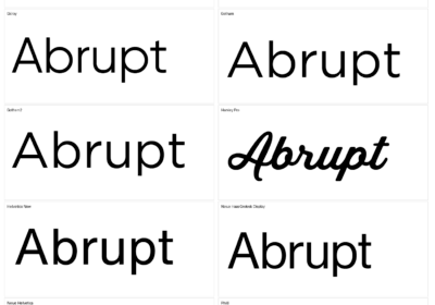
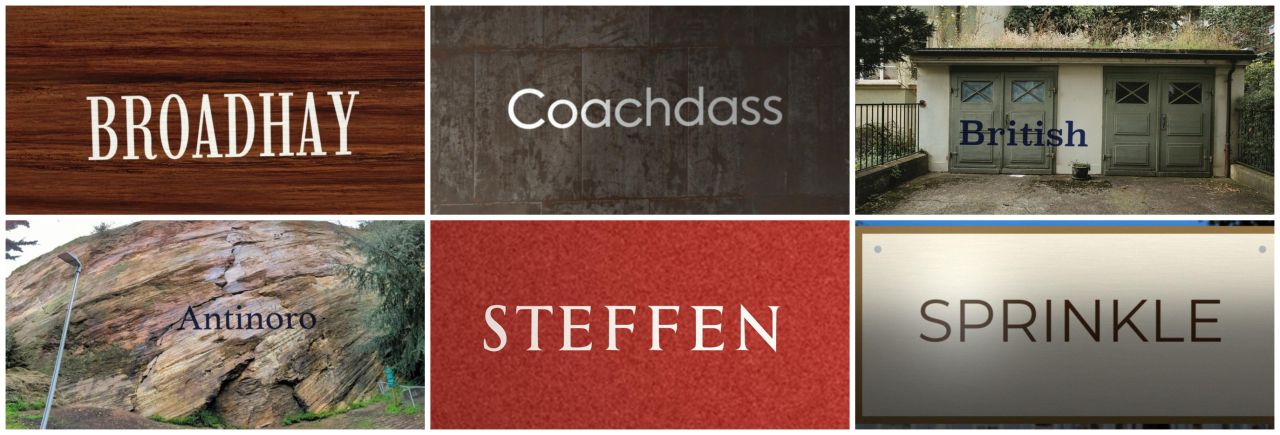
Naming a font from a clean specimen on white paper is the easy case. Now picture a word painted on a brick wall, half in shadow, saved as a rough JPEG. That is much closer to what people upload to a font finder, and we wanted a public, repeatable way to measure it. So we built one.
What WhatFontIs-Bench actually isWhatFontIs-Bench is a synthetic benchmark for font family identification. Every image shows one word of 7 to 12 letters, set in a known font and placed on a real surface or inside a real photo. Because we put the word there ourselves, we know the exact font, the text, the word’s bounding box and the position of every single letter. A photo of a shop sign never comes with answers like that.
Version 1.0 holds 11,995 images of 600 fonts: 200 sans-serifs, 200 serifs, 100 slab serifs and 100 monospaced faces. They come from Adobe Fonts (215), Creative Fabrica (191), Google Fonts (183) and DaFont (11, commercial-use licenses only). Each font gets 20 images, except Colt Soft Regular. It gets 15, because a seven-letter word at that size does not fit in 2,000 pixels.
Textures, scenes and objectsEvery font shows up in three kinds of image:
- Texture (10 per font): the word printed or painted on a close-up of wood, plaster, concrete, brick, metal, fabric, leather, paper or cardboard.
- Scene (6 per font): the word painted on a wall inside a real photo of a room, shop, facade or workshop.
- Object (4 per font): the word on a label, box, book cover, poster, menu, shop sign, package or business card.
The 153 background photos are all CC0, from Poly Haven, ambientCG and Wikimedia Commons. The words come from COCO-Text v2.
Three difficulty levelsEach image is also tagged easy, medium or hard (2,995, 3,000 and 6,000 images). Easy images have tall capitals of 160 to 220 pixels, almost even light, a touch of blur and noise, and high JPEG quality. Hard images shrink the capitals to 100 to 140 pixels, add more blur and noise, push JPEG quality down to 65 to 80, and light the scene badly. Many carry a cast shadow across the word (3,354 images), a glare spot (2,747) or light print wear (357).
The camera barely moves. Images are frontal, so an upright font never looks italic by accident, and in texture and scene images the corners shift by 1.5% at most while rotation stays within 1 degree. Contrast never drops below 70 gray levels (50 on hard), and no letter is ever clipped.
How the WhatFontIs API scoredWe ran the WhatFontIs API on all 11,995 images in September 2026. It searched its full catalogue of more than 1.2 million fonts, not only the 600 in the set. A result counts as correct when it names the right family in any weight or from any source, so Roboto Regular is a hit for a Roboto Bold image and Arial Bold is a miss. The three images where no letters were found count as misses too.
| Subset | Images | Top-1 | Top-5 | Top-20 |
|---|---|---|---|---|
| All images | 11,995 | 83.7% | 93.3% | 96.5% |
| Texture | 5,997 | 83.6% | 93.3% | 96.3% |
| Scene | 3,599 | 82.4% | 92.3% | 96.0% |
| Object | 2,399 | 85.9% | 95.0% | 97.5% |
| Easy | 2,995 | 85.2% | 93.9% | 97.4% |
| Medium | 3,000 | 83.3% | 92.8% | 96.0% |
| Hard | 6,000 | 83.1% | 93.3% | 96.3% |
| Sans-serif | 4,000 | 75.7% | 88.7% | 94.2% |
| Serif | 4,000 | 84.0% | 95.1% | 97.7% |
| Slab serif | 1,995 | 95.0% | 98.5% | 99.0% |
| Monospaced | 2,000 | 87.8% | 94.0% | 96.1% |
Overall, the right family comes first 83.7% of the time and appears in the top 20 for 96.5% of images. In plain terms, about one first guess in six misses, but the shortlist almost always contains the answer.
The surprise is how little difficulty matters. From easy to hard, Top-1 slips only from 85.2% to 83.1%. Blur, noise and JPEG damage at these levels do not confuse the matching much. Font category matters far more: sans-serifs score 75.7% at Top-1, slab serifs 95.0%. Our read is that slab serifs have loud, distinctive shapes, while sans-serifs are full of near-twins. Scenes are the hardest type (82.4%) and objects the easiest (85.9%), possibly because small painted walls force smaller capitals.
Limits you should know aboutTreat these numbers as a baseline, not a final grade. They are labeled September 2026. By our October 8 re-run the API was searching several models per request, and our older 624-image test went from 84.29% to 92.95% at Top-1 (details in our GPT, Claude and Gemini comparison). Bench v1.0 also reports WhatFontIs only, so there are no rival tools in the table.
The dataset has gaps too. Scene images reuse a limited number of real photos, each with a different word, font, position and lighting. Some fonts are near look-alikes of fonts sold under other names. And “correct” means the right family, not the exact weight or cut.
Download it and test your own toolThe dataset is public. Annotations, the font list and the tools live in the GitHub repository, and the images are four zip files in the v1.0 release, about 2 GB in total. With the GitHub CLI, one command fetches them: gh release download v1.0 –repo whatfontis/WhatFontIs-Bench. Font files are not included, backgrounds are CC0, words are CC BY 4.0, and the fonts belong to their designers and foundries.
The Bench page has an explorer that shows example images with the word box and every letter outlined, and the method is written up in a paper on Zenodo. If you want to try the API on your own images, start at the font identification API page.
So here is a question for anyone who builds or tests font recognition: how does your tool do on a hard sans-serif in a bad shadow? Run it, tell us what you find, and tell us which fonts or surfaces you would add next.

I'm a programmer at heart. But in my 20s, I discovered there was a whole world of fonts beyond Courier.
Curiosity got the better of me, so I started building a system to explore and identify them.
What began as a personal project eventually grew into WhatFontIs.com, one of the world's leading font identification platforms.
Today, WhatFontIs helps nearly one million designers—from everyday creatives to some of the biggest names in the industry—find the fonts they're looking for.