Preview Seigo Kana Classic OT EB font with your text


Seigo Kana Classic OT EB font
Publisher
MyFonts.com
License
$ Commercial
Date added
Jun 30 2026
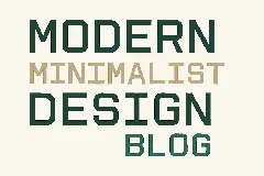
Bold, geometric sans-serif with clean lines and minimal stroke contrast.
A bold, sans-serif typeface with clean, geometric shapes and slightly rounded terminals. The characters have a uniform stroke width with minimal contrast, providing a strong and modern appearance. The design is straightforward with subtle humanist influences, evident in the open counters and balanced proportions.
Suitable for branding, headlines, signage, and digital interfaces requiring clear readability and strong presence.
Headlines, Logos, Signage
Download Seigo Kana Classic OT EB font.
Suitable for branding, headlines, signage, and digital interfaces requiring clear readability and strong presence.
Headlines, Logos, Signage
Category
Bold
Yes
Italic
No
Weight
Bold
Width
Normal
Character spacing
Normal
Line height
Normal
Contrast
Low
Overall style
Modern
X height
Cap height
High
Help your fellow font-seekers if you think you can recognize the font. Earn some good karma by doing it :-) Answer & Help

Yet sometimes the images are very complex, so other users need a bit of help.
If you recognize the font from the samples posted here don't be shy and help a fellow designer.
Thousands of designers (famous or not) use the image font detection system to find a font or similar free fonts from an image. Although we have the largest database of fonts, the search for a font from an image gets mixed results like the image above.
Recognize the font? Browse forumHave a font you want to use on the web?
Webfont Generatorin seconds.